Nature Photographers Network
This is the preserved archive of the original Nature Photographers Network. The community continues at naturephotographers.network.
Aggressive Stance - repost
‹ PreviousLandscape GalleryNext ›

Aggressive Stance - repost

by Andrew Finlayson

Gallery: LandscapePosted October 2, 2010204 views9 comments
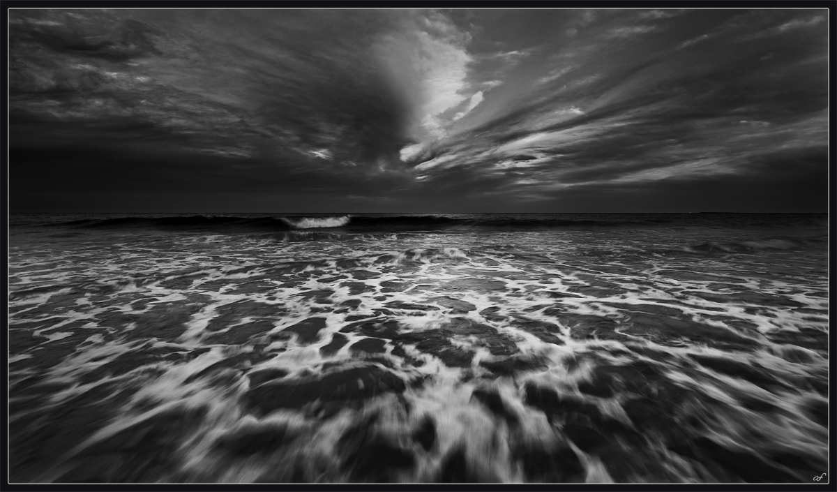
This is a BW conversion of a shot that I posted earlier this week. While post processing the colour certain steps show the shot as a high contrast BW and I thought it provided a completely different take on the shot. The colour is vibrant, positive and somewhat relaxed, I feel the BW is aggressive, angry and dominant.

Here's the link to the colour for comparison.

I think the BW is far more striking.

Comments

9 comments
Comment posted by Dennis Binda on October 2, 2010 at 6:23 AM
I like BW coversions and you're right about this version being more aggressive. I think bw pictures make us look into a world that is unfamiliar to our eyes so I tend to look at bw pics longer then colored ones. Since there is no dominant subject in this picture my eyes tend to go everywhere and nowhere. I think color suits this picture better. Nevertheless thnx for posting, I enjoyed going back and forth between the two.

best, Dennis
Registered on September 8, 2007, 56 Posts, 326 Comments
Comment posted by Ian Plant on October 2, 2010 at 3:57 PM
I like the repetition of shapes in the sky and water. Very moody, nicely done!
Registered on July 7, 2008, 271 Posts, 1657 Comments
Comment posted by Kenn Leonhardt on October 2, 2010 at 7:36 PM
I really do like the oomph that has been added to the water by the B&W conversion. It absolutely exudes a different mood compared to the colour version.
Registered on March 29, 2008, 27 Posts, 1710 Comments
Comment posted by Barry Vangrov on October 2, 2010 at 8:18 PM
B&W is much better imo.
Registered on September 1, 2009, 148 Posts, 749 Comments
Comment posted by William Vrolyk on October 2, 2010 at 9:29 PM
The mood is darker in this compared to the color version, Andrew. This one, like the other is very dramatic but I am leaning more towards the colored one in terms of preference.

Will
Edmonton, Alberta
Canada
Registered on November 1, 2003, 278 Posts, 3524 Comments
Comment posted by Bill Pelzmann on October 2, 2010 at 10:06 PM
I like this mood and MUCH prefer the BW version. Great interpretation.
Registered on January 26, 2005, 27 Posts, 265 Comments
Comment posted by Kah Kit Yoong on October 2, 2010 at 11:19 PM
You know my opinion on this one Andrew. I was thinking that perhaps you could brighten the white part of the incoming wave slightly without blowing out the highlights so that it is brighter than the foam in the foreground hence draw the eye even more?
Registered on September 27, 2006, 636 Posts, 10682 Comments
Comment posted by Andrew Finlayson on October 3, 2010 at 2:49 AM
Thanks for all your comments, much appreciated. I do often like a varied set of opinions, means they're both not too far off the mark for what they are.

Kah, great suggestion which may address Dennis' point regarding the lack of dominant subject. I've posted a quick edit. Thanks again for your time and input.
Registered on July 29, 2010, 26 Posts, 404 Comments
Comment posted by John Williams on October 3, 2010 at 11:40 PM
Intriguing to see the difference between the two Andrew, thanks for posting both. I prefer the color (but than I usually do...).
Registered on September 6, 2007, 221 Posts, 5985 Comments