Comment posted by Miro Susta on October 18, 2010 at 5:33 AM
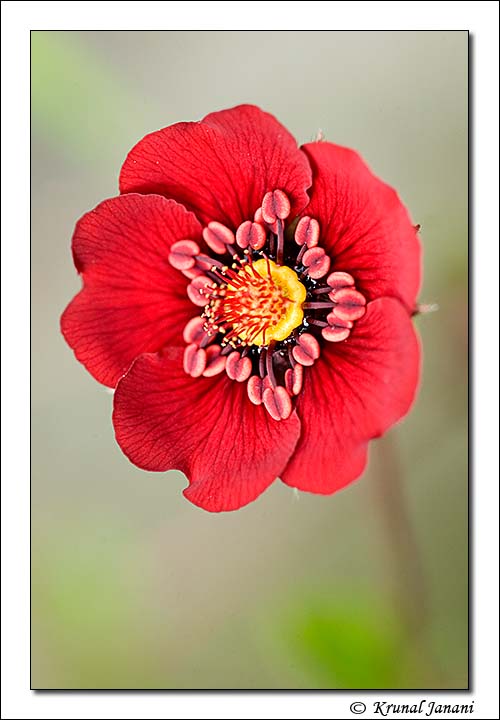
Very nice details with excellent colors. May be the edges (especially on the right side) could be a bit sharper. Nice work Krunal.
Registered on August 18, 2006, 719 Posts, 3736 Comments
Comment posted by Pat Sampson on October 18, 2010 at 7:56 AM
Krunal,
What a splendid flower. I love the color palette in this and the bg is as beautiful as the flower. It may just be my monitor but the center of the flower seems slightly out of focus to me. I can't tell if that's from focal plane or a little motion blur. I might consider sharpening/increasing the contrast there - assuming you prefer the sharpness of course.
Pat
Registered on May 19, 2007, 953 Posts, 15989 Comments
Comment posted by Krunal Janani on October 18, 2010 at 8:02 AM
@Pat
the center of the flower is indeed out of focus as it's not in the same plane, i tried to sharpen it but didn't get an desired result so left it & this was shot in 2009 & i didn't knew bout stacking so didn't do that
Registered on September 16, 2010, 60 Posts, 1370 Comments
Comment posted by Craig Strand on October 18, 2010 at 8:09 AM
Very nicely done Krunal. I like the comp and textures along with the outstanding OOF BG
Registered on March 30, 2008, 416 Posts, 2885 Comments
Comment posted by scott lanz on October 18, 2010 at 8:36 AM
I like the comp and the overall presentation is very natural and quite nice. My first thought, before reading the comments of others, was that I would have preferred the center a touch sharper.
Registered on November 14, 2003, 840 Posts, 12902 Comments
Comment posted by Ramamohan Pai on October 18, 2010 at 11:40 AM
Its a relatively small flower, Krunal. We have them here too - it has strong maroonish reds - can be quite challenging to capture that exact tone. Your photo is close enough.
Something like F/8 or F/11 might have been needed here to cover the pollen pods and all petals but not sure what it would have done to the background.
Registered on November 1, 2003, 550 Posts, 9037 Comments
Comment posted by Bill Fach on October 18, 2010 at 11:42 AM
Krunal: Sharpness issues aside, this is a beautiful flower and a solid capture. Nicely done.>=))>
Registered on November 1, 2003, 1805 Posts, 26981 Comments
Comment posted by Brigitte Lorenz on October 18, 2010 at 1:20 PM
very lovely, Krunal...wonderful comp. and colors
Brigitte
Registered on January 10, 2009, 187 Posts, 1507 Comments
Comment posted by Gary Yeoh on October 18, 2010 at 8:51 PM
Krunal:
I like this image, looks like a botanical drawing. Lovely color and sweet bg.
Registered on September 1, 2009, 588 Posts, 8184 Comments
Comment posted by Nathan Buck on October 19, 2010 at 11:25 AM
Great colors and excellent details Krunal. I wish for a bit more DOF out of the center - but I am not sure that I would want to trade the dreamy BG for it.
Nathan
Registered on November 1, 2003, 1101 Posts, 13589 Comments
Comment posted by Ian Wolfenden on October 20, 2010 at 4:09 AM
Beautifully composed and coloured, Krunal, and the centre details are superb. Maybe it would have been nice to have the R edge sharp, but this is a lovely image whatever.
Registered on May 18, 2007, 1108 Posts, 7647 Comments
Comment posted by Albert Darmo on October 20, 2010 at 10:04 PM
Hi Krunal This is some beautiful flower, the color and lines are superb.
Albert Darmo. Canada
Registered on November 25, 2008, 1386 Posts, 11978 Comments


Comments
12 commentsWhat a splendid flower. I love the color palette in this and the bg is as beautiful as the flower. It may just be my monitor but the center of the flower seems slightly out of focus to me. I can't tell if that's from focal plane or a little motion blur. I might consider sharpening/increasing the contrast there - assuming you prefer the sharpness of course.
Pat
the center of the flower is indeed out of focus as it's not in the same plane, i tried to sharpen it but didn't get an desired result so left it & this was shot in 2009 & i didn't knew bout stacking so didn't do that
Something like F/8 or F/11 might have been needed here to cover the pollen pods and all petals but not sure what it would have done to the background.
Brigitte
I like this image, looks like a botanical drawing. Lovely color and sweet bg.
Nathan
Albert Darmo. Canada