Nature Photographers Network
This is the preserved archive of the original Nature Photographers Network. The community continues at naturephotographers.network.
Santa Elena Canyon - Repost
‹ PreviousLandscape GalleryNext ›

Santa Elena Canyon - Repost

by Dottie Short

Gallery: LandscapePosted October 26, 2010146 views7 comments
Repost - Backed off on the sharpening in the repost. Thanks for all the comments both positive and negative. That's they way one improves.

Since joining NPN a few months ago I've been posting primarily in the avian gallery, but I really do love landscape photography. While I can usually produce a nice image, my pictures don't seem to have the WOW factor that many of the images present on the NPN Earth, Sea, & Sky gallery. I would appreciate any suggestions that would help me to improve my images.

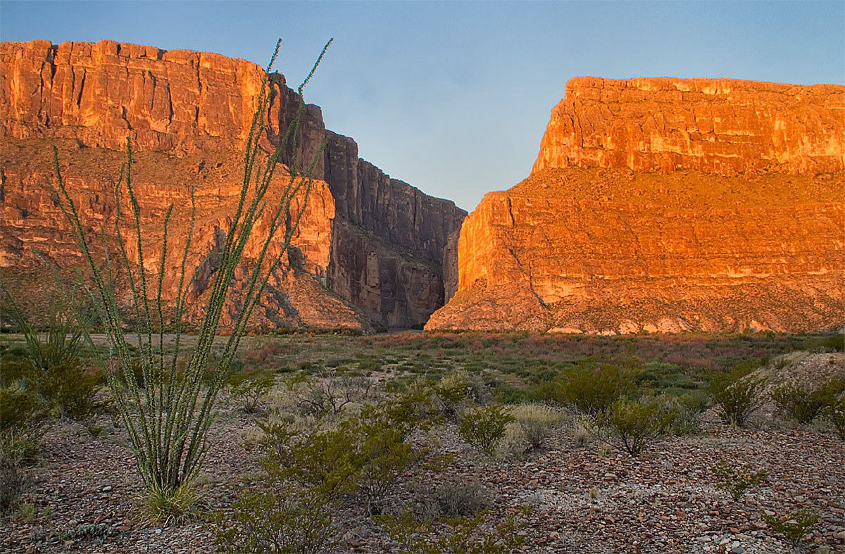
This is a different point of view of the Santa Elena Canyon in Big Bend National Park in Texas. Most of the images that I see are taken from the Rio Grande River.

7D, 18-135mm @ 19mm
F/22.0 @ 1/8, ISO 400
Gitzo tripod
PP - CS4 and Nik :wink:

Comments

7 comments
Comment posted by Kah Kit Yoong on October 26, 2010 at 7:12 PM
Lovely shot, the warm light on the cliffs makes the shot. There are a few smudges in the sky which I suspect are due to a dirty sensor. I initially thought that the tall plant passing thought the cliff on the left was a distraction but I now think it works quite well, echoing that V in the canyon.
Registered on September 27, 2006, 636 Posts, 10682 Comments
Comment posted by Jason Kim on October 26, 2010 at 8:39 PM
Keep at it, Dottie. No better way to improve than to comment a bunch and to post your pics.

In this image, I see a few things that are working and a couple of things that aren't. The big canyon walls and their orange glow are really nice, as is that V-shaped groove running down their middle. Those are powerful shapes and colors to work with. The foreground doesn't hold a ton of interest, and then you have that ocotillo which is very prominent in the comp. I think it's somewhat distracting, the way the ocotillo is camouflaged against the FG and then disrupts the harmony of the canyon wall and V-groove. The ocotillo is also a nice V-shape, so it might have been possible to change your position and use that to your advantage, without having it cut into the other elements. I do think there's a lot of potential with all of these elements, though.

As far as processing goes, this looks a little oversharpened on my monitor.
Registered on July 1, 2006, 60 Posts, 1233 Comments
Comment posted by Jim Greenwood on October 27, 2010 at 12:31 AM
I've never been to Big Bend NP, but this scene seems like it represents the landscape there quite nicely. The inclusion and placement of the cactus in the foreground appeals to me, complementing the shape of the entrance to the canyon in the background. As has been mentioned, the sharpening does look a little off.
Registered on November 9, 2003, 229 Posts, 1523 Comments
Comment posted by Bill Chambers on October 27, 2010 at 8:57 AM
I love Big Bend, it's one of my favorite places. This is a nice view of Santa Elena, but appears a tad flat on my work monitor (uncalibrated). A different viewpoint is always nice, and I like the way you included the ocotilla in your comp. Would like to see more from BB.
Registered on April 10, 2005, 753 Posts, 21216 Comments
Comment posted by Dottie Short on October 27, 2010 at 11:13 AM
Repost - Backed off on the sharpening in the repost. Thanks for all the comments both positive and negative. That's they way one improves.
Registered on April 12, 2010, 61 Posts, 375 Comments
Comment posted by Michael J Greene, on October 27, 2010 at 1:05 PM
Hi Dottie,

I don't see many images from this park and it's one that is high on my list for visiting. I am familar with this area (from doing research) and it looks like an incredible place. I am so glad you shared this with us. I like the inclusion of the ocotillo, which looks like it has some chromatic aberration issues around its branches. I do think it throws the balance of the scene off a bit, simply because the right side is empty. However, overall I like well because it anchors the compositon and seems like you took the time to find a suitable object to include in your image, which is thoughtful.

Michael

PS - the repost looks better
Registered on June 18, 2009, 86 Posts, 2317 Comments
Comment posted by Angela McCain on October 27, 2010 at 4:01 PM
I like the image-especially the repost. Looks like it was a scenic and great place to be. I like that you included the more barren land in the foreground. Gives a sense of the diverseness of this place. Look forward to more images.
Registered on April 19, 2009, 367 Posts, 3589 Comments