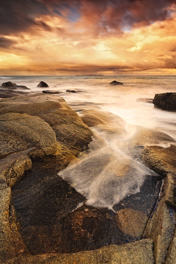
Pot of Gold
by Håkon Iversen
Critique please!! Larger version included.
I will be the first one to admit that this picture is really heavily edited. The light is much warmer and contrasty than what it was in "real life". That being said, what are your thoughts on "creative editing"? I've upped both contrast and saturation fairly hard. Used TK's luminosity masks and the "make it glow" action as well. Some local contrast and a lot of fiddling around made it what it is now. The orignal image was very flat and did not "give" me anything other than I liked the comp and the bowl/pot in the foreground.
PLEASED TO HEAR YOUR THOUGHTS, BOTH POSITIVE AND/OR NEGATIVE!
Canon 5D
Canon 17-40 @ 17mm
f/16
10sec
Lee .9 ND
Lee .3, .6 & .9 soft ND grads handheld in front
Heliopan Pola
Cheers
Håkon

Comments
9 commentsFor the shot - I like it. The tobacco-like toning looks very appealing. I'm thinking about the square shape of the water a little and I wish this were a bit more curved and harmonic. But that's minor.
The reason for the darker sky in the middle is that the clouds are a bit more dense just there, over the middle the sun is shining through.
Any crop suggestions to make the comp a little less busy?
Here I think your processing is definitely ok and not unfair.!..
Cheers
Håkon