Nature Photographers Network
This is the preserved archive of the original Nature Photographers Network. The community continues at naturephotographers.network.
Golden Curtain
‹ PreviousLandscape GalleryNext ›

Golden Curtain

by Wayne Jones

Gallery: LandscapePosted October 28, 2010380 views19 comments
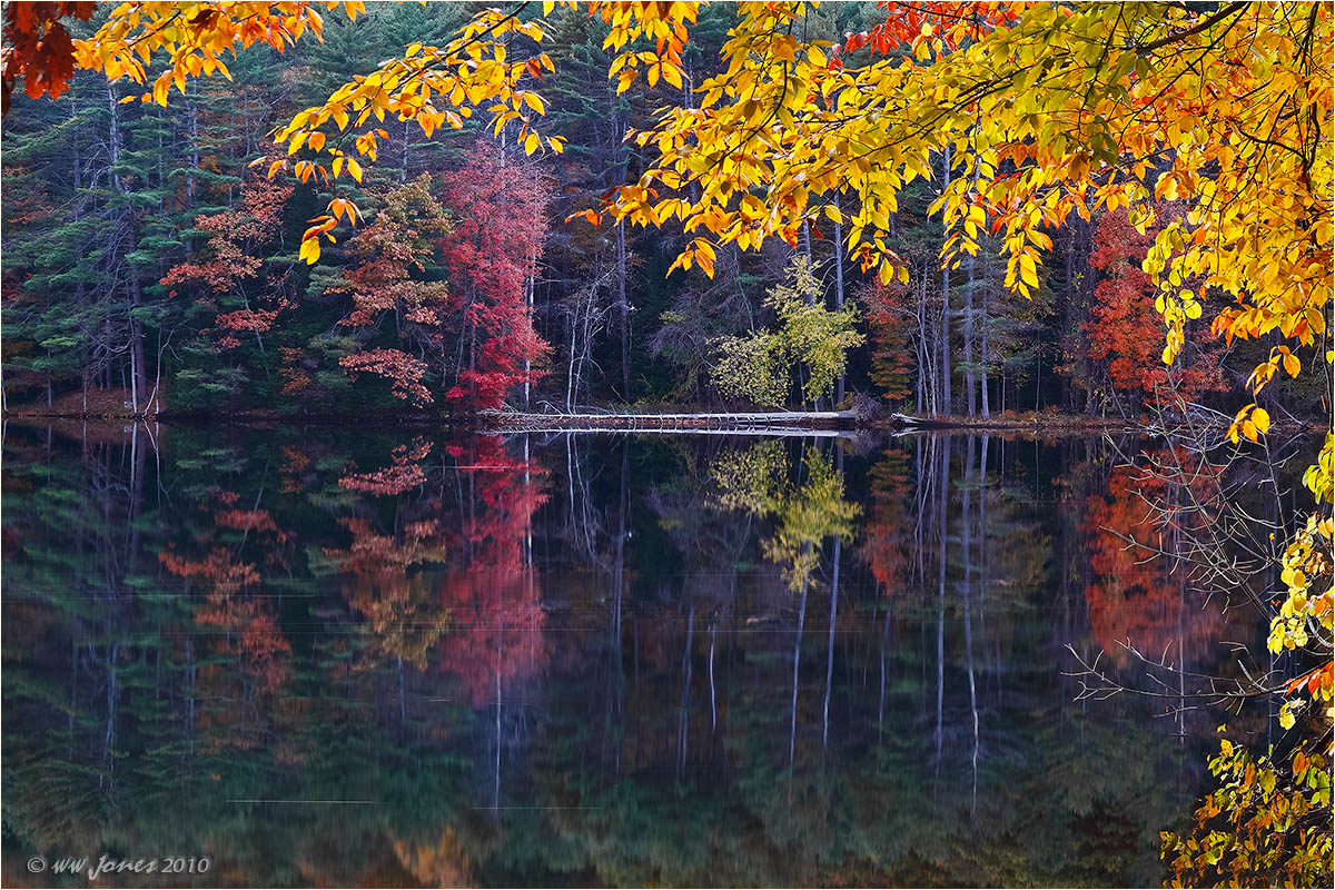
Not sure about this one. The title seems fitting because I get the feeling that the "frame" in this image outshines the picture that it surrounds. That leads to my first question:

What about that bright yellow curtain of leaves? Somehow I did not think it would be that bright after sunset. Is it just too much?

Question 2: Smooth reflections make images easy to level, but I deliberately tilted this to compensate for the optical illusion created by the leaning trees. The small and large versions are tilted different amounts -- does one "feel" more level than the other?

Thanks

Canon 50D
Sigma 17-70mm. f/2.8; Circ. Pol.
8 seconds @ f/11; ISO 100
Tripod; Mirror up

Comments

19 comments
Comment posted by Chris Chamberlain on October 28, 2010 at 9:31 PM
I think it's wonderful! Can't tell a difference in the tilt, but both look fine to me in that regard as well. There's nothing about this shot that says to me it was before during, or after sunset. So I have no issues with the brightness of the golden curtain. Details are amazing!

Chris
Registered on March 13, 2007, 500 Posts, 8365 Comments
Comment posted by Bill Chambers on October 28, 2010 at 9:35 PM
This looks great to me Wayne. The yellow is not too much me at all; it seems to give the image a 3D effect in fact. For my tired eyes the smaller version appears more level, but that may be just because it's smaller. The calm water is great, really invites you in the scene, and I love that downed tree.
Registered on April 10, 2005, 753 Posts, 21216 Comments
Comment posted by Zack Clothier on October 28, 2010 at 10:32 PM
Can't really tell the difference in the leveling between the two, they both look good. I don't think the yellow is to much, I'm used to seeing this sort of stuff, looks totally natural to me. The horizontal 'lines' in the water are a little bothersome, not sure if this is a result of compression or what. Other than that it looks great, do you mind if I ask where this was taken?
Registered on January 28, 2010, 343 Posts, 2257 Comments
Comment posted by Wayne Jones on October 28, 2010 at 10:43 PM
Thanks guys,
ZACK: Thanks for commenting on those lines in the water. I was thinking about cloning them out, but wanted to see if they bothered anyone. They are from leaves floating downstream during the 8 second exposure. I am sure you know this place well: It's directly overlooking the Sherman Island Boat Launch on Spier Falls Road -- right from the parking lot. Noticed it as an afterthought when I returned to the car after some sunset shooting elsewhere along the shore. Late fall color is amazing there this year! (Shot one in the warm sunrise light this morning that I don't know what to do with because the reds are so intense they are just not beleivable.)
Registered on April 18, 2007, 953 Posts, 6435 Comments
Comment posted by Chad Merrell on October 28, 2010 at 11:41 PM
I really enjoy the luminous quality of the gold leaves. Both look level to me. A lovely image. Thanks for sharing it.
Registered on July 8, 2010, 91 Posts, 304 Comments
Comment posted by Wayne Rhodus on October 28, 2010 at 11:56 PM
This is a lovely autumnal scene and the bright yellow leaves don't bother me.
Registered on November 16, 2003, 157 Posts, 3326 Comments
Comment posted by Jason Kim on October 29, 2010 at 1:35 AM
Wayne, I think it's fairly difficult to compose a picture like this (I've tried many times, usually without success). I think this works really well, I like the brightness and it doesn't feel like too much to me. The smaller post feels more level to me (the larger version feels like it has a tiny CW tilt).
Registered on July 1, 2006, 60 Posts, 1233 Comments
Comment posted by Scott Smorra on October 29, 2010 at 1:38 AM
I like the curtain effect you captured here Wayne. I don't really notice the tilt difference between the 2 images.
Registered on November 2, 2009, 161 Posts, 2143 Comments
Comment posted by Vance Gese on October 29, 2010 at 2:33 AM
Beautiful, Wayne. The drapery of leaves is outstanding; so crisp and clear with wonderful color. It frames the reflection and forest really nicely. Really well done.
Registered on November 13, 2008, 298 Posts, 6629 Comments
Comment posted by Stuart Williams on October 29, 2010 at 2:50 AM
very nice wayne - i like the curtain (it isn't too much IMO) and i don't notice the tilt. the darker red leaves in the top left corner do distract my eye a little and i'd consider cropping them out.
Registered on December 7, 2007, 247 Posts, 4792 Comments
Comment posted by Carl Donohue on October 29, 2010 at 3:58 AM
Hey Wayne

I think it's awesome, as is.

Cheers

Carl
Registered on November 1, 2003, 46 Posts, 589 Comments
Comment posted by Tony Kuyper on October 29, 2010 at 10:20 AM
Perfect as is, IMO. I really like the bright but intensely colored foreground yellow leave and the scene it frames is equally enticing. This is a real fine image.
Registered on November 1, 2003, 364 Posts, 22328 Comments
Comment posted by Hamed Musharbak on October 29, 2010 at 11:12 AM
very nice .. love it

i can call this the frame of the nature :rolleyes:

well done

Hamed
Registered on June 1, 2009, 372 Posts, 2282 Comments
Comment posted by Paolo De Faveri on October 29, 2010 at 11:21 AM
Antoher gorgeous fall scene from you Wayne, I think the frame of leaves works great and the background is wonderful. Furthermore, the bright leaves works really great in conceiling for a moment the background, so you when you finally look at it the pleasure is double!

:toast: :toast:
Paolo
Registered on August 29, 2007, 318 Posts, 1651 Comments
Comment posted by Nick Bristol on October 29, 2010 at 1:26 PM
Wonderful, Wayne. I really like how you framed the scene with those very pretty yellow leaves. Great reflection too. Another very pleasing and peaceful image.

Nick Bristol
Lone Rock, WI.
Registered on February 1, 2004, 752 Posts, 14140 Comments
Comment posted by Rick Goldwasser on October 30, 2010 at 11:03 AM
Very nice image, the curtain is great as are all the subtle colors in the reflection.
Registered on May 10, 2009, 127 Posts, 970 Comments
Comment posted by Eva McDermott on October 30, 2010 at 10:13 PM
Drop dead gorgeous color and reflection Wayne! BTW - I am having a difficult time noticing a differrence in tilt. Both look level to me.
Registered on January 4, 2009, 1015 Posts, 13229 Comments
Comment posted by Morris McClung on October 31, 2010 at 3:35 PM
Just stunning! :toast: :toast:
Registered on May 7, 2007, 670 Posts, 19650 Comments
Comment posted by John Williams on November 2, 2010 at 12:48 PM
LOVE it Wayne.
Registered on September 6, 2007, 221 Posts, 5985 Comments