Nature Photographers Network
This is the preserved archive of the original Nature Photographers Network. The community continues at naturephotographers.network.
Stone Abyss
‹ PreviousMan & Nature GalleryNext ›

Stone Abyss

by Bill Maile

Gallery: Man & NaturePosted October 31, 2010114 views7 comments
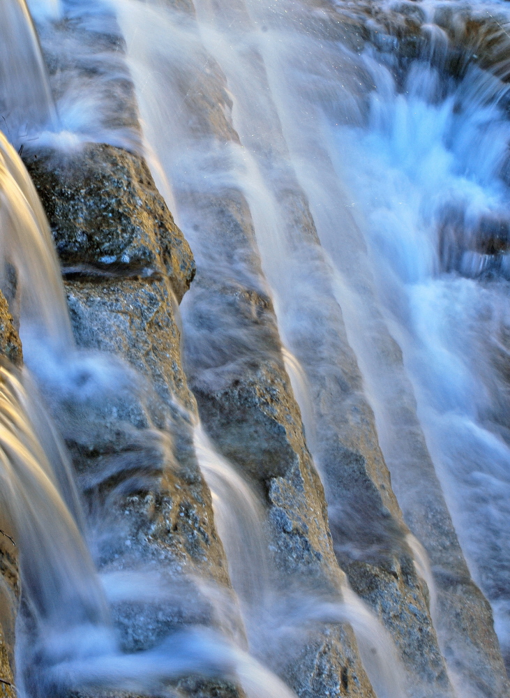
A shot of the water crashing over the spillway at a local reservoir. The deeper you go the bluer it gets, I tried fixing as much as I could but it's pretty much how it was. Going to post a B&W just for contrast.

Thanks for C&C, larger posted too. D-60, ISO-100, 1/2 second, f-18.0, CPL.

Comments

7 comments
Comment posted by Bill Maile on October 31, 2010 at 12:39 PM
A B&W version...
Registered on March 2, 2009, 984 Posts, 2518 Comments
Comment posted by David Bostock on October 31, 2010 at 4:07 PM
Bill, this is nice. I prefer the one in color. I'd also recommend adjusting the white balance to remove the blue/cyan cast tot he water...it's a wonderful image with repeating lines.
Registered on November 1, 2003, 90 Posts, 2778 Comments
Comment posted by Morris McClung on October 31, 2010 at 7:40 PM
I like the color version myself. I like your use of the diagonal lines, the color and the shutter speed for the motion of the water. Nicely done!
Registered on May 7, 2007, 670 Posts, 19650 Comments
Comment posted by Eva McDermott on October 31, 2010 at 7:54 PM
Although I tend towards B&W, in this case, I like the color version. The diagonal rocks work well and your shutter speed adds some gracefulness to the water flow. The blue/cyan of the water doesn't bother me at all and fits the scene IMO.
Registered on January 4, 2009, 1015 Posts, 13229 Comments
Comment posted by Bob&Charly Nelson on October 31, 2010 at 9:19 PM
Well, my vote goes for the color version. Really nice job with shutter and composition in my opinion Bill. I like it.
Bob
Registered on October 27, 2005, 289 Posts, 4202 Comments
Comment posted by Bill Maile on November 1, 2010 at 9:07 AM
Thank you David, Morris, Eva and Bob!! Appreciate the feedback. You know, the more I look at it, I think the color change is part of the progression downward--think I'm going to stick with it for now.
Registered on March 2, 2009, 984 Posts, 2518 Comments
Comment posted by Kah Kit Yoong on November 2, 2010 at 2:58 PM
Good use of repeated patterns in this abstract. Love the blues.
Registered on September 27, 2006, 636 Posts, 10682 Comments