Nature Photographers Network
This is the preserved archive of the original Nature Photographers Network. The community continues at naturephotographers.network.
Cornered
‹ PreviousLandscape GalleryNext ›

Cornered

by Stan Rose

Gallery: LandscapePosted November 2, 2010252 views21 comments
Thanks for all the nice comments on my last post!
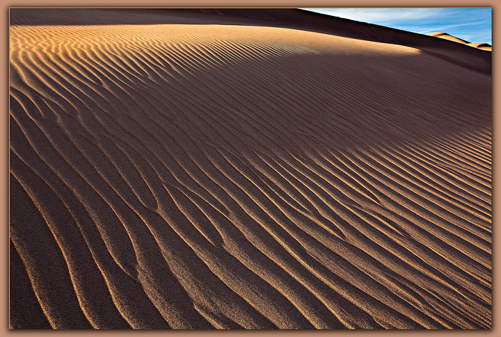
Here's something slightly unconventional which i would love to hear what you think of. I have a totally 'abstract' version of this same location and time (Great Sand Dunes Thursday), that i posted in my RMNP series. But for this shot, i wanted to tie in the abstract to the 'outside world' to give it some context, so i kept the upper corner as a little tease, a window to the real environment, as opposed to the abstract world in the sand.
5Dmkii; 17-40; 1/40s at f/20
C&C Welcome!

Comments

21 comments
Comment posted by Nicolaus Wegner on November 2, 2010 at 11:38 AM
Does not work at all for me Stan. The upper right corner is very distracting as nothing really leads your eye to it. The large shadow coming from that side seems odd as well which does not allow anywhere to focus except the lower right corner and the upper left. Looks like some nice light, just not the right comp. Not enough focus on the abstract while trying to include other elements. Maybe try again?
Registered on February 21, 2010, 133 Posts, 1509 Comments
Comment posted by John Williams on November 2, 2010 at 11:44 AM
Definitely an interesting experiment and not the jaw dropping eye candy of your prior post. While I like what the urc brings, I wish there was more of it.
Registered on September 6, 2007, 221 Posts, 5985 Comments
Comment posted by Stan Rose on November 2, 2010 at 12:34 PM
Thanks for the input, keep it coming! This got positive reaction from my non-photographer friends, but photographers tend to see things differently... :wink:
Registered on September 15, 2005, 836 Posts, 17099 Comments
Comment posted by Dorin Bofan on November 2, 2010 at 12:38 PM
Knowing and liking your original way of composing, this totally works for me, Stan! Indeed, the corner adds interest and gets you wondering what's there, why the photographer chose to compose in this way, but all in a pleasant way. And it also makes the image even more abstract for me. Awesome!
Registered on April 30, 2007, 122 Posts, 3086 Comments
Comment posted by Larry Fischer on November 2, 2010 at 1:05 PM
From a novice,
Mr. Stan,
The vertical lines in the sand are multiple "leading lines" which easily carry one's eyes from the lower center of the photo upwards to the bright area of sand, then to the right where we are "cornered" for a while with the blue contrast of the sky, then the shadow brings us back to the center.
Texture and lines are the strong features of this great composition.
As usual, superb work in my humble opinion.
the fisch
Registered on July 28, 2008, 155 Posts, 874 Comments
Comment posted by Morris McClung on November 2, 2010 at 1:39 PM
I like it, but then again, I'm a little :jump: . Definitely unconventional.
Registered on May 7, 2007, 670 Posts, 19650 Comments
Comment posted by Zack Clothier on November 2, 2010 at 2:12 PM
It's sure is different Stan, I would prefer more of the sky and distant dunes though. I really like #3 and #4 from your posts in the RMNP forum.
Registered on January 28, 2010, 343 Posts, 2257 Comments
Comment posted by Keith Bauer on November 2, 2010 at 3:48 PM
This is an interesting take. For me, the power of image is still in the sand, not the sky. The URC creates a triangle for me that is pointing out that says, "hey... look over here". Since "over here" is out of the image, I find it distracting. I do like the play of sun and shadow on the sand, so a crop would have to be done carefully to avoid losing that dynamic. Always great to experiment.
Registered on November 20, 2003, 458 Posts, 4836 Comments
Comment posted by Taylor Reed on November 2, 2010 at 4:17 PM
I like the little window in the URC but I'm not feeling the dark band below it.
Registered on February 18, 2010, 26 Posts, 556 Comments
Comment posted by Eva McDermott on November 2, 2010 at 4:46 PM
Definitely unconventional Stan. A tighter crop of just the sand ripples work better for me like your 1st post on RMNP - Deeeep Dunes.
Registered on January 4, 2009, 1015 Posts, 13229 Comments
Comment posted by Nick Bristol on November 2, 2010 at 5:00 PM
I have had to look at this for awhile because I wasn't sure about the corner. The light, texture and patterns in the sand are amazing to me. The detail is impressive (even more than that). Now I have looked at it several times and I think this is awesome! Everytime it got better and better as I came back to it, and I think the dark band and the blue corner really make this. It is quite intriging to me and it has to be that corner. I think it would make a fantastic large print and you probably won't see another like it. At least not until someone copies it :wink:
The lower 1/2 would make a great pano print all by itself.
by the way...that is a great title.

Nick Bristol
Lone Rock, WI.
Registered on February 1, 2004, 752 Posts, 14140 Comments
Comment posted by Jason Kim on November 2, 2010 at 5:40 PM
I think this works pretty well, and I imagine it isn't easy to pull off. The rich blue in that small portion of sky definitely helps, along with those two bumps and the shadows. Nicely done! It is a rather unique composition, which is a rarity in dune photography.
Registered on July 1, 2006, 60 Posts, 1233 Comments
Comment posted by Doug Roane on November 2, 2010 at 6:01 PM
You knew you would get some yays and nays on this one, didn't you, Stan? Since my opinion is the only one that really matters :rolleyes: , I'm happy to give this 2 thumbs up! You get extra points on originality - I think that triangle does just what you intended. The contrasts and textures were handled extremely well ... great work! :toast:
Registered on December 12, 2008, 213 Posts, 2226 Comments
Comment posted by Kah Kit Yoong on November 2, 2010 at 6:38 PM
I like this : unconventional and quirky - in a good way. I find it more appealing and interesting than the previous post, gorgeous as it was.
Registered on September 27, 2006, 636 Posts, 10682 Comments
Comment posted by Arnab Banerjee on November 2, 2010 at 7:57 PM
The "window" was a good idea, but I am still not getting this one. May be a bigger window would be appropriate
Registered on January 3, 2007, 313 Posts, 2270 Comments
Comment posted by Angela Classen on November 3, 2010 at 12:02 AM
I like it. It's definitely a different perspective, but it works IMO. I love all those ripples and the textures. Awesome work as always.
Registered on June 13, 2007, 434 Posts, 2742 Comments
Comment posted by Dietrich Gloger on November 3, 2010 at 2:06 AM
Man, as good as the other one! Really elegant and artsy! I like that bit of sky and the glimpse of the other dunes in that corner. This is outstanding stuff Stan!
Registered on January 26, 2007, 360 Posts, 9876 Comments
Comment posted by Dean Sauskojus on November 3, 2010 at 2:14 AM
Very nice Stan. I love the shadow cast across the dune. Very different and I like it, but do you like it?
Registered on September 29, 2009, 137 Posts, 2659 Comments
Comment posted by Stan Rose on November 3, 2010 at 10:39 AM
I love it Dean! (note the 'fancy' frame, which i only reserve for my personal favs) Anytime i can get a few unequivocal 'yays' and 'nays' from the same post--that's a grand success for me :biggrin: :wink:
Registered on September 15, 2005, 836 Posts, 17099 Comments
Comment posted by Vance Gese on November 3, 2010 at 1:08 PM
Wonderful to see a unique approach to these dunes, Stan, and I think this is outstanding. Makes one think twice as to which way is up, if that makes any sense. The textures and pattern of course are extraordinary. Amazing work.
Registered on November 13, 2008, 298 Posts, 6629 Comments
Comment posted by Phil Pogledich on November 3, 2010 at 1:33 PM
I think the little corner works quite nicely. Certainly unconventional, but that's what makes you stop, look, and think. I totally agree that you've tied in the abstract to the "outside world" with this shot . . . that's exactly what makes it work in my book.
Registered on August 24, 2009, 123 Posts, 3099 Comments