Nature Photographers Network
This is the preserved archive of the original Nature Photographers Network. The community continues at naturephotographers.network.
Narrows Classic
‹ PreviousLandscape GalleryNext ›

Narrows Classic

by Michael J Greene,

Gallery: LandscapePosted November 3, 2010309 views14 comments
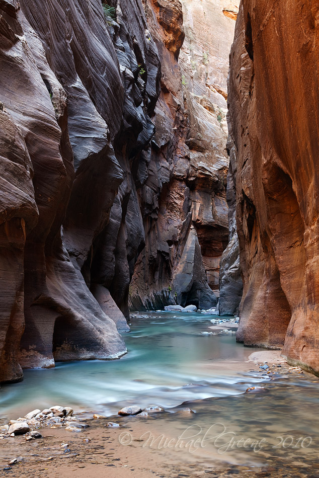
Another Zion Narrows shot here. Fall colors in the Narrows were decent this weekend, not quite peak yet...I decided to try different styles during this photography trip up the canyon. This was taken back away from the water using a longer focal length and less in your face composition, while using a longer shutter speed to smooth things out as much as possible. The light was pretty good and so was the water color....

I've included a large, uncropped version as well as a smaller, slightly cropped version. Now I also noticed the colors in the original posted version are different than either the large version or the cropped version. So if you are not too confused yet, like I am, please let me know which one you like the best and overall what you think of this image. Thanks so much.

Michael

PS - there is an article about me on Induro's blog you can find it here if you are interested.
http://blog.indurogear.com/

Comments

14 comments
Comment posted by Michael J Greene, on November 3, 2010 at 3:29 PM
The colors in this version are what I intended to present here. :wavey:
Registered on June 18, 2009, 86 Posts, 2317 Comments
Comment posted by Andreas Resch on November 3, 2010 at 3:34 PM
I guess I could spend several days at this location. Whenever I see images from there I wanna get on a plane and head there.
Great shot, Michael. Nice vertical comp and the motion in the water is just wonderful.
Registered on November 14, 2007, 322 Posts, 6101 Comments
Comment posted by Barry Vangrov on November 3, 2010 at 4:43 PM
Very nice take on a classic. Maybe burn in the top background wall a bit? :smile:
Registered on September 1, 2009, 148 Posts, 749 Comments
Comment posted by Dean Sauskojus on November 3, 2010 at 4:56 PM
Michael, I really like the bottom twos thirds of the image. I'm finding that the bright very back wall takes me away from the important and more attractive elements of the scene. I would either suggest a crop or take down the brightness of the back wall so it blends in better with the walls in the foreground. The colors and motion in the water are lovely. Nice work.
Registered on September 29, 2009, 137 Posts, 2659 Comments
Comment posted by Kurt Budliger on November 3, 2010 at 5:16 PM
Sweet shot, I think I'd crop some off the top making it more of a squarish comp.. I keeping getting distracted by the lighter wedge in the background but am loving the color and texture of the lefthand wall.
Registered on June 11, 2006, 113 Posts, 2116 Comments
Comment posted by Phil Pogledich on November 3, 2010 at 5:19 PM
Nice, classic shot, as you say. You could go a bit darker (or just drag up the black point) overall and I think that might be effective . . . the second shot does seem to be a bit darker, but I could see this going even a bit further in that direction. The bright wedge at the top is a mild distraction, as others have noted, but I'd try to address that by burning it rather than a crop.
Registered on August 24, 2009, 123 Posts, 3099 Comments
Comment posted by Miles Morgan on November 3, 2010 at 5:19 PM
Really love the colors here Michael. If it were up to me, I'd probably choose the cropped version. For me the highlight is those aqua water tones, and the more of that the better! I'll take whichever one you don't want. :biggrin:
Registered on November 23, 2009, 6 Posts, 185 Comments
Comment posted by Daniel Ewert on November 3, 2010 at 7:30 PM
I like the second version better--beautiful!! That water looks great.

I was in the Narrows on Friday. Did we see each other??

Daniel
Registered on June 2, 2009, 103 Posts, 1500 Comments
Comment posted by Vance Gese on November 3, 2010 at 11:50 PM
Gorgeous composition, Michael. Especially like the second post with the colors as you intended them. I also would try a bit of burning of the top portions of the image, especially that far wall at top, to right of center. Really like your use of the longer lens.
Registered on November 13, 2008, 298 Posts, 6629 Comments
Comment posted by John Williams on November 4, 2010 at 10:07 AM
Glad you posted number two, and love the color in the water. This is a nice image with the topped cropped off to a square too.
Registered on September 6, 2007, 221 Posts, 5985 Comments
Comment posted by Wayne Willison on November 4, 2010 at 10:22 AM
The silky turquoise water really adds a nice touch to this texture filled image.
I like the extra space in the first one, but the colors in the second. I think an image this powerful can afford the extra space in the fg.
Registered on April 10, 2009, 292 Posts, 3967 Comments
Comment posted by Morris McClung on November 4, 2010 at 10:42 AM
I like the comp as is and the others have mentioned the issues I would have addressed. I also like the great water color and motion.
Registered on May 7, 2007, 670 Posts, 19650 Comments
Comment posted by Harry Lichtman on November 4, 2010 at 9:09 PM
Michael - I prefer the tighter version. I might have gone a little further and cropped off the top just a hair - there is a bright orange spot next to the right wall that was a little distracting that close to the edge. I was in the Narrows on Friday, and it was nice to see all of the more serious photographers working together so as not to get in each other's shot. My first time in a canyon - I was blown away by the beauty in there.

Regards, Harry
Registered on September 17, 2010, 304 Posts, 3507 Comments
Comment posted by Chris Chamberlain on November 5, 2010 at 1:31 AM
Beautiful shot, Michael! I don't see any difference between the two posts. I do see wonderful subtle colors and light. The shutter speed works well for me too. The exposure looks good and well balanced to me.

Chris
Registered on March 13, 2007, 500 Posts, 8365 Comments