Gallery: Macro & Close-upPosted November 11, 201080 views8 comments
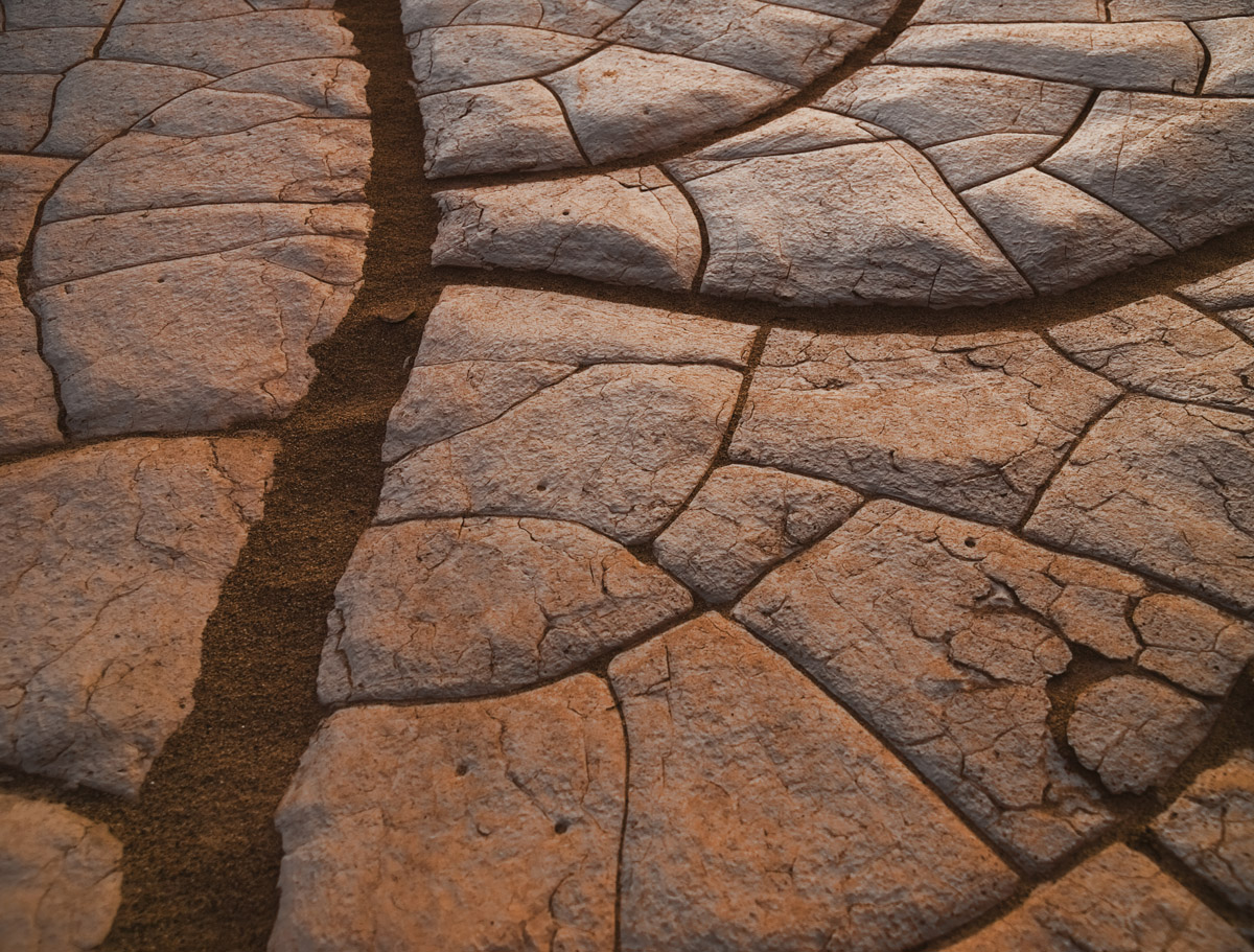
I found this interesting pattern while exploring the sand dunes in Death Valley National Park, California.
Olympus E3
f/3.2 @ 1/4sec
Comments
8 comments
Comment posted by Krunal Janani on November 12, 2010 at 8:13 AM
Very nice pattern Jonathan, although i'm no expert on B/W but i think this will look really nice in B/W
Registered on September 16, 2010, 60 Posts, 1370 Comments
Comment posted by Jim Lou on November 12, 2010 at 9:25 AM
I like each block has its only pattern and texture. It is like photos with a photo. The side lighting provides dimension and nice color variation. I also like the bold line on the left balanced with a number small ones on the right.
Registered on August 3, 2010, 86 Posts, 273 Comments
Comment posted by Audrey Rice on November 12, 2010 at 10:53 AM
Nice shot, Jonathan. It sort of reminds me of veins in a leaf. I too would like to see it in b&w.
Registered on November 2, 2010, 12 Posts, 39 Comments
Comment posted by Jonathan Sinclair on November 12, 2010 at 3:38 PM
Here is the B/W conversion
Registered on February 11, 2010, 35 Posts, 39 Comments
Comment posted by Ron Pederson on November 13, 2010 at 6:51 AM
Nice abstract image. All sense of scale is gone, so I wouldn't have guessed this was so small. I think I'd prefer it to be slightly lighter with more contrast. My preference is the color version; the B&W lacks the tonal range needed to make it sing.
Registered on October 19, 2010, 95 Posts, 470 Comments
Comment posted by Phil Pogledich on November 15, 2010 at 7:56 PM
I really like this shot but think it needs a touch more post-processing to really make it sing. Both seem to need a bit more contrast . . . it may require as little as an adjustment to the black point. The B&W would probably benefit from a bit more mid-tone contrast as well. I'd also give some thought to cropping a bit off the bottom, as it appears that area is a bit out of focus.
These are all pretty minor edits and, as I said, I really like the shot! So I hope these comments don't at all come off as harsh.
Registered on August 24, 2009, 123 Posts, 3099 Comments
Comment posted by Jeffrey Sipress on November 23, 2010 at 11:00 PM
I like so many things about this image. It's metaphor, for one. I prefer the color since the glow is so nice. It has ample contrast for me as is. Wonderful work.
Registered on February 17, 2004, 236 Posts, 1197 Comments
Comment posted by Albert Darmo on November 24, 2010 at 10:16 PM
Hi Jonathan This is a marvelously structured composition!!! All the shapes ,colors and patterns are remarkable
Albert Darmo. Canada
Registered on November 25, 2008, 1386 Posts, 11978 Comments

Comments
8 commentsThese are all pretty minor edits and, as I said, I really like the shot! So I hope these comments don't at all come off as harsh.
Albert Darmo. Canada