Nature Photographers Network
This is the preserved archive of the original Nature Photographers Network. The community continues at naturephotographers.network.
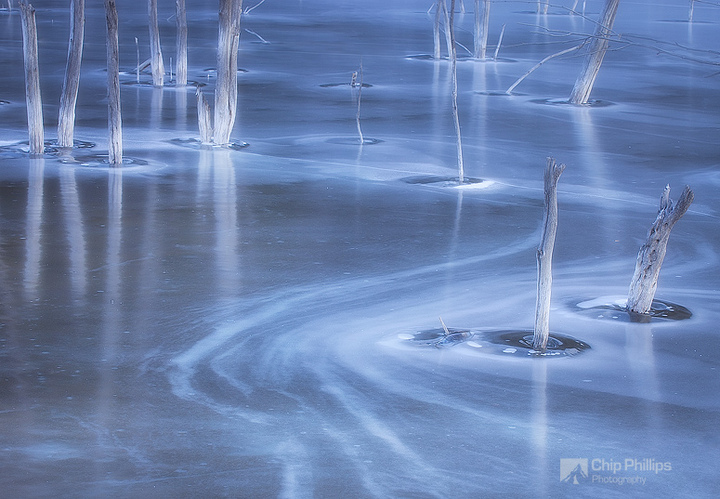
Frozen Pond, Jasper AB
‹ PreviousLandscape GalleryNext ›

Frozen Pond, Jasper AB

by Chip Phillips

Gallery: LandscapePosted November 30, 20101,994 views79 comments
I'm curious as to which of these two, if either, you think works best.
I found this nice frozen pond in the shade while traveling on 16 out of Jasper, Alberta, and battled the wind for some shots of these frozen sticks peacefully placed in the ice. Thanks for your time in advance! Chip

Canon 5D
Canon 70-200 f4L
polarizer

Comments

79 comments
Comment posted by Chip Phillips on November 30, 2010 at 10:26 PM
Here's the other:
Registered on November 26, 2007, 128 Posts, 1436 Comments
Comment posted by Marc Adamus on November 30, 2010 at 10:31 PM
There's some kind of substantial glow added to this that's really helping to further the atmosphere. I really can't decide which I like more. An interesting subject here in any case.
Registered on September 17, 2005, 780 Posts, 8091 Comments
Comment posted by Anne K. Rusk on November 30, 2010 at 10:38 PM
I like both photographs for different reasons. I would frequent this place in various conditions and create a whole portfolio! The glow is otherworldly. Great job!
Registered on October 10, 2010, 65 Posts, 904 Comments
Comment posted by Bill Chambers on November 30, 2010 at 10:42 PM
This is quite nice. It has a very pleasant surreal appearance, almost dreamlike. Beautiful color and light. I definitely like the original version best.
Registered on April 10, 2005, 753 Posts, 21216 Comments
Comment posted by Benjamin Olson on November 30, 2010 at 10:57 PM
I like the first one a lot, it has better leading lines and flows much more smoothly imo. Nicely done.
Registered on April 7, 2007, 169 Posts, 725 Comments
Comment posted by Kent Mearig on November 30, 2010 at 11:02 PM
Well they definitely both work in their own way. The first has the initial draw of those great sweeping curves, but I still think I might have to choose the second image if I was forced to pick between them. It has a more predictable composition but sacrifices none of the mystery inherent in the location.
Registered on September 4, 2006, 237 Posts, 4748 Comments
Comment posted by Chris Chamberlain on November 30, 2010 at 11:19 PM
Holy cow! It's hard to choose between the two, but probably the first one. I absolutely love the processing here, but can't say it resonates with me as natural. More like a dream, but as I said, I love it!

Chris
Registered on March 13, 2007, 500 Posts, 8365 Comments
Comment posted by Koveh Tavakkol on November 30, 2010 at 11:30 PM
I agree with Kent on this one Chip. Very beautiful work in both, and I love the leading lines in the first, but the second just feels well balanced and simpler.
Registered on September 1, 2009, 41 Posts, 608 Comments
Comment posted by Phil Pogledich on December 1, 2010 at 12:04 AM
Well, wow. I'll take one of each! Love both, but perhaps would lean toward the second as well.
Registered on August 24, 2009, 123 Posts, 3099 Comments
Comment posted by Max Waugh on December 1, 2010 at 12:11 AM
I prefer the first, in part due to the variety of objects and contours in the frame. While I like the "striped" pattern in number 2, the crop doesn't appeal to me (the point where the sticks meet the ice is a little too close to the center for my tastes).

Really nice color and smooth texture in both!

Max
Registered on September 26, 2008, 428 Posts, 2329 Comments
Comment posted by Floris van Breugel on December 1, 2010 at 12:18 AM
Gorgeous image, Chip! I love the bright glowing trees and the blue tones. I like the complexity of the first image, and it would without a doubt be my first choice, except the lower left feels a little empty. It captures the frozen fairy tale feeling better than the second composition IMO. That said, the second image is more than lovely as well.
Registered on December 19, 2008, 306 Posts, 4840 Comments
Comment posted by Miles Morgan on December 1, 2010 at 12:31 AM
The first one FOR SURE for me Chip. Those graceful curves are just to DIE for.

To be totally honest, I think this is one of your finest images, and as a huge fan of your work, that is really saying something. It's simply glorious.
Registered on November 23, 2009, 6 Posts, 185 Comments
Comment posted by Miles Morgan on December 1, 2010 at 12:34 AM
Ok.... now that I'm done drooling over it. I actually think the first one is more balanced than the second, which I guess goes against the popular consensus. The fact that the curves are strong in the lower right and then the majority of the sticks are in the upper left really works well off each other. THen there is the reflection in lower left and the nice details in the upper right that fell well complimented as well. Seriously man.... this one REALLY resonates with me.
Registered on November 23, 2009, 6 Posts, 185 Comments
Comment posted by John Williams on December 1, 2010 at 1:04 AM
I'd have to take the first one too, but barely. The second one makes a nice pano with the bottom cropped off.
Registered on September 6, 2007, 221 Posts, 5985 Comments
Comment posted by Naret Visesvongsa on December 1, 2010 at 1:25 AM
I like the first one Chip. I like the way you use curve leading viewer eyes into the picture.
Registered on November 10, 2010, 6 Posts, 73 Comments
Comment posted by Adam Gibbs on December 1, 2010 at 1:32 AM
They are both beautiful. Nice work Chip.
Registered on November 1, 2003, 168 Posts, 870 Comments
Comment posted by Jimmy Gekas on December 1, 2010 at 1:48 AM
Love them both! Wowsers. If I had to pick one, it would be the first one for the cool curved lines. :toast:
Registered on July 26, 2007, 244 Posts, 2807 Comments
Comment posted by Jared Atencio on December 1, 2010 at 2:01 AM
Wow Chip, these are both absolutely terrific and great additions to your already amazing portfolio. I love the curvy lines in the first, but my personal taste would be to crop some off the bottom, making the lead in lines seem smoother and more flawless, also drawing more attention to those cool ice mounds around the sticks in the LRC. I actually like the second one cropped as well just above that darker spot in the ice in the LLC. That would probably throw the ratios of these off, but may be worth playing with to see what you think. Very cool shots nonetheless!
Registered on June 23, 2009, 21 Posts, 422 Comments
Comment posted by Grant Collier on December 1, 2010 at 2:47 AM
Great shot! I prefer the first because of the way the lines cause your eyes to flow through the image.
Registered on July 29, 2005, 73 Posts, 430 Comments
Comment posted by Andreas Resch on December 1, 2010 at 3:10 AM
Wow - this one really blows me away. What a great light you've got here. The branches seem to glow with their bases being so bright. Unique capture, Chip.
Registered on November 14, 2007, 322 Posts, 6101 Comments
Comment posted by Michael Anderson on December 1, 2010 at 3:32 AM
Fantastic Chip! I prefer the first because I like the flowing lines through the composition. You have a great eye to see this! VERY well done and quite original too! :toast:
Registered on January 31, 2006, 228 Posts, 3072 Comments
Comment posted by Ian Cameron on December 1, 2010 at 3:55 AM
Hi Chip

The first image is just fabulous and would be my choice of the two. The other is great but comparitively static. I also think this is one of, if not yor finest image to date. For me this goes beyond mere visual communication reaching the exalted plane of photography as art.
Registered on August 6, 2004, 1125 Posts, 3318 Comments
Comment posted by Arild Heitmann on December 1, 2010 at 4:17 AM
i agree with marc...somekind of glow that really makes this interesting. The cool tones are great..

Of the two i prefer the first one, simply because im a sucker for curves...
Registered on October 13, 2010, 27 Posts, 378 Comments
Comment posted by Stan Rose on December 1, 2010 at 4:50 AM
#1, no contest because of the curves. This is extremely cool, Chip! Your recent posts really keep me in suspense, and that's a very good thing :wink:
Registered on September 15, 2005, 836 Posts, 17099 Comments
Comment posted by Gary McGhee on December 1, 2010 at 5:24 AM
It's the first one for me Chip, my eye seems to flow through the shot much better. The soft glow effect and the colour of the ice looks great.

Gary.
Registered on April 15, 2010, 142 Posts, 2416 Comments
Comment posted by John Mumaw on December 1, 2010 at 7:13 AM
#1 for me. Those curves and that glow are simply outstanding!
Bravo for yet another fine performance!!
Registered on September 9, 2005, 62 Posts, 2289 Comments
Comment posted by Matt Anderson on December 1, 2010 at 7:38 AM
Both are quite good, but I prefer the first. (Haven't read comments below yet)
What a dreamy swirly neat abstract. The tele on a FF makes such amazing compositions.
Nice work Chip!!!
Registered on September 6, 2007, 346 Posts, 2696 Comments
Comment posted by Nick Bristol on December 1, 2010 at 7:55 AM
These are wonderful Chip. I really like the dreamy feel along with the color and light. I like the first one the best. The curve really makes that one for me. Nice work.

Nick Bristol
Lone Rock, WI.
Registered on February 1, 2004, 752 Posts, 14140 Comments
Comment posted by Dan Baumbach on December 1, 2010 at 8:17 AM
I like the first one best. But they're both very nice and different from each other.

- Dan.
Registered on November 1, 2003, 473 Posts, 7980 Comments
Comment posted by Wayne Rhodus on December 1, 2010 at 8:21 AM
I like the second image better Chip because of the clean, crisp presentation. There is a little more texture to be enjoyed in the snags and just a hint of warmer tones in the fg as an anchor for all the cool blue tones. My preference doesn't diminish the fact that your first offering is a wonderful image in its own rights. Well done on both counts! :toast:
Registered on November 16, 2003, 157 Posts, 3326 Comments
Comment posted by Harry Lichtman on December 1, 2010 at 8:44 AM
Chip - I think I prefer the 1st version. The S curve of the ice does it for me. My personal taste would be to dodge the upper LC or do a slight crop to eliminate the darker shadow of the uppermost sticks. For some reason that part of the image is throwing me off a little. A great find. :toast:
Registered on September 17, 2010, 304 Posts, 3507 Comments
Comment posted by scott lanz on December 1, 2010 at 9:02 AM
Sorry, I can't help you. Both are equally outstanding.
Registered on November 14, 2003, 840 Posts, 12902 Comments
Comment posted by Jay Patel on December 1, 2010 at 9:09 AM
Now this is breathtaking. Very creative work Chip. I like the various curves on this one. Perhaps the second one would look good if you were to do a panoramic crop.

-Jay
Registered on August 28, 2008, 87 Posts, 566 Comments
Comment posted by Mel Ladewig on December 1, 2010 at 9:09 AM
I'm going to fall into Kent's camp on this one. The sweeping lines of the first are nice... but the graceful curves of the second take the cake.
Registered on July 24, 2005, 114 Posts, 1205 Comments
Comment posted by Gino Cortez on December 1, 2010 at 10:11 AM
If I had to choose, I'd go with number 1. Seems to have more depth and I like the lines in the ice. Did you use a masked blur on the sticks? They seem to have a glow around the edges that is very pleasing. :toast:
Registered on November 23, 2010, 57 Posts, 396 Comments
Comment posted by Paul Marcellini on December 1, 2010 at 11:05 AM
Love this, the atmosphere is awesome. Glad you continue to find intimates. I prefer the first.
Registered on November 27, 2007, 250 Posts, 2468 Comments
Comment posted by Michael J Greene, on December 1, 2010 at 11:11 AM
Chip - they are both incredible. I prefer the second though because of the cleaner look. The branch sticking in from the side of the first one does detract from the mystery a little bit. Still, I like both very much. Outstanding work.

Michael
Registered on June 18, 2009, 86 Posts, 2317 Comments
Comment posted by Joseph Kayne on December 1, 2010 at 11:16 AM
:toast: :toast: :toast:
Registered on November 1, 2003, 573 Posts, 2619 Comments
Comment posted by Chip Phillips on December 1, 2010 at 11:27 AM
Thanks guys. Very interesting to hear all your opinions on which you like best and why. Seems to be somewhat split, but leaning more towards #1 today. I really appreciate the time taken to give opinions and comments/suggestions!
Registered on November 26, 2007, 128 Posts, 1436 Comments
Comment posted by Marc Adamus on December 1, 2010 at 12:04 PM
I would also like to take a moment to observe our collective appreciation for the processing here. It wasn't that long ago that I (or whoever) could post an image like this, where the processing was very apparent and has contributed greatly to the mood and feel of the image, on just about any forum, and had the opinions be dominated by or at least split on the topic of the added effects. It seems in today's world of imaging such discussions are fading away in photo communities.....at long last.
Registered on September 17, 2005, 780 Posts, 8091 Comments
Comment posted by Guy Tal on December 1, 2010 at 12:05 PM
This is absolutely superb, Chip (both of them) One of the most creative images I've seen in a while.

Guy
Registered on November 1, 2003, 566 Posts, 15507 Comments
Comment posted by Tom Haxby on December 1, 2010 at 12:40 PM
Wow. Like the first better, but both are superb. Like the glow and the lines along with reflections in the ice.
Registered on July 6, 2006, 126 Posts, 647 Comments
Comment posted by dean hebert on December 1, 2010 at 12:52 PM
These are both stunning Chip! The light is incredible. I like the lines in the first and could see a crop off the bottom of the 2nd. :toast:
Registered on August 4, 2010, 70 Posts, 1132 Comments
Comment posted by Abdullaziz Bin Ali on December 1, 2010 at 12:58 PM
I love both of them. However, loved the first one more
the tone is ideal for this subject :smile:
Registered on May 31, 2009, 112 Posts, 1590 Comments
Comment posted by Dorin Bofan on December 1, 2010 at 1:30 PM
Very hard to decide which one is better. I'll go with both. Fantastic work, Chip! :toast:
Registered on April 30, 2007, 122 Posts, 3086 Comments
Comment posted by Dietrich Gloger on December 1, 2010 at 1:44 PM
WOW, one of the most beautiful shots I have ever seen! Clearly the first one. Fantastic work Chip!
Registered on January 26, 2007, 360 Posts, 9876 Comments
Comment posted by Aaron Cowan on December 1, 2010 at 2:18 PM
Chip,
I love the glow on the sticks in the second shot, but the comp seems to flow better in the first shot. The curve in the ice and two sticks in the lower right make it a stronger comp, IMO.
Registered on September 22, 2010, 8 Posts, 165 Comments
Comment posted by Kah Kit Yoong on December 1, 2010 at 2:59 PM
Here's a vote for the first one. I like the curved lines and the greater contrast in the sticks. Wonderful stuff.
Registered on September 27, 2006, 636 Posts, 10682 Comments
Comment posted by Rick Gomez on December 1, 2010 at 3:47 PM
WOW! :eek:
I choose both. Each composition is equally pleasing to my eye.
Registered on March 3, 2007, 206 Posts, 1853 Comments
Comment posted by Scott Smorra on December 1, 2010 at 5:13 PM
At first I thought I liked the first version better, but after studying both photos, I've decided I like them equally. Really helpful I know!! The compositions and processing are very effective. Well done.
Registered on November 2, 2009, 161 Posts, 2143 Comments
Comment posted by Ron Pullen on December 1, 2010 at 6:27 PM
Chip, I prefer the first one, it is a much more pleasing comp. for me. This is a beautiful miniature landscape scene. Well done. Ron :toast: :toast:
Registered on December 18, 2005, 74 Posts, 1413 Comments
Comment posted by David Chauvin on December 1, 2010 at 6:41 PM
Both images have a wonderful feel,,,,I really can't choose. :cool:
Registered on August 5, 2004, 1007 Posts, 5595 Comments
Comment posted by Harley Goldman on December 1, 2010 at 6:45 PM
Both are excellent! I think I know the pond. I visited it July of 2009. Wonderful otherworldly look. Great color, shapes and form. Outstanding images.
Registered on November 19, 2003, 586 Posts, 11271 Comments
Comment posted by Tyson Fisher on December 1, 2010 at 6:57 PM
My vote is for the first one. The curving patterns in the ice draws me right in. Love the dreamy atmosphere here. Great work Chip!
Registered on September 17, 2008, 44 Posts, 623 Comments
Comment posted by Chip Phillips on December 1, 2010 at 6:59 PM
Thanks guys! I really appreciate the comments. Harley-if so, it must have looked pretty different then. I hope to revisit Jasper this summer. I've only seen the area in the dead of winter.
Registered on November 26, 2007, 128 Posts, 1436 Comments
Comment posted by Zack Clothier on December 1, 2010 at 9:25 PM
Amazing, both of them. I think I prefer the first one, although it's a tough decision. Processing is great, very creative work. :toast: :toast:
Registered on January 28, 2010, 343 Posts, 2257 Comments
Comment posted by Tony Kuyper on December 1, 2010 at 10:05 PM
I love them both but would choose the first if I had to choose one for my wall. What a great pair of photos. EP if I ever saw one.
Registered on November 1, 2003, 364 Posts, 22328 Comments
Comment posted by Lon Overacker on December 1, 2010 at 10:47 PM
Chip,

Phenomenal! Had I seen the second one first, and alone, I would have said phenomenal too. But the first one is a clear winner for me; that is between two phenomenal images. The original post has so much more to offer - depth, flow and actually I think is more engaging, keeping me glued to this beautiful setting in nature. This is just surreal, magical. Congratulations! :toast:

Lon
Registered on November 24, 2006, 521 Posts, 19147 Comments
Comment posted by Jason Kim on December 2, 2010 at 12:00 AM
I like the top image the best, but both are wonderful. Love the icy blues and metallic sheen to this.
Registered on July 1, 2006, 60 Posts, 1233 Comments
Comment posted by Sarah Marino on December 2, 2010 at 12:15 AM
The thumbnail doesn't do this justice! Glad I clicked on this, as both are very engaging images. I like them both for different reasons. The curves in the first definitely add interest, whereas I appreciate the simplicity of the second one.
Registered on November 10, 2008, 23 Posts, 393 Comments
Comment posted by Anthony Vincent on December 2, 2010 at 7:32 AM
Not sure if I can add anything else :smile:
Frozen pond? Come on Chip you can be more creative than that :wink: :wink:
Awesome abstract and you know I love ice shots. Very ghostly and even though the processing is evident it doesn't take away from the vision you had on this one. Did you desat the blues some of was it really some soft blue light?

Great job
Registered on February 5, 2009, 199 Posts, 2775 Comments
Comment posted by Richard Hartmann on December 2, 2010 at 10:56 AM
I keep coming back to this one.

Another vote for the first and I love the glow.
Thank you for inspiring me to look in different places!
Registered on January 15, 2009, 13 Posts, 772 Comments
Comment posted by Youssef Ismail on December 2, 2010 at 8:28 PM
Chip,

These are amazing. Incredible glow in both of them. I love the frozen starkness of the trunks just near the ice surface. The ghostly reflections are also very mesmerizing. They are both fascinating photographs and each has its own attraction. I would have liked to see them as separate entries rather than each competing. In any case I think you should frequent this area and come up with more of this. Really brightened my evening.
Registered on November 1, 2003, 474 Posts, 5555 Comments
Comment posted by Carl Donohue on December 3, 2010 at 2:52 AM
Hey Chip

The first one is amazing.

Cheers

Carl
Registered on November 1, 2003, 46 Posts, 589 Comments
Comment posted by David W. Kelly on December 8, 2010 at 12:32 PM
Awesome image Chip. Congrats. :toast:
Registered on October 7, 2005, 883 Posts, 6590 Comments
Comment posted by Vincent Grafhorst on December 8, 2010 at 12:41 PM
Both of them are stunning and unique Chip, but my preference goes out to no.1. Congrats! :toast:
Registered on February 24, 2006, 504 Posts, 7203 Comments
Comment posted by Albert Darmo on December 8, 2010 at 12:55 PM
Hi Chip :wavey: Both are superb compositions! I prefer the first one, because the scene. has more complexity, and holds my attention more.... Both are awesome icescapes :eek: :cool: :smile:
A well deserved E.P.. Congrats :toast: :toast
Albert Darmo. Canada:
Registered on November 25, 2008, 1386 Posts, 11978 Comments
Comment posted by Chip Phillips on December 8, 2010 at 1:34 PM
Thanks guys! Thanks for the EP!
Registered on November 26, 2007, 128 Posts, 1436 Comments
Comment posted by Robert Dayton on December 8, 2010 at 1:53 PM
Congratulations, Chip!
Registered on November 11, 2008, 281 Posts, 3958 Comments
Comment posted by Rob Graham on December 8, 2010 at 2:29 PM
Congrats on two beautiful images, and a bigger congrats for the well deserved EP!!! I prefer the first, btw, for the reasons many stated. :toast:
Registered on August 22, 2006, 842 Posts, 2824 Comments
Comment posted by David Cobb on December 8, 2010 at 2:57 PM
Congrats on the EP Chip, I hadn't seen this earlier. So beautiful, and unlike much of your other work, and what great lines this has throughout.

p.s. The top image gets my vote.
Registered on December 14, 2007, 312 Posts, 3243 Comments
Comment posted by Catherine Reilly on December 8, 2010 at 8:28 PM
First one is fascinating! Second one is just spectacular! Please don't ask me to choose. Have to be a diptych. Congrats on the EP!
Registered on August 16, 2006, 603 Posts, 9192 Comments
Comment posted by Bill Fach on December 8, 2010 at 10:39 PM
Chip: What an incredible find and a superb capture. I much prefer the first but the second is spectacular as well. Congrats on a marvelous shot. >=))>
Registered on November 1, 2003, 1805 Posts, 26981 Comments
Comment posted by Winnie Ho on December 9, 2010 at 5:23 AM
congratulations on the ep, well deserved. Stellar image, Chip! :toast:
Registered on January 6, 2008, 93 Posts, 1788 Comments
Comment posted by Kory Lidstrom on December 10, 2010 at 5:15 PM
Beautiful images here, Chip. I definitely like the first one better. The curving line really adds depth and interest.
Registered on November 19, 2008, 49 Posts, 1035 Comments
Comment posted by SandyRichardsBrown on December 11, 2010 at 5:53 PM
Just beautiful - congrats on the nice EP!
Sandy
Registered on November 24, 2003, 3937 Posts, 12909 Comments
Comment posted by Ken Archer on December 14, 2010 at 4:13 AM
Stunning Images Chip!!! Congrats on the well earned EP :biggrin:

Ken Archer
Registered on October 28, 2004, 222 Posts, 6683 Comments
Comment posted by Gary Reed on December 16, 2010 at 7:37 PM
Luminescent.... :smile:
Registered on September 19, 2009, 198 Posts, 1074 Comments
Comment posted by John Fan on December 21, 2010 at 3:06 PM
I like both of them. They look out of this world!
Registered on August 24, 2010, 135 Posts, 489 Comments