Nature Photographers Network
This is the preserved archive of the original Nature Photographers Network. The community continues at naturephotographers.network.
Aspen Firedance
‹ PreviousPhoto Art GalleryNext ›

Aspen Firedance

by Vance Gese

Gallery: Photo ArtPosted December 3, 2010466 views14 comments
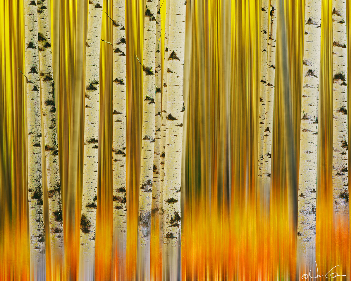
Haven't participated much in this gallery but thought I would see what you folks think of this attempt. Used some motion blur in PS CS3 with very careful masking. Wondering if the contrasting blurred and sharp areas are too stark. Any suggestions or comments would be appreciated.
Pentax 6x7, 135mm, velvia. Microtek M1 scan.

Provided a large image as well.

Edited image below. Thanks.

There sure is some beautiful creative work in the Photo Art gallery. Very inspiring.

Comments

14 comments
Comment posted by David W. Kelly on December 3, 2010 at 4:40 PM
I think this really works. Good stuff Vance. :toast:
Registered on October 7, 2005, 883 Posts, 6590 Comments
Comment posted by Marc Ward on December 3, 2010 at 5:38 PM
Vance,

Great new take on this technique. I like the mix of blurred and sharp. It forces your eye to move around more. Not quite sure if your processing would allow this, but I might prefer seeing the bottom of the foreground trees be as solid as the tops. I think it might help "anchor" the image a bit more. Well conceived!
Registered on February 26, 2009, 304 Posts, 1365 Comments
Comment posted by SandyRichardsBrown on December 3, 2010 at 5:51 PM
Sure works for me! The contrast of the sharp and blur is very dramatic, and, along with the colors, and provides a stunning image.
:toast:
Sandy
Registered on November 24, 2003, 3937 Posts, 12909 Comments
Comment posted by Buck Ward on December 3, 2010 at 6:47 PM
The best of both worlds. Creative, original, and well done.
Registered on December 8, 2003, 96 Posts, 1917 Comments
Comment posted by Mark Zemmin on December 3, 2010 at 7:39 PM
This is very pleasing to look at. The contrast between sharp and blurry and the color range are wonderful.
Registered on November 4, 2010, 8 Posts, 170 Comments
Comment posted by Larry Reitz on December 3, 2010 at 8:21 PM
I'd say its a wall hanger. Very provocative image. Well done and well worth the effort.

My only issue is that I missed some really good plays in the UCONN basketball game because I was admiring it on the lap top.
Registered on September 7, 2007, 32 Posts, 335 Comments
Comment posted by Barbara Graham on December 3, 2010 at 10:03 PM
Wow! I agree, this is very creative and very well done. :toast:
Registered on July 27, 2010, 1310 Posts, 5035 Comments
Comment posted by Albert Darmo on December 3, 2010 at 11:00 PM
Hi Vance :wavey: Something different and very creative. :eek: The contrasting lines work well to capture my interest :cool: :smile:
Albert Darmo. Canada
Registered on November 25, 2008, 1386 Posts, 11978 Comments
Comment posted by Vance Gese on December 4, 2010 at 1:18 AM
Thank you everyone for your encouraging comments. Really appreciate the feedback.
Registered on November 13, 2008, 298 Posts, 6629 Comments
Comment posted by Winnie Ho on December 4, 2010 at 6:52 PM
Thought I would check out what photo art actually is, and I see this...stunning image, Vance! Strong graphic appeal and punchy colours. The static and motion blur works well.
Registered on January 6, 2008, 93 Posts, 1788 Comments
Comment posted by Patricia Brundage on December 4, 2010 at 11:13 PM
What an impact! Immediately catches the viewer's attention and I applaud your imaginative PS work. :toast:
Registered on March 23, 2006, 1111 Posts, 6531 Comments
Comment posted by Tony Kuyper on December 5, 2010 at 12:13 AM
Excellent, Vance. This takes the motion blur concept to a whole 'nother level.
Registered on November 1, 2003, 364 Posts, 22328 Comments
Comment posted by Philip Schwarz on December 7, 2010 at 7:38 PM
Beautiful colors. I think you need to sharpen the trees on the bottom as well. If you do this you will have an outstanding photo.
Registered on November 29, 2006, 236 Posts, 1210 Comments
Comment posted by Vance Gese on December 7, 2010 at 10:30 PM
Thanks again for all the great comments and suggestions. Finally edited this image using the suggestion of having the bases of the aspens sharp rather than blurred. I masked off the blur at the base of four of the aspens which seemed to work quite well to me. The red and orange color around the bases of the aspens is from fireweed in its autumn color and most of the aspens had quite a bit at their bases. Any comments would be much appreciated.
Registered on November 13, 2008, 298 Posts, 6629 Comments