Nature Photographers Network
This is the preserved archive of the original Nature Photographers Network. The community continues at naturephotographers.network.
*W/ Repost* Forgotten Capsule
‹ PreviousLandscape GalleryNext ›

*W/ Repost* Forgotten Capsule

by Jared Atencio

Gallery: LandscapePosted December 7, 2010584 views18 comments
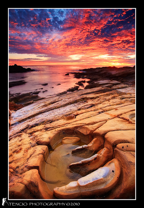
Starting a new year's resolution early, which is to post more, get more feedback (hopefully) and improve my technique. Since the tide was extremely low on this particular day and the sea was very flat, I opted to shoot from up above the wave action at this spot I had scouted previously. I appreciate as much constructive criticism as you're willing to give. Is the saturation/vibrance over the top? Are the shadows from the grad ND distracting? Finally is the sharpening sufficient/too much? Anything else you're seeing or that could be improved? Thanks in advance for your feedback.

-J

Canon 5dmkii
Canon 17-40mm L @17mm
ISO 200 (to try reduce cloud movement)
Singh-Ray 3 Stop Reverse ND
2 Exposures Blended for FG/Sky (first at 1.3", second at 2.5")

Comments

18 comments
Comment posted by Marc Adamus on December 7, 2010 at 8:36 PM
That is an interesting looking foreground there, Jared. Makes for a powerful one-two with that sky. The light/dark in the background/foreground in this one is a throwback to five, maybe more like ten years ago when the ol' grad-line was part of an image like this (which I don't really mind). Today, with all the blending and whatnot though (which it seems you indulged in anyway) I'm thrown off a bit by the almost totally black rocks in the middleground (caused by the reverse grad) and the bright, almost glowing foreground which I'd expect to be receiving only a little more of the actual diffused light. I think I'd prefer a more cohesive transition front to back that would come from blending the whole image and not just 1 stop of it. I actually don't see any reason to blend anything more than 3-4 stops apart in exposure anyway.
Registered on September 17, 2005, 780 Posts, 8091 Comments
Comment posted by Jared Atencio on December 7, 2010 at 8:53 PM
Thanks Marc, I never got to participate in the black grad line days, so thought maybe I could make it cool again and bring it back like tight rolled jeans. I guess I prefer a lighter FG to draw viewer in, maybe at the expense of looking a little "unnatural" to the trained eye, but I agree that this is too much and throws off the exposure balance in the image. I'll try to rework this with other exposures I shot and see if I can get something a little more balanced and realistic. I appreciate the feedback!
Registered on June 23, 2009, 21 Posts, 422 Comments
Comment posted by Harry Lichtman on December 7, 2010 at 8:55 PM
That is one crazy sky! Quite a mix of colors and textures. Looks like the FG formation is cut off a little- I might have given it a little more space at the bottom. In addition to toning down the FG a tad, the upper right sky looks to be oversaturated, compared to the left portion. Pulling back on the sat. may allow some of the sky detail in this area to show. It would still be mighty colorful.

Regards, Harry
Registered on September 17, 2010, 304 Posts, 3507 Comments
Comment posted by Tom Haxby on December 7, 2010 at 10:05 PM
The foreground is a good lead in, however, the rock feature is clipped off a little. The sky on my monitor is awesome as I like the light and dark contrasts. As the others have already noted, the middle of the image especially the dark rocks don't add a lot. Still, the image has a lot to like.
Registered on July 6, 2006, 126 Posts, 647 Comments
Comment posted by Jared Atencio on December 7, 2010 at 10:21 PM
I reprocessed a single shot (w/3 stop Reverse GND) to see if this seems more balanced. Any thoughts on this vs. the first. Thank you again in advance for any feedback.

Also, there was some distracting grass and ugly dirt directly below this shot, that is why I framed as I did with the seeming "cut off" bottom.
Registered on June 23, 2009, 21 Posts, 422 Comments
Comment posted by Arnab Banerjee on December 7, 2010 at 10:24 PM
I like the sky, but the FG looks a bit bright. The comp is very very engaging
Registered on January 3, 2007, 313 Posts, 2270 Comments
Comment posted by Todd Liotine on December 7, 2010 at 11:41 PM
I agree with Marc and the repost is much closer, i would bring the foreground down a little more (1/2 stop) and see if you could pull a little detail out of the dark areas. The comp is killer though and the foreground is a nice find.
Registered on July 1, 2008, 131 Posts, 671 Comments
Comment posted by Tony Kuyper on December 8, 2010 at 12:07 AM
Comp is incredible. Repost is awesome. 'Cept for maybe being a tad oversharpened, it looks like a Marc Adamus quality image. Good stuff.
Registered on November 1, 2003, 364 Posts, 22328 Comments
Comment posted by Winnie Ho on December 8, 2010 at 3:48 AM
striking image, Jared. I don't think I have ever seen a rock like this, it looks like crab claws. Very cool. agree it feels a bit tight at the bottom. The repost is much better. Excellent work.
Registered on January 6, 2008, 93 Posts, 1788 Comments
Comment posted by John Mumaw on December 8, 2010 at 6:54 AM
Much better, Jared.
It appears that you ever so slightly desaturated the skies, making them seem more natural to my eye.
Repost seems a bit too crisp (oversharpened, but that's a minor fix). Overall, an excellent and unique image!
Registered on September 9, 2005, 62 Posts, 2289 Comments
Comment posted by Gino Cortez on December 8, 2010 at 10:08 AM
I much prefer the re-post. The original almost looked like a composite, whereas the later version is more fluid/realistic. Outrageous sky and foreground. Beautiful!
Registered on November 23, 2010, 57 Posts, 396 Comments
Comment posted by Sean Bagshaw on December 8, 2010 at 12:39 PM
Repost looks sweet. All the elements in this image are about as good as you can get. So much visual complexity and mood distilled down into one powerful and cohesive picture. I would have tried to give the feature at the bottom a bit more room to breathe.
Registered on February 14, 2007, 99 Posts, 479 Comments
Comment posted by dean hebert on December 8, 2010 at 12:40 PM
Definitely the repost! I find the cut-off FG bothersome but the rest of this is fantastic! I might have tried to remove the distractions in PP if possible. :toast:
Registered on August 4, 2010, 70 Posts, 1132 Comments
Comment posted by Jimmy Gekas on December 8, 2010 at 1:00 PM
Repost is a fantastic improvement! :toast:
Registered on July 26, 2007, 244 Posts, 2807 Comments
Comment posted by Jared Atencio on December 8, 2010 at 2:20 PM
Thanks everyone for the feedback. Trying to hone in on a more consistent PP method and define my own processing style, which as you can see is a work in progress. Still not happy with the mid portions of this, I don't mind having completely dark areas as the back of the rocks were in extreme shadow, but could pull some more detail out of the shadows to the right using some lum. masks. Also agree about the sharpening John and not content with the sky detail, but it's a start. Thanks again!
Registered on June 23, 2009, 21 Posts, 422 Comments
Comment posted by Rick Gomez on December 9, 2010 at 4:51 PM
This is beautiful, Jared! I definitely prefer the repost. It does look more balanced to me... Love it!
Registered on March 3, 2007, 206 Posts, 1853 Comments
Comment posted by John Williams on December 9, 2010 at 11:27 PM
The repost is superb Jared, a true beauty. I too would like a bit more room for that bottom finger of rock, but that's my only minor nit on a great shot!
Registered on September 6, 2007, 221 Posts, 5985 Comments
Comment posted by Morris McClung on December 10, 2010 at 5:05 PM
Excellent comp and the sky is fantastic. Others have already made the suggestions I would. A little more work and this will be a phenomenal image!
Registered on May 7, 2007, 670 Posts, 19650 Comments