Nature Photographers Network
This is the preserved archive of the original Nature Photographers Network. The community continues at naturephotographers.network.
Granite Stream
‹ PreviousLandscape GalleryNext ›

Granite Stream

by David Edwards

Gallery: LandscapePosted December 28, 201063 views6 comments
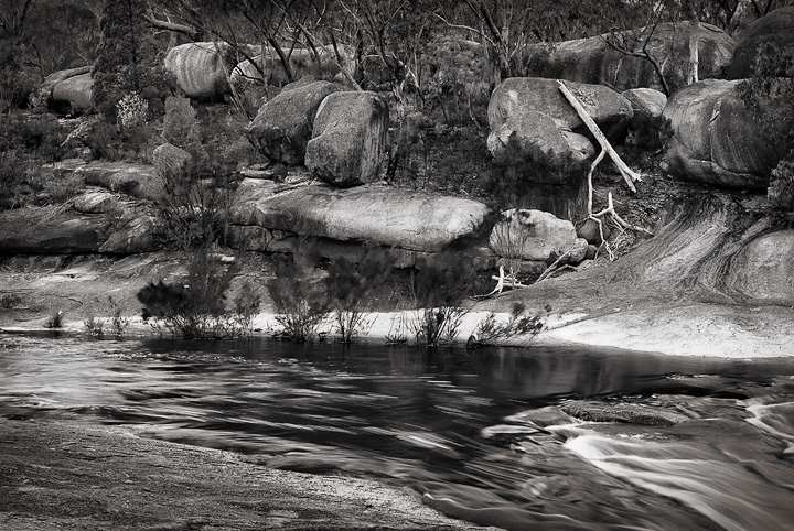
Bald Rock Creek, Girraween NP, Queensland.

I'm having some trouble calibrating my old monitor, which seems to be giving results that are too bright, therefore producing darker images than I realize. I would be interested if anyone finds this image too dark on their monitors, and also if the tones seem in balance. The image was taken in overcast light.

Nikon D80,35mm lens, 0.8sec, f/11, ISO 100, polarizer.

I greatly appreciate your feedback and C&C. I hope you all had a wonderful Christmas and have a happy new year! :toast:

All the best for 2011!
David.

Comments

6 comments
Comment posted by Bill Chambers on December 28, 2010 at 4:48 PM
This is really nice David. The tonal values look perfect to me. I do wish the shoals were not so close to the right, but that's fairly minor. I'm on my work monitor and the darkness looks fine, but it is a little brighter than my home monitor. Nice work.
Registered on April 10, 2005, 753 Posts, 21216 Comments
Comment posted by Reno DiTullio on December 28, 2010 at 5:28 PM
The bw conversion looks fine, rich dark tones, bright light tones and "normal" neutrals, well done.
Registered on November 14, 2003, 130 Posts, 1644 Comments
Comment posted by Lon Overacker on December 28, 2010 at 8:13 PM
David,

Have to agree with the first two comments because this looks like a fine b&w conversion with great tonal range and excellent contrast throughout.

There's a lot to look at visually here, but yet it doesn't seem busy. It's like everything has it's place and it's just nice to explore and enjoy this scene.

As far as dark/light, this looks pretty spot on to me.

All the best to you and yours in 2011 as well!

Lon
Registered on November 24, 2006, 521 Posts, 19147 Comments
Comment posted by Tony Kuyper on December 28, 2010 at 9:24 PM
Lots to looks at here, but the B&W simplifies it some and the contrast creates a lot of interest. The white on the other side of the water feels just a bit bright, but it does serve as a focal point for the scene.
Registered on November 1, 2003, 364 Posts, 22328 Comments
Comment posted by Doug Roane on December 29, 2010 at 11:51 AM
Looks good to me, David. Great range of tones and good comp. I personally would brighten the midtones, leaving the shadows and whites alone, but that's just me.
Registered on December 12, 2008, 213 Posts, 2226 Comments
Comment posted by Peter Richter on January 3, 2011 at 4:58 PM
I appreciate your picture very much, it is a fine balanced B&W. Although I can imagine that especially in this scene colors could still contribute a lot to the atmosphere. What I like most is the delicate play of the water.

Peter
Registered on November 10, 2010, 218 Posts, 2723 Comments