Nature Photographers Network
This is the preserved archive of the original Nature Photographers Network. The community continues at naturephotographers.network.
A bit different
‹ PreviousWildlife GalleryNext ›

A bit different

by Edwin kats

Gallery: WildlifePosted January 6, 2011369 views8 comments
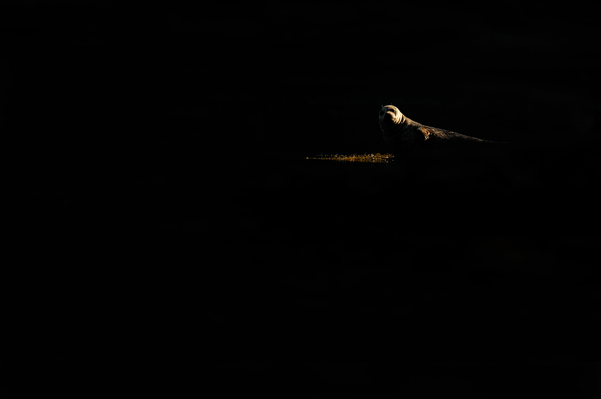
A common seal from Norway. Taken from a boat in nice backlit conditions. By underexposing 4 stops it completely blacked out the sea and still enough light to lighten the seal. I guess this is a 'love it or hate it' type of picture.

iso 200 1/1600 sec. f/4 hand held

Edwin Kats

Comments

8 comments
Comment posted by John Kerr on January 6, 2011 at 10:28 PM
By placing the seal where you did in the frame and especially the addition of the little bit of light that's on the ground this photo works for me. Great out of the box thinking. :toast:
Registered on October 28, 2009, 111 Posts, 1070 Comments
Comment posted by Floris van Breugel on January 6, 2011 at 11:07 PM
I love your work with black backgrounds! This one took some scratching of the head before I finally figured out what was going on - the larger version helped with that. It's not as simple and immediately catching as many of your other dark images, so I don't like it quite as much for that reason, but still a nice image (and different always gets bonus points from me!).
Registered on December 19, 2008, 306 Posts, 4840 Comments
Comment posted by Harshad Barve on January 7, 2011 at 4:18 AM
Terrific shot , very creative
:toast: :toast: :toast:
Registered on July 25, 2010, 39 Posts, 210 Comments
Comment posted by Brad Hill on January 7, 2011 at 9:11 AM
Hi Edwin,

I always like images that are outside the box and have played with similar techniques on more than a few occasions, so I appreciate what I'm seeing here. To my eye, I think the there's almost too much light on that one portion of the head, which leaves the contrast almost too high. I'd almost like to see a bit of re-balancing here (if your file would allow it) where there was a little more light striking a larger portion of the seal (giving us a few more subtle hints at what we're looking at) and a little less light on that left side of the seal's head. I guess what I'm driving at is to make the image a little more subtle and slightly less harsh? Hope that makes some sense to you...

Cheers...hope 2011 is starting out well for you...

Brad
Registered on May 29, 2007, 431 Posts, 6061 Comments
Comment posted by Stephen Kaluski on January 8, 2011 at 2:56 AM
Hi Edwin, certainly 'Thinking out of the box' on this one. :wink:

I think Brad has a point, for me it's a little too stark. With the surround of the dominant black it certainly draws your eye to the subject and isolates it very well, but would just like to see more within the image. :toast:

TFS
Steve
Registered on March 25, 2007, 189 Posts, 1064 Comments
Comment posted by Oscar Benavides on January 8, 2011 at 9:56 AM
Something different is always welcome. To my mind there is too much black space, If the image were mine I would probably crop a bit but maintaining the position of the seal in the frame.
Registered on January 2, 2011, 12 Posts, 141 Comments
Comment posted by Edwin kats on January 8, 2011 at 10:02 AM
Thank a lot guys. All very useful comments and much appreciated.

Edwin
Registered on April 24, 2006, 177 Posts, 399 Comments
Comment posted by Vincent Grafhorst on January 9, 2011 at 1:15 PM
I love it Edwin! I only find the amount of negative space a bit too much. A crop of app 70% would be about right to present this IMO. :toast:
Registered on February 24, 2006, 504 Posts, 7203 Comments