Gallery: LandscapePosted January 14, 2011381 views15 comments
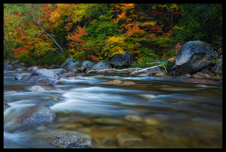
Fall colors along the Swift River off the Kancamagus Highway.
Canon 7D, Canon 10-22mm, ISO 200, f/16, 2.5 sec.
Comments
15 comments
Comment posted by Bill Chambers on January 14, 2011 at 9:23 PM
This is gorgeous Justin. The colors really pop, contrast is just right, and the comp is excellent as well. Very nicely done.
Registered on April 10, 2005, 753 Posts, 21216 Comments
Comment posted by Kent Mearig on January 14, 2011 at 10:06 PM
What a beautiful assortment of colors. I wonder how this would look with a little less space at the bottom, but the streaks in the water make a nice contrast to the more chaotic textures in the leaves.
Registered on September 4, 2006, 237 Posts, 4748 Comments
Comment posted by Mark Zemmin on January 14, 2011 at 11:12 PM
Wonderful colors and very nice silky water. Beautiful!
Registered on November 4, 2010, 8 Posts, 170 Comments
Comment posted by Tony Kuyper on January 14, 2011 at 11:22 PM
I really like the colors and fine textures here, Justin. Beautiful light.
Registered on November 1, 2003, 364 Posts, 22328 Comments
Comment posted by Bob Miller on January 15, 2011 at 3:34 AM
Beautiful work.
Registered on January 24, 2005, 152 Posts, 405 Comments
Comment posted by Gino Cortez on January 15, 2011 at 4:56 AM
Very nice colors, composition, and sense of motion.
Registered on November 23, 2010, 57 Posts, 396 Comments
Comment posted by Nick Bristol on January 15, 2011 at 9:54 AM
Beautiful. Great comp and wonderful color. The stream and rocks look great with the fall color. Really nice work, Justin.
Nick Bristol
Lone Rock, WI
Registered on February 1, 2004, 752 Posts, 14140 Comments
Comment posted by Andreas Resch on January 15, 2011 at 2:13 PM
Impressive, Justin. Wonderful foliage, great dynamic on the water, well balanced comp - no nits whatsoever.
Registered on November 14, 2007, 322 Posts, 6101 Comments
Comment posted by Gary McGhee on January 15, 2011 at 3:52 PM
Wonderful saturation and comp Justin, the water flows very nicely.
Gary.
Registered on April 15, 2010, 142 Posts, 2416 Comments
Comment posted by Robert Dayton on January 15, 2011 at 5:26 PM
Beautiful, Justin! In the fall of 2000 I photographed along the Swift River.
This image motivates me to return.
Registered on November 11, 2008, 281 Posts, 3958 Comments
Comment posted by Wayne Jones on January 15, 2011 at 9:32 PM
Just beautiful! Your treatment of the foliage is wonderful, and it looks great with the textures of the rocks and stream. I like the way your chosen shutter speed preserved the structure of the water flow, and the transparency of the river revealing the rocks below brings even more life to the image.
Registered on April 18, 2007, 953 Posts, 6435 Comments
Comment posted by Bruce Omori on January 16, 2011 at 3:19 AM
Another great shot with those beautiful fall colors!!! Love it, Justin!!! Great composition as well. The blurred rocks in the stream adds depth (no pun intended). Well done, my friend!!!
Registered on December 6, 2010, 6 Posts, 175 Comments
Comment posted by Mark Metternich on January 16, 2011 at 1:13 PM
Sweet simple scene here Justin!
It gets a little heavy in luminosity on the right, so I'd maybe think about doing a graduated luminance adjustment in ACR from far right to far left to balance that a little?
Registered on June 19, 2009, 276 Posts, 6240 Comments
Comment posted by Lon Overacker on January 17, 2011 at 2:57 PM
Justin,
I'm a little late to the party here, but wanted to comment. First, this is a beautiful autumn and streamside image. The strong L-R flow of the water is calming and the fall color is brilliant.
Now this hasn't even been mentioned so I question whether or not it's me.... but I think this is heavy in the saturation. I use TK's saturation masks all the time and I love images that pop, however what drew my eye to comment on this is actually not the reds and oranges of the fall color, but the rocks along the shore. At least to me, the tops of most of those rocks are very cyan. For me, it's been a long process to learn how to "see" colors in the field and perhaps there certainly could be some blue/cyan cast to the rocks... but it seems to be to be just past natural. Of course we're all within the realm of personal choice and creativity and so I don't have any issues if that's the intent, but I wanted to pass this along as an observation.
Lon
Registered on November 24, 2006, 521 Posts, 19147 Comments
Comment posted by Doug Roane on January 18, 2011 at 12:51 AM
strong image, Justin. Nice work!
Registered on December 12, 2008, 213 Posts, 2226 Comments

Comments
15 commentsNick Bristol
Lone Rock, WI
Gary.
This image motivates me to return.
It gets a little heavy in luminosity on the right, so I'd maybe think about doing a graduated luminance adjustment in ACR from far right to far left to balance that a little?
I'm a little late to the party here, but wanted to comment. First, this is a beautiful autumn and streamside image. The strong L-R flow of the water is calming and the fall color is brilliant.
Now this hasn't even been mentioned so I question whether or not it's me.... but I think this is heavy in the saturation. I use TK's saturation masks all the time and I love images that pop, however what drew my eye to comment on this is actually not the reds and oranges of the fall color, but the rocks along the shore. At least to me, the tops of most of those rocks are very cyan. For me, it's been a long process to learn how to "see" colors in the field and perhaps there certainly could be some blue/cyan cast to the rocks... but it seems to be to be just past natural. Of course we're all within the realm of personal choice and creativity and so I don't have any issues if that's the intent, but I wanted to pass this along as an observation.
Lon