Nature Photographers Network
This is the preserved archive of the original Nature Photographers Network. The community continues at naturephotographers.network.
Tree & Bush
‹ PreviousPhoto Art GalleryNext ›

Tree & Bush

by Bill Chambers

Gallery: Photo ArtPosted January 15, 2011118 views5 comments
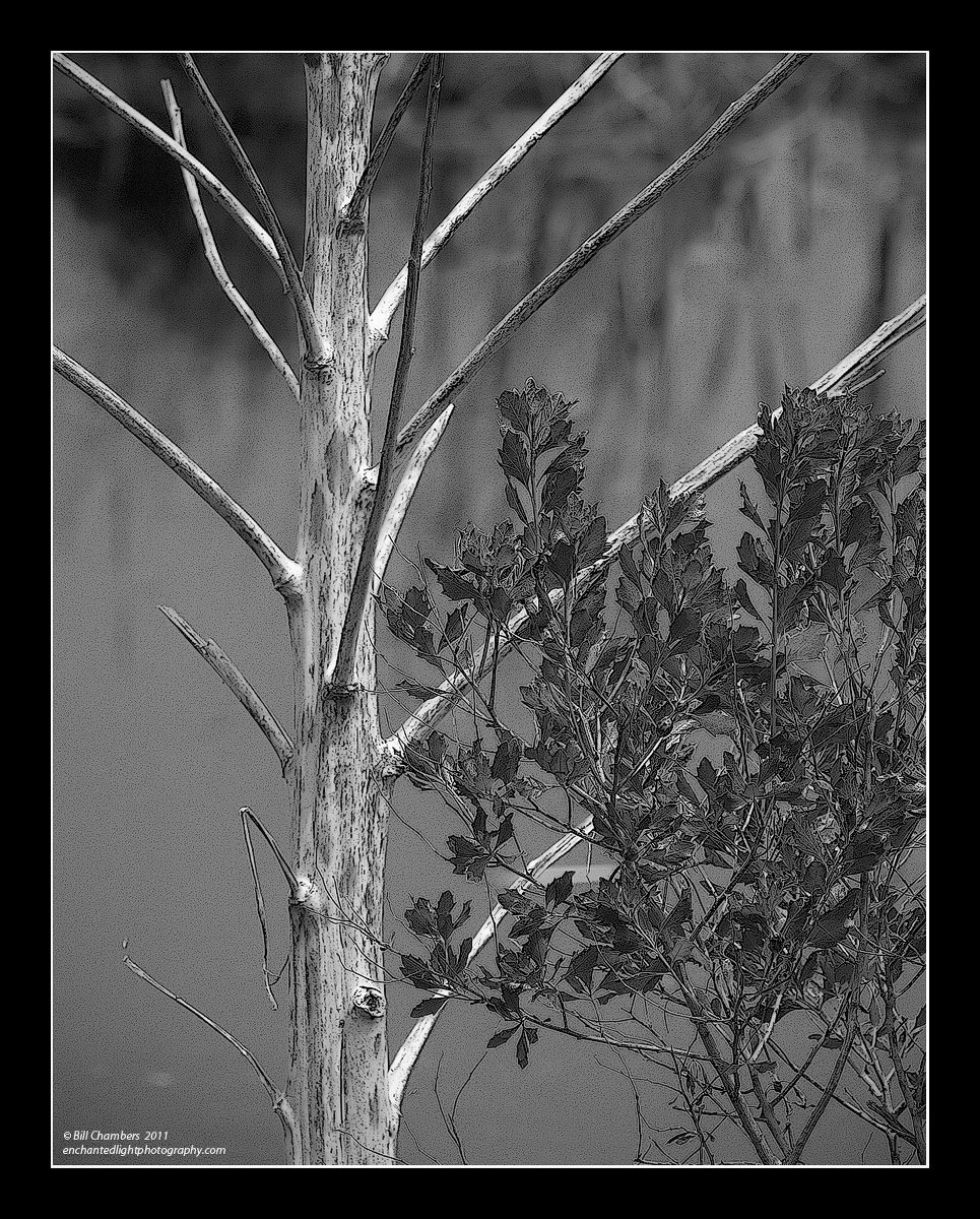
I processed this a good while back, so I really don't remember exactly what I did to it, but I think I just posterized it. It was a pretty windy day so I upped the shutter speed a good bit.

D2X w/ 70-200 VR @ 200mm
1/250 @ f/8 - MLU and mc-30 remote release
100 ISO
No filters that I recall
Tripod
Capture One 4, CS4, TK's Luminosity Masks & Sharpening

Thanks for looking, and thanks for any comments!

Comments

5 comments
Comment posted by Patricia Brundage on January 15, 2011 at 10:44 PM
The contrast between the stark brances and the lacy leaves makes for some eye candy. Just the right amount of posterization. Love it! :toast:
Registered on March 23, 2006, 1111 Posts, 6531 Comments
Comment posted by David W. Kelly on January 17, 2011 at 11:56 AM
Bill I like the posterization effect and the comp is very strong. I bet a straight conversion would look awesome to.
Registered on October 7, 2005, 883 Posts, 6590 Comments
Comment posted by SandyRichardsBrown on January 19, 2011 at 12:32 AM
Bill, nice lines of the bare tree and great contrast bewteen the stark limbs and lush tree.
The posterization works great here.
sandy
Registered on November 24, 2003, 3937 Posts, 12909 Comments
Comment posted by Lucy VanSwearingen on January 20, 2011 at 2:18 PM
The posterization is perfect for drawing out the textures...the worn tree and the delicate leaves. Good one!

Looks like a work of art with a very fine pencil! Very satisfying. Also like the hidden picture. Look at the middle of the tree. Doesn't it look like a trio of leaf impressions? I hope someone else sees this! I really do see them! . Too many years reading Highlights magazine, when I was a child! :eek: :eek:
Registered on May 23, 2009, 800 Posts, 2042 Comments
Comment posted by Catherine Reilly on February 5, 2011 at 1:27 AM
Really like this, Bill. The filter added some nice texture esp. to the bush. Think it would look cool as more of a square comp with some off the top; brightness and disorderly looking vegetation in the urc take away from the harmony of the rest of the scene, imho.
Registered on August 16, 2006, 603 Posts, 9192 Comments