Nature Photographers Network
This is the preserved archive of the original Nature Photographers Network. The community continues at naturephotographers.network.
Desert Storm II +Repost
‹ PreviousLandscape GalleryNext ›

Desert Storm II +Repost

by Doug Roane

Gallery: LandscapePosted January 16, 2011346 views18 comments
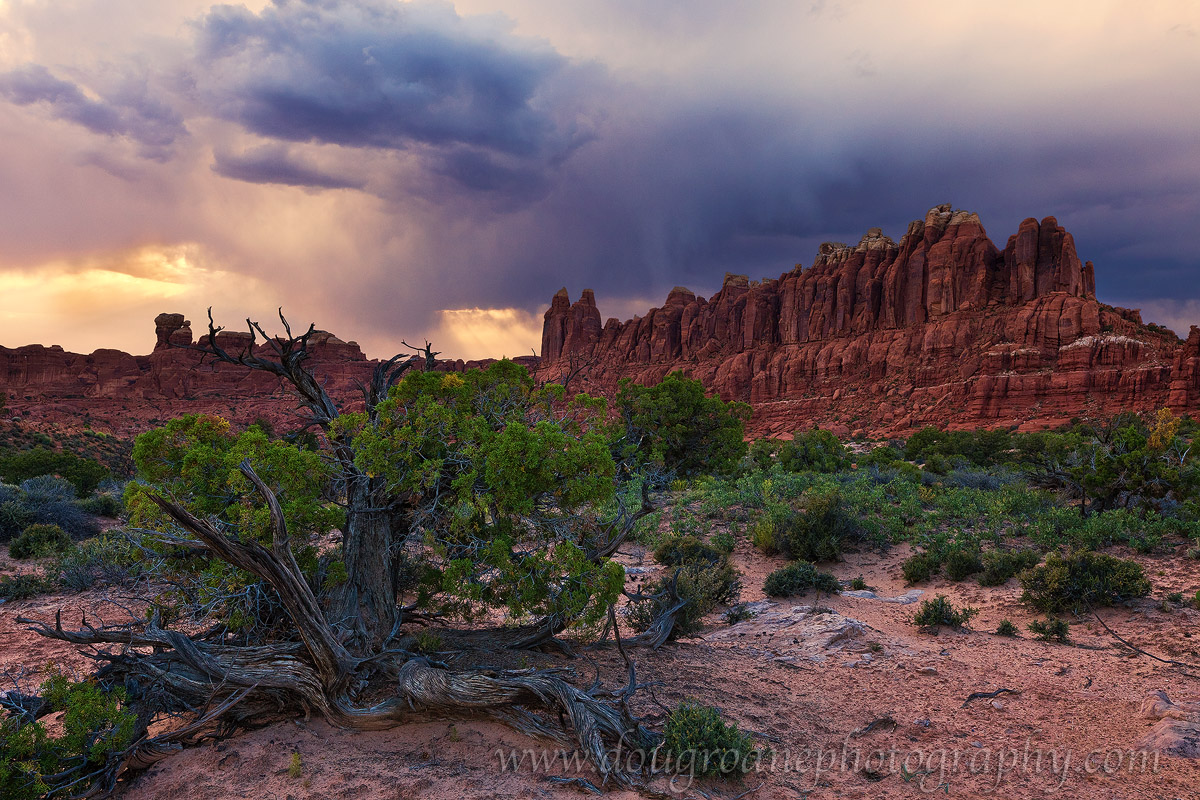
Another comp from the Klondike Bluffs, Arches NP. This brings back a fun but scary family experience we had in trying to outhike the storm back to the truck. :smile: :eek:

This is a 2 exposure manual blend. ISO 400. f/16. Canon 5DII. 16-35/2.8. I did do some color manipulation using Nik Color Efx Pro. Is it ok, or over the top? C&C always welcome.

This really should be VIEWED LARGE! Thanks.

Comments

18 comments
Comment posted by SandyRichardsBrown on January 17, 2011 at 12:01 AM
Doug, wonderful forboding skies against the red rocks. The great tree in the FG is a good anchor and pulls it all together. :toast:
Sandy
Registered on November 24, 2003, 3937 Posts, 12909 Comments
Comment posted by Chris Chamberlain on January 17, 2011 at 12:10 AM
Looks real nice, Doug! I think the colors look good. Since you brought my attention to it, the greens look strong, but not over the top to me.

Chris
Registered on March 13, 2007, 500 Posts, 8365 Comments
Comment posted by Steve Sieren on January 17, 2011 at 1:05 AM
Doug, the sky has a film type of color to it, that is one thing I really do like about CEP. Some of the shadows have some blue tones in them probably more emphasized with the adjustments. The percentage of these blues are minimal in the image percentage wise so I wouldn't see a non photographer bringing them up.
Registered on January 2, 2008, 360 Posts, 5321 Comments
Comment posted by James Fougère on January 17, 2011 at 1:35 AM
Another nice image! I can see what Steve is saying about the blue in the sky, and close to the upper right side of the image. I like the green, very vibrant :smile: Well done
Registered on October 25, 2010, 41 Posts, 831 Comments
Comment posted by Bob Miller on January 17, 2011 at 2:41 AM
Beautiful image. It's great when you get the opportunity. You nailed it. I don't know if you are a purist- but if were me, I'd give a little left tug to the TL corner, to visually equallize the spread of the angle of view of the promentory on the right side. :toast:
Registered on January 24, 2005, 152 Posts, 405 Comments
Comment posted by Bret Edge on January 17, 2011 at 3:08 AM
This looks really natural to me, Doug. Another beautiful sky, great composition and of course, an interesting location. Well done!
Registered on November 1, 2003, 711 Posts, 6363 Comments
Comment posted by Balakumar Kaushik on January 17, 2011 at 5:41 AM
Very fine composition. The FG tree trunk is amazing. Nice details overall. Might reduce the saturation in blues in the sky (for my tastes).
Registered on January 4, 2008, 98 Posts, 1403 Comments
Comment posted by Dan Baumbach on January 17, 2011 at 8:19 AM
The color looks fine to me. Nice image.

- Dan.
Registered on November 1, 2003, 473 Posts, 7980 Comments
Comment posted by Nick Bristol on January 17, 2011 at 10:26 AM
Another great scene, Doug. This all looks really nice to me. I like the colors, fantastic sky and I can see why you had to try and out run it. The detail in the large version is very nice!

Nick Bristol
Lone Rock, WI
Registered on February 1, 2004, 752 Posts, 14140 Comments
Comment posted by Gino Cortez on January 17, 2011 at 11:45 AM
Larger version has great detail and really puts the tree into proper perspective. Nice color and inviting storm action....nice job on the blend as well.
Registered on November 23, 2010, 57 Posts, 396 Comments
Comment posted by Eva McDermott on January 17, 2011 at 12:18 PM
Color looks great Doug. I really like the ominous sky and detail in the larger view.
Registered on January 4, 2009, 1015 Posts, 13229 Comments
Comment posted by Bill Chambers on January 17, 2011 at 2:17 PM
I'm on my work monitor so I can't help much on the color, but I really like the image. This is gorgeous country, and you captured it so nicely.
Registered on April 10, 2005, 753 Posts, 21216 Comments
Comment posted by Gary McGhee on January 17, 2011 at 3:05 PM
This looks great Doug, the sky looks awesome.

I noticed this on the Telegraph website last week. Is it one of yours. Great shot too.

http://www.telegraph.co.uk/news/picturegalleries/theweekinpictures/8210351/The-week-in-pictures-17-December-2010.html?image=19

Cheers, Gary.
Registered on April 15, 2010, 142 Posts, 2416 Comments
Comment posted by R.Bill Moser on January 17, 2011 at 3:27 PM
The colors looks good to me. It's not over the top. nice comp as well. Great drama in the sky.
Registered on January 29, 2010, 285 Posts, 4281 Comments
Comment posted by Lon Overacker on January 17, 2011 at 3:28 PM
Doug,

Another nicely captured image from Arches. I like the dramatic sky, but yet it doesn't over power the landscape. I think I prefer the comp in the previous post, but this one works quite well.

Apparently you and your family made it out safely! :eek:

Lon
Registered on November 24, 2006, 521 Posts, 19147 Comments
Comment posted by Tony Kuyper on January 17, 2011 at 8:59 PM
I like the comp and colors. Processing-wise, the light areas at the top edge of the frame tend to pull me out of the picture. I think the previous tighter version was the stronger of the two.
Registered on November 1, 2003, 364 Posts, 22328 Comments
Comment posted by Doug Roane on January 17, 2011 at 11:07 PM
Thanks all. Tony, you make a good point about the sky. Here, I have darkened the top portion, and also decreased the blue a bit, which makes the sky a little more natural looking to me.
Registered on December 12, 2008, 213 Posts, 2226 Comments
Comment posted by Morris McClung on January 18, 2011 at 11:45 PM
Outstanding comp and color. The tonal range in this works better overall than the last one. This just needs to be printed HUGE! :toast:
Registered on May 7, 2007, 670 Posts, 19650 Comments