Nature Photographers Network
This is the preserved archive of the original Nature Photographers Network. The community continues at naturephotographers.network.
Graphism
‹ PreviousLandscape GalleryNext ›

Graphism

by Dorin Bofan

Gallery: LandscapePosted January 31, 2011131 views14 comments
Hello all!
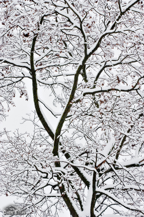
Took this one a few weeks back very close to where I live after a heavy snowstorm. I really liked the elegant curves of the branches and their dark bark against the white snow and sky. Not much else to say about it. Hope you like it and I appreciate any suggestions.

450d, 70-200

Comments

14 comments
Comment posted by Barbara Graham on January 31, 2011 at 7:49 AM
Dorin, I agree with you. This is elegant.
Registered on July 27, 2010, 1310 Posts, 5035 Comments
Comment posted by Bill Chambers on January 31, 2011 at 8:18 AM
Very pretty Dorin. Elegant does describe it very nicely.
Registered on April 10, 2005, 753 Posts, 21216 Comments
Comment posted by Peter Richter on January 31, 2011 at 8:28 AM
A very fine composition, Dorin. What I like most are the delicate color elements, as the leaves and the structure of the bark.

Peter
Registered on November 10, 2010, 218 Posts, 2723 Comments
Comment posted by Nick Bristol on January 31, 2011 at 8:33 AM
I like this, Dorin. Great job with the comp. I too like the form of dark branches against the snow. Just a little color in there looks good too. Very nice.

Nick Bristol
Lone Rock, WI
Registered on February 1, 2004, 752 Posts, 14140 Comments
Comment posted by Tony Kuyper on January 31, 2011 at 9:58 AM
Nice abstract quality to the comp with a still readily recognizable form. I'm wondering if pure black and white might actually serve this better.
Registered on November 1, 2003, 364 Posts, 22328 Comments
Comment posted by Justin Reznick on January 31, 2011 at 11:59 AM
Fantastic Dorin! I love the lines and strong contrast! It's images like this which make you one of the best intimate landscape photographers IMO.
Registered on November 24, 2009, 79 Posts, 515 Comments
Comment posted by R.Bill Moser on January 31, 2011 at 12:04 PM
Dorin, i like this one. I like the the strong contrast of the bark and the snow. nice lines and curves as well.
Registered on January 29, 2010, 285 Posts, 4281 Comments
Comment posted by Stuart Williams on January 31, 2011 at 12:37 PM
i like it dorin - right down my street! two things distract slightly but i think importantly: the larger leaf in the top left and whatever it is that is behind your signature! other spot on and i really like the hints of colour conveyed by the (other) leaves.
Registered on December 7, 2007, 247 Posts, 4792 Comments
Comment posted by Alex Mody on January 31, 2011 at 3:39 PM
Loving the high-key look, and the intricate, and as you said, elegant patterns. Great work, Dorin! :biggrin:
Registered on December 25, 2007, 163 Posts, 1896 Comments
Comment posted by Neale Dyster on January 31, 2011 at 5:08 PM
The curves, lines and contrasts are wonderful. Great work Dorin.
Registered on February 19, 2008, 94 Posts, 738 Comments
Comment posted by Vance Gese on January 31, 2011 at 7:56 PM
Love the composition, Dorin. The curves of the two main branches really give a sense of motion, almost like a couple dancing. The snow and the contrasting tones with the dark branches are superb. Really nicely done.
Registered on November 13, 2008, 298 Posts, 6629 Comments
Comment posted by Stan Rose on January 31, 2011 at 11:22 PM
I have kind of mixed feelings about it--but overall i like it. The mixed feelings come from the fact that ive seen the same subject/comp many times. Usually, though, the patterns fill the whole frame--in this shot, there's more open space which makes it a bit different. But the 'Catch-22' is that i think the subject is strongest when its most graphical, which requires the frame to be filled--which in turn makes it less unique! Of course, youre only gonna hear critique like that from hard-to-please critics like myself who are a bit jaded. I think if you crop off the very bottom, to get rid of that one oddish looking section in the extreme llhc, i can get past my picky nits and declare it a clear winner :wink:
Registered on September 15, 2005, 836 Posts, 17099 Comments
Comment posted by Dorin Bofan on February 1, 2011 at 6:29 AM
Thank you so much for the comments, guys.
Tony, I thought that the hint of color would keep the viewer a little bit longer on checking the intricate details and adding that little bit of interest.
Justin, thank you, but I have a long way to go until one can say I'm best at something. :smile:
Stuart, Stan, that thing in the lower left is actually part of my signature. You're not the first to tell me this, but i like it. :smile:
Registered on April 30, 2007, 122 Posts, 3086 Comments
Comment posted by Stan Rose on February 3, 2011 at 8:11 AM
Lol, well then its a clear winner (despite the signature) :biggrin:
Registered on September 15, 2005, 836 Posts, 17099 Comments