Nature Photographers Network
This is the preserved archive of the original Nature Photographers Network. The community continues at naturephotographers.network.
[REPOST] Rock and a hard place...
‹ PreviousLandscape GalleryNext ›

[REPOST] Rock and a hard place...

by Julian Barkway

Gallery: LandscapePosted February 1, 201189 views6 comments
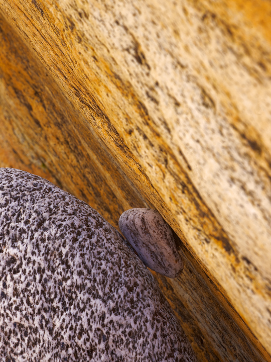
Some niceely contrasting rock textures and colours and a little pebble neatly connecting the two....

--------------------------------------------------------------------
Sony A900, Sony 70-300 G @ 210mm, 1/15" @ f22, iso 200

Comments

6 comments
Comment posted by Bill Chambers on February 1, 2011 at 12:01 PM
Neat comp, and I love the strong diagonal. The OOF URC is pretty distracting however. I also like the contrast between circular rock and straight face.
Registered on April 10, 2005, 753 Posts, 21216 Comments
Comment posted by R.Bill Moser on February 1, 2011 at 12:09 PM
I do love the idea but the out of focus area is a bit distracting. nice composition.
Registered on January 29, 2010, 285 Posts, 4281 Comments
Comment posted by Lon Overacker on February 1, 2011 at 9:28 PM
Julian,

Great find and a wonderful, intimate little nature story; gotta love the dynamics of the little stone wedged between the two bigger rocks. Unfortunately for me, too much of the space (almost half) is the blurry front of the main rock. At that range and focal length you're of course not getting that much dof, so other than a focus stack of images, not sure what you could do. This one would even be tough with the 4x5.

Like the image, the lack of dof takes away though.

Lon
Registered on November 24, 2006, 521 Posts, 19147 Comments
Comment posted by Tony Kuyper on February 1, 2011 at 10:02 PM
Fascinating. Could see burning the URC a bit to focus more on the squeeze play.
Registered on November 1, 2003, 364 Posts, 22328 Comments
Comment posted by Vance Gese on February 1, 2011 at 10:47 PM
Love the color and composition, Julian. As others have stated, the OOF area in the upper right really seems to take away from the image, for me anyway. Love the color contrasts and the nice textures of the black and white rock.
Registered on November 13, 2008, 298 Posts, 6629 Comments
Comment posted by Julian Barkway on February 2, 2011 at 5:15 AM
Hmmmm. I'm not sure it's the fact that such a lot is OOF that's the problem so much as the distribution of light and shade isn't how it should be to make the most of the subject. I've tried to remedy this in the repost.

I'm not sure why it's the convention that all landscape images should be pin-sharp from front to back (or corner-to-corner :wink: ) and were it so in this case the stripey rock would be a lot more distracting, I feel.
Registered on January 18, 2007, 344 Posts, 1961 Comments