Gallery: AvianPosted February 3, 2011111 views9 comments
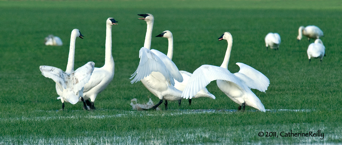
Hi, all. Here's another in the series of arguing swans. Hopefully this image is adjusted a little bit better as far as color cast.
Comments
9 comments
Comment posted by Rob Drummond on February 3, 2011 at 6:10 AM
Really like the interaction here Catherine and the stark contrast between the white of the swans and the vivid green of the vegetation
cheers
Rob
Registered on November 8, 2003, 617 Posts, 8267 Comments
Comment posted by Randy Bacon on February 3, 2011 at 7:47 AM
I really like this Catherine, nice and sharp where it needs to be, great action - I especially like haw the swans in the BG could care less about the ruckus and I like the addition of the splash below the center swan - adds an additional sense of action. Well exposed and I too like the contrast between the white and vivid green. I might wish for a little more room on top as the swan's heads are starting to get a little crowded, otherwise a wonderful image.
Registered on November 24, 2008, 56 Posts, 492 Comments
Comment posted by richard remington on February 3, 2011 at 9:07 AM
Catherine,
Very pleasing image with interesting action between the birds.
Rick
Registered on March 12, 2010, 105 Posts, 368 Comments
Comment posted by Brian Gatlin on February 3, 2011 at 9:38 AM
nice action here, Catherine, and glad to see you got the color issue worked out--this looks good. I'd consider cropping the two right-most swans.
Registered on March 21, 2009, 202 Posts, 4187 Comments
Comment posted by Howard Cheek on February 3, 2011 at 10:29 AM
I like this much better Catherine, great job on correcting the color balance.
Comp works well as is, but I agree that a bit more space up top might improve it.
Well done
Registered on July 24, 2008, 1201 Posts, 10758 Comments
Comment posted by Ron Dudley on February 3, 2011 at 7:18 PM
Looks to me like you've solved the color cast problem Catherine. I like the interaction between the swans and the whites against the greens. I too would give this more room up top.
Registered on March 30, 2007, 437 Posts, 10915 Comments
Comment posted by Catherine Reilly on February 3, 2011 at 7:46 PM
Thanks, everyone. Glad to know the processing turned out better. I cropped out a farmhouse from the top and posted it thinking about how it then needed more room (i.e., grass) at the top, but didn't want to take the time to paint in more canvas. (I'll probably end up doing that on the keeper file.) Thanks for mentioning it; it's unanimous! In its full frame version, it's more of a "Man and Nature" shot... But I loved the quality of light on the birds and wanted to emphasize that along with the action.
Registered on August 16, 2006, 603 Posts, 9192 Comments
Comment posted by Mia McPherson on February 3, 2011 at 9:15 PM
Catherine,
I think you handled the color issue. I really like the interaction of the sans and the pano comp.
Registered on June 25, 2007, 491 Posts, 12566 Comments
Comment posted by Sharon Hallowell on February 3, 2011 at 9:39 PM
Comp is very good and the foot stomp in the puddle just makes this for me! Sharon
Registered on November 1, 2003, 392 Posts, 4810 Comments

Comments
9 commentscheers
Rob
Very pleasing image with interesting action between the birds.
Rick
Comp works well as is, but I agree that a bit more space up top might improve it.
Well done
I think you handled the color issue. I really like the interaction of the sans and the pano comp.