Nature Photographers Network
This is the preserved archive of the original Nature Photographers Network. The community continues at naturephotographers.network.
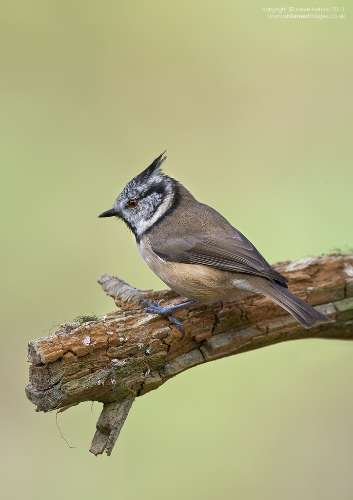
A 'wee' Crestie
‹ PreviousRegional: UKNP GalleryNext ›

A 'wee' Crestie

by Stephen Kaluski

Gallery: Regional: UKNPPosted February 9, 2011183 views9 comments
Title: Crested Tit - (Lophophanes cristatus)

Was after something else when these guys arrived, so it would have been rude not to fire off a few shots. The branch is part of the tree, so nothing you can do.

Shot in woods so very nature, but personally the BG is everything I detest in an image, as it is so 'studio backdrop' with a hint of Dulux, a cross between Nordic spa & Putting Green, or for the more discerning something from Farrow & Ball, but some may like it, as it's clean. :wink:

A tad too much above as presented, but... :smile:

Steve
MKIII 500f/4 1/200 f/6.3 ISO200 (almost FF)

Comments

9 comments
Comment posted by Stephen Kaluski on February 9, 2011 at 3:44 AM
Mottled is more interesting IMHO, however will post a head on just for you at some point, illustrating the qiff. :biggrin:
Registered on March 25, 2007, 189 Posts, 1064 Comments
Comment posted by David Sewell on February 9, 2011 at 4:38 AM
I once had a bathroom the same colour as that background :biggrin:

A little large in the frame for my personal taste, but otherwise a fine shot with plenty of detail.

David
Registered on September 10, 2008, 63 Posts, 801 Comments
Comment posted by Ian Mason on February 9, 2011 at 4:51 AM
Background is great! I suppose you could darken some of the pink areas to give a little mottling, but it's all down to personal preference I guess. Seems you were shooting in portrait? I think landscape might have worked here - these little buggers never do what you want them though. Feather definition is great by the way.
Registered on December 14, 2005, 399 Posts, 2305 Comments
Comment posted by Neil Burton on February 9, 2011 at 5:02 AM
I would hate to have a GB like this :rolleyes: Maybe just delete? :biggrin:

But I like the branch and the cresty, yes alright, keep it ;)
Registered on September 16, 2010, 26 Posts, 461 Comments
Comment posted by John Robinson on February 9, 2011 at 10:49 AM
Nice Crested pic Steve. You don.t say if its full frame but I agree landscape would probably suit better. I feel more canvas on the right would balance better.
Perch looks well "splattered "too :smile:
A bird I,ve yet to see in this country.
JR
Registered on March 2, 2008, 535 Posts, 2453 Comments
Comment posted by Stephen Kaluski on February 9, 2011 at 11:26 AM
LOL David :biggrin:

Ian - shot portrait and yes they move fast, so no real chance of 'set-up' as such, not the one I was going to post after our exchange of emails. I was amazed the BG had gone to this, but the next tree line was at least 100-150m away. Just prefer a more mottled, textured feel to a BG. Certainly black text on here wouldn't give a 'creative' any issues for publication.

John, I think if it was landscape that it might be 'too' central and difficult to use? The next one will be a real nightmare in many senses!!! :wink:

Steve
Registered on March 25, 2007, 189 Posts, 1064 Comments
Comment posted by Kim Connolly on February 9, 2011 at 1:25 PM
Splendid shot Steve, beautiful detail. :toast:
Registered on June 18, 2008, 14 Posts, 226 Comments
Comment posted by Justin on February 9, 2011 at 4:53 PM
An attractive bird and the although the plain background may not be to your taste it certainly allows the crest to stand out very well from this angle.
Registered on November 1, 2003, 106 Posts, 1697 Comments
Comment posted by Geoffrey Baker on February 10, 2011 at 6:54 AM
It's a great image and I like the plain BG just the way it is.
Well done.

Geoff.
Registered on August 20, 2010, 192 Posts, 980 Comments