Gallery: Photo ArtPosted February 12, 2011131 views5 comments
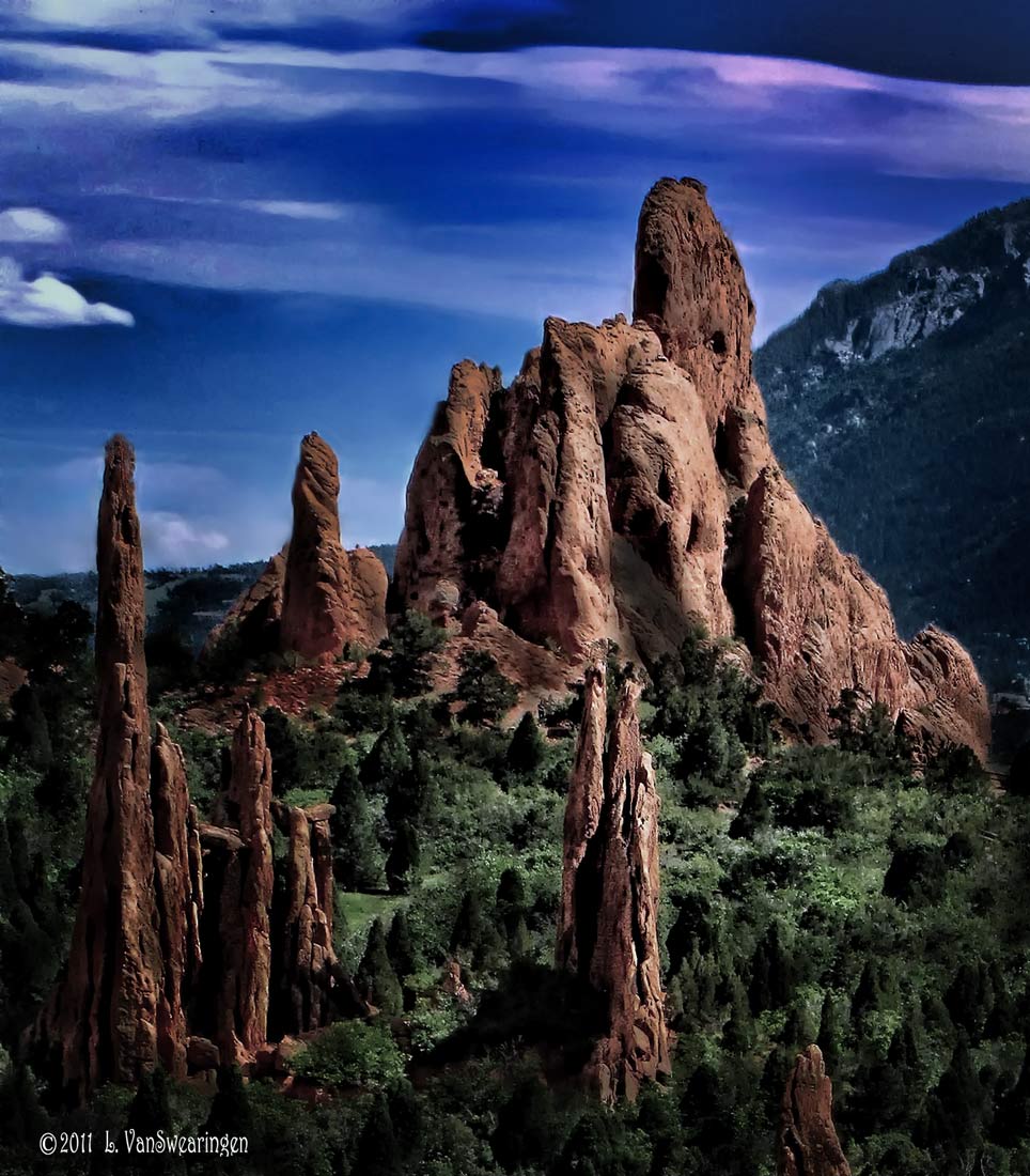
This set of spires in Colorado Springs "Garden of the Gods" screamed JRR Tolkein to me. I neutralized the colors, then darkened a lot of the photo to give it that "Lord of the Rings" dark mood.
Comments
5 comments
Comment posted by David W. Kelly on February 13, 2011 at 10:15 AM
I along with Frodo and Samwise think it is very cool very nice Lucy.
Registered on October 7, 2005, 883 Posts, 6590 Comments
Comment posted by Stan Rose on February 13, 2011 at 3:56 PM
I was just in GOG and i drove by this angle and was going to shoot it at night, but i didnt like the city lights in the bg, so i went on to Balanced Rock (will post that in Landscape in a couple days). Anyhow, i like 90% of this--pretty cool, looks like a painting of GOG. You really should share it in the RMNP forum, i bet some folks there would get a kick out of it.
The only thing im not totally sold on is the sky. I have my own thoughts about how i would approach it, but rather than give you a lengthy description ill just poinit out what i dont care for--1) the dark strip at top 2) the sloppy 'brush strokes' haloeing the rocks.
The bottom 2/3 is super cool, so i think its worth working a bit on the sky...
Registered on September 15, 2005, 836 Posts, 17099 Comments
Comment posted by Paul Wegemann on February 13, 2011 at 6:04 PM
Wow, this is surrealistic and dramatic. I like this a lot Lucy, especially the comp and the lower rocks, but I do agree with Stan about the brush strokes and sky.
Registered on December 14, 2006, 58 Posts, 1888 Comments
Comment posted by Jeremy Week on February 14, 2011 at 8:21 AM
I really like the texture in the rocks and brush. Very surreal. Great fit with Lord of the Rings, as you said. :)
Registered on February 19, 2007, 62 Posts, 394 Comments
Comment posted by Richard Waas on February 14, 2011 at 12:36 PM
I agree about the dark strip at the upper RHS. A wee bit more work on the sky and it's a winner. Congrats!
Registered on January 11, 2010, 31 Posts, 90 Comments

Comments
5 commentsThe only thing im not totally sold on is the sky. I have my own thoughts about how i would approach it, but rather than give you a lengthy description ill just poinit out what i dont care for--1) the dark strip at top 2) the sloppy 'brush strokes' haloeing the rocks.
The bottom 2/3 is super cool, so i think its worth working a bit on the sky...