Tombstone Rock+(repost)
by Jared Atencio
Due to the close proximity of the Big Sur coast to where I live, it is one of my "go-to" local destinations. Since it is so widely photographed, I have really been making attempts to get some different shots from this area and have been enduring some of the most challenging shoots I've yet to experience.
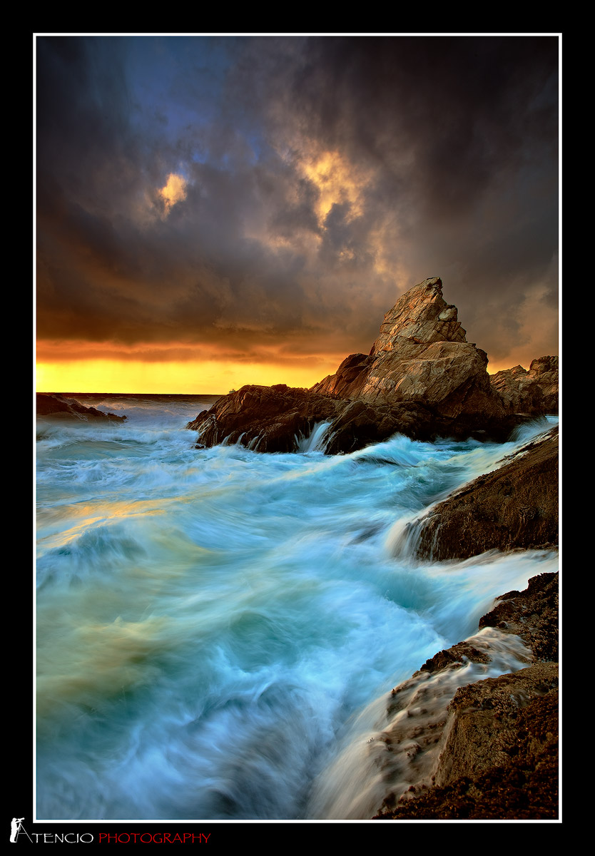
On this particular day, there was a high-surf warning issued, but the tide was only about 1'+. I had shot this comp a couple days prior for an even moodier sunset, but really wanted to come back hoping that the sun would break the clouds and strike this pinnacle. I was attracted to the violent waves that swirl around in this surge-channel, but wanted a fairly high surge to get the water retreating from the rocks. Shortly after taking this shot, a surge came in and took my photobag (it was about another 10' higher than me on the rock behind me in a "safe" spot I had left it), and pulled it back into the ocean. I sat and watched as my backpack got thrown around in this channel from wave to wave, and rock to rock which felt like a lifetime. Eventually, lenses came flying out, filters, gps unit, basically EVERYTHING but my camera, my tripod, and the one filter I had in my pocket were lost to the bottom of the ocean...
I always respect the ocean and basically prepare for battle when I go and shoot in these conditions, preparing for the absolute worst including rogue waves. I study the ocean each time before I dare go near to try and get the pattern down, and even then, always keep an eye on the sea. Even after being "prepared," a freak accident like this can happen and thinking about how close this came to me still makes me shake just writing about it.
A lot of us out there wanting to push the envelope take many "calculated risks" to get the goods. I will keep pushing as well, but just another friendly reminder to be careful, respect the power of mother nature, and LIVE life to the fullest...
Any C&C welcome here-Are you bothered by the color & Sat? (I actually desaturated the water a bit)...
Tech Notes:
5dmk2
5 shot handblend

Comments
45 commentsAs for the image, very dramatic. I think the comp is perfect and the light on the rocks looks great too. The clouds add a lot to this image, basically the drama. The water color doesn't look "right" though, at least to me. Granted, I've never been there, so it may be accurate, but it looks like it has too much cyan. Shutter speed looks great though for the water motion.
Chris
Nice image and I'm so sorry to hear about the gear!
Wayne-I noticed that too and zoomed in to pixelation and still can't make it out, but looks like a ship/boat off in the distance to me
Thanks again everyone!
First of all, I'm very sorry to hear about the equipment loss, but more importantly you didn't end up where your lenses did...
The image is a beautiful and dramatic seascape no doubt. I love the action in the water, but would agree with some slight color work. I'm actually less bothered by the cyan and know that the blue/greens doe exist in the surf like this. It's the whitewater/foamy stuff that probably should be less cyan and more neutral. But what my eye gets drawn to more is the patch of reflected yellow/orange near the left edge. I certainly believe the reflected light and color should be there, but it looks like the sat slider has slipped a little bit too much there.
The only other suggestions I have would be a slight crop off the top not quite to 4x5 format, but perhaps about 1/2 of the blue sky? I think the main focus is the waves.
Also, since I expect this will be quite worthy of a print, you might want to clone whatever that thing is that Wayne mentioned. Looks like a cruise ship or a giant Hotel! ;-) But pretty impossible to distinguish at these sizes.
A great and beautiful image.
Lon
Sorry about your gear. I've gotten caught by sneaker waves a few times but only ended up with wet gear.
- Dan.
Chris
First, as I told you earlier when we talked, the important thing is you made it out of there without being hurt or worst. Gear can always be replaced, as much as it sucks.
Second... I hate you!!! This shot is out of control sweet man. Such an intense stormy scene and you captured it so well. As far as the posts go, I like #2 quite a bit myself. You can put a bit of blue back in, but not too much. I think it just looks much more natural than before. The rest looks excellent to me. Comp and processing are awesome man. Well done!
I think it is a great shot, but would like to see some of the color tamed a bit.
Love the second version!
So sorry to hear about the gear.
Nathan
I'm deeply impressed, though.
Anil-are you referring to the original or the repost? You are correct in that the light was incredible. This large very dark cloud you see formed quickly just west of my vantage (I was facing north) and as it blew east over where I was. I thought I would get no light due to it being so thick and black, but it began to break apart just as the sun was setting. This shot has the sun peaking under the underside of the cloud, but the intense yellow in the background is rain and water vapor being side lit by the sun, so it was really pretty intense in person. I also wanted a point where the wave crests would pick up some warm highlights, and although I got a small dose of it here, the light was actually much more intense and even better about 10 minutes after this but way too sketchy to get down to this vantage point to shoot (I tried and began slipping on the now wet rock into the ocean, so turned back). Right after the sun set, this cloud opened up and rained on me all the way back to the car. I'll take a look and see if lightening the upper most clouds helps in the rework-thanks for your comments.
As you noted, somewhere between the two would be perfect, IMO. I could not disagree with Anil more. That light looks quite natural to my eye. In fact, your processing of this image is exemplary! Your work in that regard has improved exponentially sine just a few months ago.
I see an Editor's Weekly Pick here, if someone doesn't come along and post another aurora shot!
Great shot!
Sorry to hear about your gear.. It is definitely a good reminder for all of us shooting out in the elements.
While I agree that the OP may be too cyan for some tastes.......this freakin' rocks!!! Sorry about your gear but I love the colors and dram of the op....just perhap a tweaks on the whites! Awesome and well worth the sacrifice!!!
This has the tempest and dramatic color in the broody skies and tossing sea that holds my eye to the action. Well done, but sorry to hear of your gear loss. I prefer the first to the repost, as the repost seems too flat and has lost its drama. In this case, I feel the saturation and cyan enhance the image (I am ususally conservative and not akin to overboard saturation). The cyan gives the water a colder look to me, similar to the color of glacial ice. Perhaps a tweener version with the whites of the waves popped would be the answer, as many have said. The water's horizon shows a slight CW tilt to me.
Sorry to hear about you losing some of your gear.
Gary.