Nature Photographers Network
This is the preserved archive of the original Nature Photographers Network. The community continues at naturephotographers.network.
Subterrestrial (+REPOST)
‹ PreviousLandscape GalleryNext ›

Subterrestrial (+REPOST)

by Andrew Morrill

Gallery: LandscapePosted February 25, 2011411 views16 comments
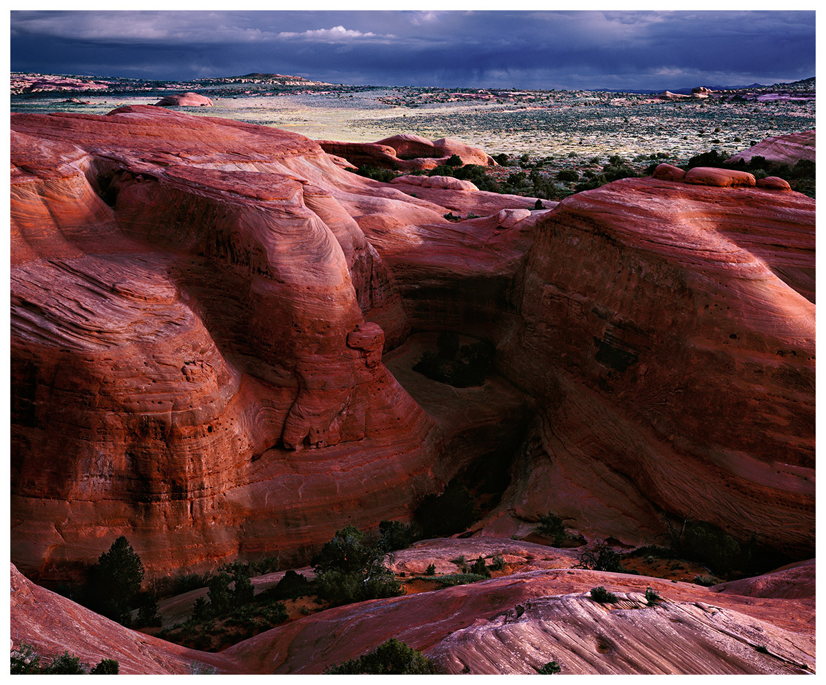
Across from Utah's most famous arch, Delicate Arch, is this scene that, to me, captures the essence of Utah's red rock country - hopefully I was able to convey that feeling. Most visitors are so distracted by the Arch (rightfully so) that they miss this view. Love to know what you think.

This was one of my first large format images, taken in 2005, that I am reprocessing.

Larger Version Available.

All comments/critiques/suggestions appreciated.

Cambo 4x5, Velvia 100F, Nikkor 180mm, drum scan

Comments

16 comments
Comment posted by Floris van Breugel on February 25, 2011 at 2:46 AM
Wow, Andrew, this is great! First image I've seen from Delicate that makes me want to go - I've never been. If possible, I'd love the see the shadows softened a little, and the light on the rocks and landscape warmed up a bit. I bet with a little more careful sharpening you could make the web version pop a little more in crispness too. Anyhow, this is a fantastic view in some superb light, well done!
Registered on December 19, 2008, 306 Posts, 4840 Comments
Comment posted by Andrius Pašukonis on February 25, 2011 at 2:55 AM
Gorgeous colors and shapes. I've haven't seen much of Utah but I can totally see why this pictures for you captures the essence of it. Well done :toast:
Registered on July 23, 2005, 111 Posts, 408 Comments
Comment posted by Philip Hodgkins on February 25, 2011 at 8:17 AM
A well crafted image! Floris has made some excellent suggestions, with which I agree.
Registered on July 24, 2006, 2741 Posts, 12349 Comments
Comment posted by scott lanz on February 25, 2011 at 8:26 AM
Excellent capture. I agree with the suggestions made by Floris.
Registered on November 14, 2003, 840 Posts, 12902 Comments
Comment posted by Preston Birdwell on February 25, 2011 at 1:22 PM
What a wonderful place that you've captured nicely. I agree it could be warmed up some, and the shadows are a bit too dense. It looks like you had a pretty wide dynamic range for Velvia, so it may be a little tough to pull shadow detail with increasing noise--it's sure worth trying, though. I sure like the composition, and the light is superb.

Have you tried Tony Kuyper's Luminosity masks? I believe their use would be advantageuos for this shot.

--P
Registered on November 1, 2003, 471 Posts, 5188 Comments
Comment posted by Richard Teller on February 25, 2011 at 2:45 PM
Nice image. I like the color a lot. I am going to be to be in Arches this May. This gives me another vision to shot some different images.
Registered on August 23, 2010, 1162 Posts, 6692 Comments
Comment posted by Luis Argerich on February 25, 2011 at 3:00 PM
I love the composition it feels very unique and its captivating.
In this size it looks a little soft, I feel the rocks need a little sharpening.
Registered on December 22, 2009, 91 Posts, 1349 Comments
Comment posted by Nancy Lea Sandy on February 25, 2011 at 3:03 PM
amazing structure, color and lines. I find the sky in the bg a little distracting as it is also a very strong element and competes with the sandstone formations (IMO) I think you could crop it to just above the hills in the bg, keeping just a little of the sky, and have a stronger image. As it is, I still find it impressive. Nicely Done
Registered on January 24, 2011, 576 Posts, 6942 Comments
Comment posted by Lon Overacker on February 25, 2011 at 7:45 PM
Andrew,

Great landscape and a view that I'm sure is appreciated by many - and me even though I've never been to Arches. You got the classic image too right? :biggrin:

I hate to jump on the bandwagon and I have to apologize if it seems like I've been picking on you recently. I know 100F and I would agree that the color balance is pretty cool. I would say the magenta, or the combo of red and blue could be reduced in a Levels/Curves layer. And lots of possibilities with TK's stuff as I know you play around with. And just to let you know that I'm not just saying it because I'm on a color cast bandwagon, but I do really look at the image. My clue here is in the URC where it looks like more open rock formations just below the horizon, right edge. It looks quite lavendar to me, which is what causes me to really look closer and think about the colors.

But, the good news is, it's just one person's opinion and far from gospel.

Lon
Registered on November 24, 2006, 521 Posts, 19147 Comments
Comment posted by Joe Rogers on February 25, 2011 at 9:01 PM
I do not find the sky distracting at all....IMO adds to the overall impact of the scene.
Joe Rogers
Registered on August 30, 2009, 1 Posts, 6 Comments
Comment posted by Tony Kuyper on February 25, 2011 at 10:04 PM
You had some really special conditions and light for this, Andrew. I like the color contrast, but the overall tonal contrast seems a bit strong. Lot of personal preference, though, in every image so you need to decide what works best for you.
Registered on November 1, 2003, 364 Posts, 22328 Comments
Comment posted by Andrew Morrill on February 25, 2011 at 11:54 PM
Thanks everyone for the feedback.

I kinda feel like an idiot because I realized tonight that my monitor was set on the wrong color space. The monitor can switch color spaces on the fly - and I had it on my sRGB emulation mode the other day for gaming. Anyway - because it wasn't on my photo editing mode I ended up editing this more saturated than I had intended - causing the rock to feel too magenta. Really annoying because I thought for sure at least this image would have good color - unlike some of my others :biggrin:.

Anyway - I can't blame the monitor for the dark shadows. The slide was actually somewhat underexposed and I had already brought the shadows up quite a bit. I've lightened them up a little more, but unfortunately the very darkest parts were simply jet black on the slide and can't be lightened. I also tried to warm up the colors in general a little. Let me know what you think. Check out a new larger version here.

@Richard -- I'll be in Moab in May, too, over Memorial Day weekend for the Moab art festival. You should come check out my booth and say hello, if that's when you'll be there. :wavey:

@Lon - don't worry, I don't feel picked on :biggrin:. I joined this forum to get honest feedback and that's what you always give.
Registered on June 10, 2010, 51 Posts, 216 Comments
Comment posted by Tom Haxby on February 26, 2011 at 8:39 AM
What I like about the image is the contrast in size between the foreground rock formation and the background. It gives a sense of what is out there on the horizon.
Registered on July 6, 2006, 126 Posts, 647 Comments
Comment posted by Jason Kim on February 26, 2011 at 5:51 PM
The repost is great, Andrew. Very rich color and dramatic light, and I think the areas in shadow are perfect. Nice one.
Registered on July 1, 2006, 60 Posts, 1233 Comments
Comment posted by Scott Fricke on February 26, 2011 at 7:21 PM
Repost looks great, nice job with the processing, and getting your camera pointed away from the arch.
Registered on January 19, 2007, 133 Posts, 1448 Comments
Comment posted by Vance Gese on February 26, 2011 at 8:35 PM
Beautiful image, Andrew. Love the composition with the incredible rock formations prominent in the foreground. The rocks contrast so well with the flat meadow behind them, and the ominous clouds in the distance. Your repost is superb.
Registered on November 13, 2008, 298 Posts, 6629 Comments