Gallery: FloraPosted February 25, 201144 views7 comments
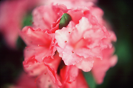
So why did I pick this caption? Don't rightly know;just seemed to
correlate well with my composition. Azaleas are quite 'photo favorable.' Taken with Canon FTB and normal lens- Kodachrome ISO 64.
~ Jeff Wiles
www.jeffwilesphotography.com
Comments
7 comments
Comment posted by Pat Sampson on February 25, 2011 at 3:59 PM
Rich color palette Jeff. I'm having a little trouble relating toe the shapes or finding a pattern in the composition. I think I probably need a little more dof in this but that's not unusual for me. See how the others react to the image.
pat
Registered on May 19, 2007, 953 Posts, 15989 Comments
Comment posted by Nancy Lea Sandy on February 25, 2011 at 10:12 PM
There is a dream-like quality to this image, very subjective, I think. The colors are excellent,
Registered on January 24, 2011, 576 Posts, 6942 Comments
Comment posted by Jeff Wiles on February 25, 2011 at 10:20 PM
Thanks for your comments Pat S. and Nancy S. Can hardly wait 'till Spring to discover some more dream-worthy subjects!
~ Jeff W.
Registered on January 22, 2011, 43 Posts, 46 Comments
Comment posted by Carol Hyman on February 25, 2011 at 11:06 PM
Hi Jeff,
Lovely color palette. Makes me want to see more of this flower. To my mind's eye, it's difficult to tell what I'm looking at.
Carol
Registered on January 18, 2007, 597 Posts, 8062 Comments
Comment posted by Jeff Wiles on February 26, 2011 at 12:52 AM
Hi Carol H., I must confess- there's a little trickery at play here. The shallow depth of field
was put there purposely to spike the imagination of your 'mind's-eye'.. ha!
Best, Jeff W.
Registered on January 22, 2011, 43 Posts, 46 Comments
Comment posted by Bill Fach on February 26, 2011 at 1:14 AM
Jeff: Nice colors. Would still like to see your posts bigger and the black frame merges too much with the image borders. >=))>
Registered on November 1, 2003, 1805 Posts, 26981 Comments
Comment posted by Michael Lowe on February 26, 2011 at 9:32 AM
Hi Jeff. I like the concept here. I think it could be better appreciated with a better BG. As Bill says the black merges too much into the photo. If youre posting on a black BG, try stroking a thin white line around your photo or a black line for a white BG.
Registered on February 11, 2004, 777 Posts, 5252 Comments


Comments
7 commentspat
~ Jeff W.
Lovely color palette. Makes me want to see more of this flower. To my mind's eye, it's difficult to tell what I'm looking at.
Carol
was put there purposely to spike the imagination of your 'mind's-eye'.. ha!
Best, Jeff W.