Nature Photographers Network
This is the preserved archive of the original Nature Photographers Network. The community continues at naturephotographers.network.
Wild Light on Mammoth
‹ PreviousLandscape GalleryNext ›

Wild Light on Mammoth

by Steve Sieren

Gallery: LandscapePosted March 2, 2011413 views18 comments
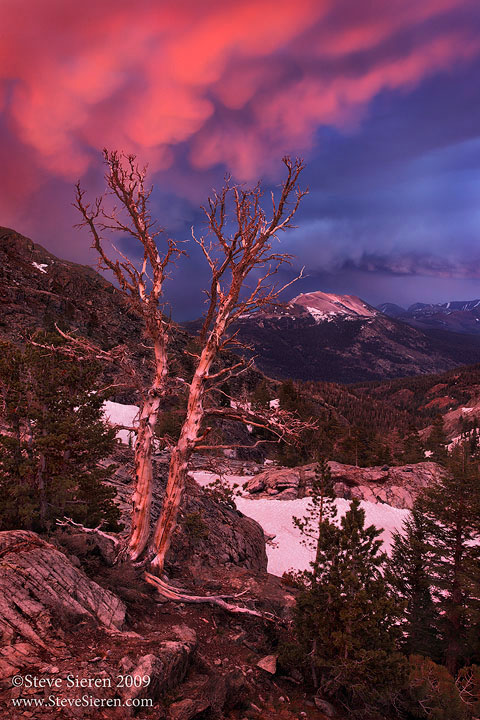
This one was taken a few years back after a quick late afternoon thunder storm from a ridge in the Minaret Wilderness. It was a bit of scramble in trying to unglob all the trees! I'm not one to sit in one place and just wait for the light. With the light above changing in so many different directions I felt like the tazmanian devil trying to get it all. Anyway it was a fun moment while it lasted.

If you don't get to backpacking much a gondola ride up to the top of Mammoth is a nice little experience. My pops took me up there as a kid once and when you're a kid everything is wow.

Comments

18 comments
Comment posted by Steve Sieren on March 2, 2011 at 10:50 AM
Here is a version where the shadows are brighter but I'm favoring the first version. Thanks for any feedback.
Registered on January 2, 2008, 360 Posts, 5321 Comments
Comment posted by Jared Ropelato on March 2, 2011 at 11:18 AM
Steve, great shot from a great vantage point. I'm liking the brighter version more (could be my monitor) as it allows my eye to enjoy the whole scene more. In the darker version, my attention is held by the clouds and the lit up mountain top in the back. In either case, I love the position of the tree as it appears to be "propping" up that great sky. The clouds seem to have a weight to them, great volume and drama. Wonderfully complex comp, layered and excellent processing.
Registered on March 1, 2011, 25 Posts, 204 Comments
Comment posted by Robert Stough on March 2, 2011 at 11:31 AM
I'd go for the dark side myself, Steve. It's a dramatic shot either way but there's nothing much in the foreground that you'd want to highlight and the flatter tone curve takes away from that wild sky.
Registered on November 20, 2010, 26 Posts, 273 Comments
Comment posted by Steve Sieren on March 2, 2011 at 11:34 AM
Jared, thanks your feedback it's appreciated. I agree with you on wanting to see all the details and the reason why I like the first version is part of what you said in your reply. You said you look at the main subjects. There are 3 of them in a simple triangle shape and I want the viewer focus more on these subjects rather then the scene as a whole with it's minor details. I'm no one to decide who likes what so it's nice to see how the group thinks here. Thanks again for the feedback Jared.

I was hoping to keep the colors more subtle as in the second version but with the curves adjustment they turned out a little stronger in the first version.
Registered on January 2, 2008, 360 Posts, 5321 Comments
Comment posted by Jared Ropelato on March 2, 2011 at 12:19 PM
No worries Steve. I'm a "wonderer" when viewing photos. Both you and Robert have a great point about giving what's most important more attention. Cheers. :toast:
Registered on March 1, 2011, 25 Posts, 204 Comments
Comment posted by Andreas Resch on March 2, 2011 at 1:30 PM
Wonderful shot with great colors and a magnificent sky. I also prefer the first version as it lets the trunks "shine" a bit better.
Registered on November 14, 2007, 322 Posts, 6101 Comments
Comment posted by Mat Malone on March 2, 2011 at 2:47 PM
Steve, I love mammatus clouds :smile:

The sky and distinctive, withered tree really carry the image and all balance nicely with Mammoth. You did a good job unglobbing the trees and the foreground, but I do wish the foreground was a bit less busy. Not an easy task below the treeline of course. I prefer the darker version.
Registered on December 15, 2008, 91 Posts, 882 Comments
Comment posted by Mark Seaver on March 2, 2011 at 6:59 PM
What amazing color in the clouds. I like the first version best. I don't mind "working" to see into the shadows and it emphasizes the snag.
Registered on January 23, 2011, 1103 Posts, 17270 Comments
Comment posted by Mark Metternich on March 2, 2011 at 9:46 PM
I'm still a kid and everything is still "wow"!

Nice shot Steve. :toast:
Registered on June 19, 2009, 276 Posts, 6240 Comments
Comment posted by Tony Kuyper on March 2, 2011 at 9:59 PM
I'm fascinated with your ability to always find such good comps with good light is happening, Steve. You make it look so easy. My preference is for the second version.
Registered on November 1, 2003, 364 Posts, 22328 Comments
Comment posted by Steve Sieren on March 2, 2011 at 10:39 PM
Mark, it's the only way to see!

Tony, it was a pain in the ass composition. Tree move left, mountain move right!
Registered on January 2, 2008, 360 Posts, 5321 Comments
Comment posted by David Chauvin on March 2, 2011 at 11:22 PM
Steve,,,,at first glance its hard to get past the intense color but the more I look the better the comp gets. :cool: My vote is for the darker version.
Registered on August 5, 2004, 1007 Posts, 5595 Comments
Comment posted by Eva McDermott on March 2, 2011 at 11:36 PM
I like the second version Steve. The first seems to have a touch too much of red/magenta. Spectacular scene,
Registered on January 4, 2009, 1015 Posts, 13229 Comments
Comment posted by Steve Sieren on March 3, 2011 at 2:56 AM
Eva, I know how you feel, I don't like magenta casts that much if they aren't really there but Floris can vouch for this one.
Registered on January 2, 2008, 360 Posts, 5321 Comments
Comment posted by Lizzie Shepherd on March 3, 2011 at 10:02 AM
Lovely powerful image Steve - I wonder if you could get the best of both worlds (ref colour/subject isolation) if you layered these two together and just brought out the elements that you like best from each?
We went skiing in Mammoth for a few days about 12 years ago - I can remember the most amazing views from the top - particularly for those of us used to skiing in Europe it was really strange being able to see desert down below!
Registered on March 2, 2011, 18 Posts, 120 Comments
Comment posted by Bruce King on March 3, 2011 at 11:18 AM
I usually prefer dark, moody scenes as opposed to brighter ones but in this case I think I like the second version slightly more. In the 1st, the snow seems a litttle strong/distracting. A nice image though, love the gnarly tree.
Registered on January 14, 2010, 276 Posts, 2212 Comments
Comment posted by Doug Roane on March 3, 2011 at 11:59 AM
Hey Steve,
I'm really liking the 2nd version. I'm actually finding the deep shadows a little distracting on the first one. Incredible sky and good comp. If you find a curves adjustment alters your color too much, you can change the blending mode of the layer to 'luminosity', and that will help alot.
Registered on December 12, 2008, 213 Posts, 2226 Comments
Comment posted by Hamed Musharbak on March 3, 2011 at 12:44 PM
very strange mood here Steve

i really like your vision in this

Hamed
Registered on June 1, 2009, 372 Posts, 2282 Comments