Nature Photographers Network
This is the preserved archive of the original Nature Photographers Network. The community continues at naturephotographers.network.
Shades of Ice
‹ PreviousLandscape GalleryNext ›

Shades of Ice

by Jimmy Gekas

Gallery: LandscapePosted March 4, 2011178 views18 comments
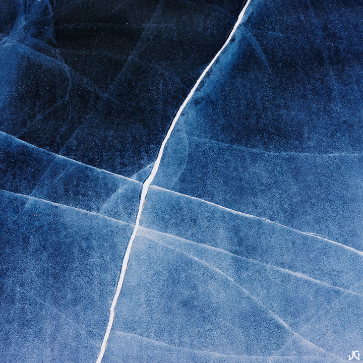
Rocky Mountain National Park, Colorado.

I think I have overstayed my welcome with all the ice abstracts, so this will be the last I will post. I recently got an 30 x 30 of the first ice shot I posted and it looks amazing...I should have got it printed larger. Oh, well. While not as visually stimulating as that image, I do like this one quite a bit for some reason. Maybe it's the different shades of blue or the gradation from dark to light.

Canon 5Dmk2, 90mm TS-E, two shot stitch.

Comments

18 comments
Comment posted by Jared Ropelato on March 4, 2011 at 1:34 PM
Great detail and abstract. Love the gradient and the tones. Very nice.
Registered on March 1, 2011, 25 Posts, 204 Comments
Comment posted by Adam Gibbs on March 4, 2011 at 3:05 PM
Lovely series of ice images Jimmy. The simplicity is very effective.
Registered on November 1, 2003, 168 Posts, 870 Comments
Comment posted by Margo Pinkerton on March 4, 2011 at 3:32 PM
I was drawn to the simple but very effective graphics here. Nicely done!
Registered on October 18, 2007, 39 Posts, 214 Comments
Comment posted by Bill Chambers on March 4, 2011 at 4:31 PM
I've really enjoyed the series Jimmy, and love this one - Reminds me of blue marble. Gorgeous
Registered on April 10, 2005, 753 Posts, 21216 Comments
Comment posted by Nick Bristol on March 4, 2011 at 4:39 PM
I agree, a wonderful series of these, Jimmy. They all have looked great to me, including this one. Yes, I bet that first one you posted looks great in the large print. Would be nice to see it.

Nick Bristol
Lone Rock, WI
Registered on February 1, 2004, 752 Posts, 14140 Comments
Comment posted by Harley Goldman on March 4, 2011 at 4:51 PM
Another fine image, JG. It has been a most enjoyable series.
Registered on November 19, 2003, 586 Posts, 11271 Comments
Comment posted by Morris McClung on March 4, 2011 at 6:57 PM
Another winner. You had a very productive trip, Jimmy! Beautiful work.
Registered on May 7, 2007, 670 Posts, 19650 Comments
Comment posted by Dan Baumbach on March 4, 2011 at 9:29 PM
Keep posting them. They keep getting better.

- Dan.
Registered on November 1, 2003, 473 Posts, 7980 Comments
Comment posted by Vlad Sadovsky on March 5, 2011 at 12:46 AM
Simplicity, geometrical impact is great. Texture of ice comes very effectively too. Transition of brightness from light to dark is quite interesting.
Registered on November 12, 2010, 48 Posts, 358 Comments
Comment posted by David Chauvin on March 5, 2011 at 7:43 AM
The whole series has been great and this is no exception. Creating balanced compositions from a riot of lines and color gradations is no small task and you make it look easy. :toast:
Registered on August 5, 2004, 1007 Posts, 5595 Comments
Comment posted by Tony Kuyper on March 5, 2011 at 8:41 AM
This has been a great series, Jimmy. I like this one for it's colors and it's connection, though I miss the bubbles.
Registered on November 1, 2003, 364 Posts, 22328 Comments
Comment posted by Eva McDermott on March 5, 2011 at 11:11 AM
I like the graphic nature and varying shades of blue here Jimmy. Anoher well seen ice abstract.
Registered on January 4, 2009, 1015 Posts, 13229 Comments
Comment posted by Scott Smorra on March 5, 2011 at 12:59 PM
Another nice ice abstract Jimmy. Have I mentioned that I've enjoyed the series? This one is very nice, but I agree with Tony that it needs some bubbles!
Registered on November 2, 2009, 161 Posts, 2143 Comments
Comment posted by Chris Chamberlain on March 5, 2011 at 5:01 PM
Yeah, this is nice with the natural fade from light to dark. I would agree that some bubbles would be an added bonus, but I think I see a lot of small details that would make this a great print.

Chris
Registered on March 13, 2007, 500 Posts, 8365 Comments
Comment posted by Jason Blankenship on March 5, 2011 at 9:04 PM
When/where can we see the entire(excellent) series in print :smile:
Registered on May 20, 2008, 15 Posts, 94 Comments
Comment posted by Preston Birdwell on March 6, 2011 at 2:41 PM
Jimmy, I find your ice abstracts quite intriguing...don't stop now! I like the linear nature of this one. It reminds of a blue crystal with inclusions. Nicely done!

--P
Registered on November 1, 2003, 471 Posts, 5188 Comments
Comment posted by Lon Overacker on March 6, 2011 at 3:03 PM
Jimmy,

Of course I'd have to compare prints, but from a web perspective I think I prefer this one - without the white blobs. Great abstracts all them, but this one is simpler and perhaps more striking. Great color too.

Lon
Registered on November 24, 2006, 521 Posts, 19147 Comments
Comment posted by Vance Gese on March 6, 2011 at 5:17 PM
Love the design and the tonal variation, Jimmy. Beautiful. Your series has been really phenomenal and would make a wonderful set of prints. Fantastic work.
Registered on November 13, 2008, 298 Posts, 6629 Comments