Nature Photographers Network
This is the preserved archive of the original Nature Photographers Network. The community continues at naturephotographers.network.
Dalmore, Isle of Lewis
‹ PreviousRegional: UKNP GalleryNext ›

Dalmore, Isle of Lewis

by Lizzie Shepherd

Gallery: Regional: UKNPPosted March 7, 2011194 views12 comments
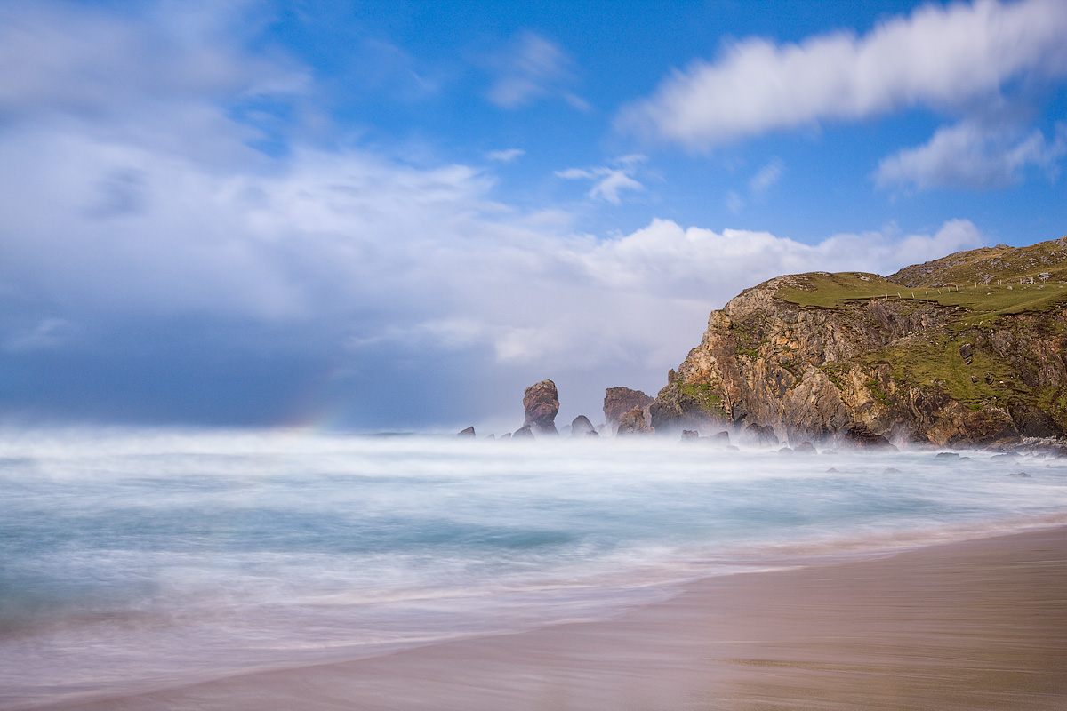
A brief trip to Lewis last October and on the first day, very strong winds and showery weather. I have versions with and without ND filter - of the former, this is the one I believe works best. I have a colour and B/W version and would be very interested to know if any preferences and why. Unfortunately you can only see the colour one LARGE but worth doing so as the large sea stack looks just like a giant cat emerging from the waves - well it does to me! ;-) I will post the B&W version in the first reply here.
1DSiii, 24-70 at 40mm, ISO200, 8 secs, CPL + 10 stop ND

Comments

12 comments
Comment posted by Lizzie Shepherd on March 7, 2011 at 5:00 PM
Here is the B&W version
Registered on March 2, 2011, 18 Posts, 120 Comments
Comment posted by Cristina Strudthof on March 7, 2011 at 5:17 PM
I like the composition and the effect of the long shutter. The small rainbow is an added bonus of color even though the rest of the scene has plenty of great color. Nice work. :toast:
Registered on January 14, 2011, 53 Posts, 363 Comments
Comment posted by Lizzie Shepherd on March 7, 2011 at 5:23 PM
Christina - thank you. I should have said that the rainbow was in fact far more complete earlier on when I was not using the ND filter - you get more of the power of the waves and the rainbow is fun but the foreground becomes a little 'ugly' without the slower s/s - small versiobn on my website if interested:
http://www.lizzieshepherd.com/photo_7075069.html
Registered on March 2, 2011, 18 Posts, 120 Comments
Comment posted by Ian Haskell on March 7, 2011 at 6:32 PM
Hi Lizzie,

I have been here and stood here, but not in such good conditions. I take it there were good sand patterns on the beach with the stormy weather. I enjoy the mood and the painterly feel to the overall photo...and find is very good. Did you get any evening shots?

Ian
Registered on October 30, 2008, 24 Posts, 673 Comments
Comment posted by Larry Reitz on March 7, 2011 at 6:39 PM
I really like this Lizzie. If it were mine it would be printed large and hung prominently on the rack in my show booth. The black and white version is OK, but the color version is outstanding. IMHO the colors n this image are just too good to lose.
Registered on September 7, 2007, 32 Posts, 335 Comments
Comment posted by Lizzie Shepherd on March 8, 2011 at 4:32 AM
Many thanks Ian and Larry.
Ian - no sand patterns that I recall - probably a bit too much surf for any to hang around in any case. It was a bit late in the year for evening shots here so I didn't try - but of course would be great in the summer.
Registered on March 2, 2011, 18 Posts, 120 Comments
Comment posted by Edwin kats on March 8, 2011 at 4:49 AM
Both versions work really well. But I like the colored version best because of the great colors and rainbow. Beautiful!!

Edwin
Registered on April 24, 2006, 177 Posts, 399 Comments
Comment posted by Neil Burton on March 8, 2011 at 8:47 AM
The sky works better in colour, perhaps work on that in the B&W version a little more contrast!
Registered on September 16, 2010, 26 Posts, 461 Comments
Comment posted by Eva McDermott on March 8, 2011 at 7:14 PM
Oh my Lizzie, definitely the color version The sand and water color are gorgeous as is the touch a rainbow. Wonderful water motion as well.
Registered on January 4, 2009, 1015 Posts, 13229 Comments
Comment posted by Lizzie Shepherd on March 9, 2011 at 12:30 PM
Thanks all! Colour wins again it seems! ;-) I like the fact that I can bring out more of the textures in the rock and waves in the B+W - something I find I can't do in the colour one without giving it a too gritty look.
Neil - I had already increased the contrast very slightly with the B+W version - deliberately not more so as I didn't want to lose the slight dreamy look of the slower exposure - but I agree it would make the sky that much more dramatic were I to do so.
Registered on March 2, 2011, 18 Posts, 120 Comments
Comment posted by Geoffrey Baker on March 10, 2011 at 4:07 PM
This is lovely Lizzie, good use of the 10 stopper.
I prefer the colour version myself.
Well done.

Geoff.
Registered on August 20, 2010, 192 Posts, 980 Comments
Comment posted by Danny Green on March 13, 2011 at 5:59 PM
Beautiful, just bloody beautiful.

Danny
Registered on November 27, 2005, 70 Posts, 313 Comments