Her Majesty, The Queen
by Ashley Vincent
Canon EOS 40D, EF 100-400mm f/4.5-6.5L IS USM @ 285mm, Program Mode @ f/5.6 (1/25 sec), ISO 640, JPG from RAW
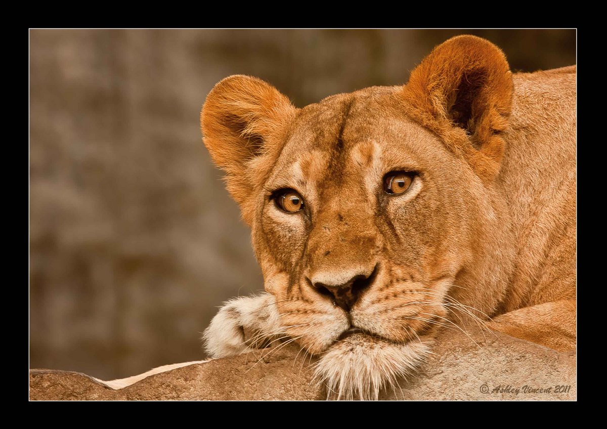
Five days after taking that shot of The King, I was back again at the zoo determined to capture at least one good shot of The Queen and this is the one I liked the most, for the pure intensity of her stare. The eyes of big cats always seem to hold at least a glint of potential danger but, while Leopards are my favourites, for me no cat can match the mesmerising intensity and sheer menace in the look from a Lion's eyes 8^.
Ordinarily I wouldn't want to show any images of animals where anything manmade was so clearly visible, but I've made an exception is this lady's case, as her look speaks such great volumes to me ;^)
PP: Slight crop of the top and sides, though nothing off the bottom; would have wanted to allow a bit more space for the hairs on her chin, but wanted to have as little of that ghastly piece of concrete she was laying on in view. Worked with shadow and highlights while also boosting the vibrance.
Critique and comments as always welcome and thanks in advance :^)
Ashley

Comments
11 commentsThanks for sharing.
Balan Vinod
Andrius & Richard: Totally agree, I should have stepped back a bit more to allow full view of the hairs on her chin ;^)
Balan: Just before I took this shot I'd been taking others of her (that didn't come out nearly as well) where she was staring to the left and I'd been trying to compose those to allow her more room to look into, so when she finally decided to pay me a little attention, without thinking I automatically went for the same composition I'd been trying before. But as you astutely noted, this is one shot where having the subjects head much more centrally positioned would probably have been a far better composition ;^)
Stu: I did actually blur the BG quiet a bit in PS, but interesting to note your suggestion that it could do with a bit more ... OK, just re-worked it in PS again and yep, I think this looks much better, thanks :^) Damn! just realised I could have also given her ear a little more space at the top ;^. Haven't got the time to work this again right now, but thanks also for pointing this out and, should I show her off again, you can be sure I'll make the correction beforehand ;^)
Yep, this was set at 1/25, not 1/125; the lighting was pretty low.
I like the general composition and have little new to add beyond what has already been said. I do quite love the expression that's driven by those inquisitive eyes (almost as tho' she's pondering what you'd taste like!).
I am in agreement with the crop being a little tighter than I like - I know you have no more room on the bottom (pity - losing those whiskers is quite unfortunate) but I would definitely add a LITTLE more room on top.
To my eye, and on my monitor, the subject looks a little too orange/red to me. This could be accurate and/or natural, but what makes me think this is even the white portions of the chin and paw carry the colour cast...
Cheers...thanks for sharing this...
Brad
Brad: Yep, I agree there's a tad too much saturation where the orange level is concerned ;^)
Before working on photos in PS I always make the basic adjustments in Lightroom 3, the first one always being White Balance. With this image, the colour temperature as shot in RAW was 3950 (tint: +15), and when I clicked Auto (which for my taste is, more often than not, spot on) it seemed to give everything a far too washed-out and cold appearance at the setting of 3650 (tint: +10), so I tired the next option down, which was Daylight, and hit a setting of 5500 (tint: +10) and was immediately blown away by the rich colourful effect! 8^)
I should perhaps hasten to add that this adjustment was made pretty early on in my learning by experimentation with post-processing tools, and it took a while for me to draw back a little on any of the controls that seemed to sock me in the eye with the impact of the WOW! factor one acquires at the higher settings - LOL ;^p
OK, the least I can do in thanks and appreciation for all the helpful thoughts and suggestions I've been receiving, is rework this one and show you the result I hope you'll find somewhat more pleasing than the original I posted :^)