Infinite Sands
by Basil Greber
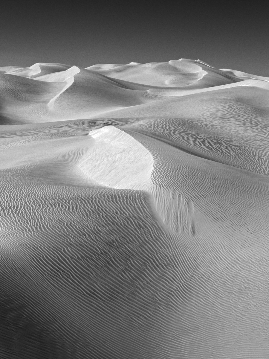
While I think that this shot would also work in color, I feel that I like the mood of the B&W version much better. The eye is not as distracted by the blue-yellow contrast between the sky and sand, so the pattern in the sand that is leading into the scene is more prominent (so I think, at least).
Techs: Nikon D300, 17-55/2.8 DX @ 32 f/11, handheld; B&W conversion and quite some contrast increase in RAW conversion. Taken in Oman.
What do you think?

Comments
11 commentsYour are right about B&W working well in this image. I like the pattern on the sand but wish the pattern was not disrupted by the brighter central patch. May be toning down the bright spot may help - just need to experiment.
Good contrast and great FG lines.