Nature Photographers Network
This is the preserved archive of the original Nature Photographers Network. The community continues at naturephotographers.network.
Twin Stacks
‹ PreviousLandscape GalleryNext ›

Twin Stacks

by Gary Yeoh

Gallery: LandscapePosted March 20, 2011292 views12 comments
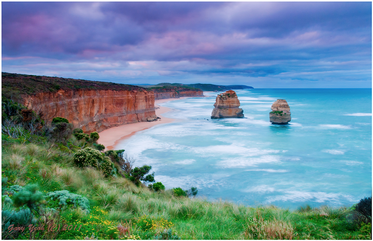
Thanks for the feedback on my previous post. with the general comment it was over-saturated. As it turned out, I did not increase the saturation per se with that image which was attributed to TK smart glow action which was applied. In any the case, the image was very saturated because of the use of polariser and long exposure. This image is taken about the same time but looking east towards Gibson steps and the beach rather than west as in the previous shot. I have posted the same two stacks taken at the beach level in M&N. I have used channel layers to simulate Velvia film which accentuates the green which is quite obvious in the vegetation. Saturation was reduced by 20 for the water. Some selective brightness adjustment with Viveza 2. Levels and curves using TK luminosity mask.

D90 18-200@18mm F20 5sec graduated ND8 filter. Thanks for looking and C&C appreciated. I am interested to hear comments on the processing especially Velvia simulation.

Comments

12 comments
Comment posted by Sebastian Kraus on March 20, 2011 at 8:41 AM
Lovley colourus but for me blue is just a little bit oversaturated.
Registered on March 17, 2011, 30 Posts, 132 Comments
Comment posted by Neale Dyster on March 20, 2011 at 9:00 AM
Gary I love your f/g and the cliffs but like Sebastian, to me the blue water looks oversaturated. Nice image.
Registered on February 19, 2008, 94 Posts, 738 Comments
Comment posted by Stan Rose on March 20, 2011 at 11:40 AM
Real pretty comp, Gary--a nice balance of the elements here. Looks like a nice postcard. Oh yeah--its oversaturated :wink:
Registered on September 15, 2005, 836 Posts, 17099 Comments
Comment posted by Morris McClung on March 20, 2011 at 3:55 PM
It's a great scene, and very beautiful, Gary. But, it is like the grad gave a different color cast to the top than what is at the bottom. And since they don't appear to be the same, the top and bottom seem disconnected, if that makes any sense. I like the colors at the top, but the bottom seems too light and maybe too cyan. Just a little more balance in that, and it's a big wall hanger.
Registered on May 7, 2007, 670 Posts, 19650 Comments
Comment posted by David Taylor on March 20, 2011 at 4:06 PM
I happen to like it, as is. Everyone has legitimate comments, but I really believe that technical perfection is the enemy of passionate photography - hope THAT comment isn't too over the top :biggrin: Often times, I think we get caught up too much in the minutiae of technique and overlook the spirit of the capture.
What I mean is, you captured a feel here. Lush vegetation, beautiful warm light at an amazing location. Well done. :toast:
Registered on March 3, 2008, 25 Posts, 64 Comments
Comment posted by Tony Kuyper on March 20, 2011 at 9:51 PM
Doesn't look over-saturated to me, Gary. Stan must be having monitor problems. This is very nice. My only thought is to burn down the center some as it's brightness feels a bit out of balance with the rest of the frame.
Registered on November 1, 2003, 364 Posts, 22328 Comments
Comment posted by Stan Rose on March 21, 2011 at 12:35 PM
Ha! :jump: Tony wears special contact lenses that decrease the global saturation by 50%, so he sees things a bit differently than the rest of us mere mortals :biggrin: :wink:
Registered on September 15, 2005, 836 Posts, 17099 Comments
Comment posted by Phil Pogledich on March 21, 2011 at 4:29 PM
I like the composition quite a bit, particularly the sweep of foliage in the foreground. The dramatic sky also helps make this a fine capture.

As far as improvements, I'd suggest considering a crop from the right to eliminate that dark bush that just makes its way into the bottom of the frame. The saturation issue is an interesting one. If not for your comments, I'd agree with the others (except Tony) and say that it feels oversaturated. But having never been there I really have no idea what, in fact, the color of the sea actually is, etc. The sky does seem a bit "off", however, and I think that selectively removing some or perhaps most of the magenta from the sky would help bring the overall color scheme into more of a pleasant balance.

As a final thought, you could use the selective color tool (or another, if you have something you're more comfortable with) in PS with a layer that isolates the foreground to create a bit more color contrast between the foreground and the ocean. Both feel a bit blue/cyan . . . that's good for the ocean, not so good for the plants, which I think could benefit from a bit of warming.
Registered on August 24, 2009, 123 Posts, 3099 Comments
Comment posted by Chris Chamberlain on March 21, 2011 at 10:47 PM
Nice comp, and beautiful scene. Only issue for me is the color. Seems too intense for me. At least the blues overall.

Chris
Registered on March 13, 2007, 500 Posts, 8365 Comments
Comment posted by Craig Myers on March 22, 2011 at 1:09 PM
Really like this comp AND the colors (a real study in pastels). Reminds me of those old color postcards with the deckled edges.
Registered on September 1, 2008, 85 Posts, 757 Comments
Comment posted by Mohammad Hosseini on June 28, 2011 at 9:52 AM
I have the same feeling as Craig. It is nice and very cliche. Colors just don't connect with me.
Registered on May 16, 2011, 15 Posts, 301 Comments
Comment posted by Jared Ropelato on June 28, 2011 at 9:43 PM
I really like the perspective here. Very nice composition.
Registered on March 1, 2011, 25 Posts, 204 Comments