Headwaters--95
by Nancy Lea Sandy
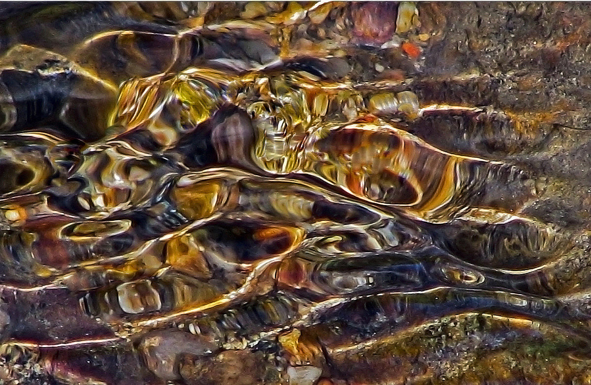
I am very grateful for all the critiques and suggestions I've recieved on this series. On my last 'headwaters' post, it was suggested that including recognizable elements might increase the overall impact of the image. I think the pebbles in the bg of this image are recognizable. Do they help emphasize the current in the image? Do they ground the image? Do they help provide a pathway for the veiwer to 'wander' through the image? Do they increase the overall impact of the image? All critiques and suggestions are most welcome.
1/400sec f/3.5 200mm
Thanks for looking

Comments
15 commentsBalan Vinod
EDIT: Dumb Me, I just figured out that ALL of the color in the center is caused by the pebbles. DUH! In that case, let me change my statement about impact. The pebbles make a very positive imapct! Sorry Nancy.
Being this an abstract I think some liberties can be taken editing and I'd try a blue version of the water. Maybe I don't like browns :)
Balan, I will attempt your suggestion next time I'm out.
Luis, Blue is probably more traditional for water but beyond sharpening and sometimes increasing the saturation, I try to keep these images 'as shot'.
Thanks all of you for your suggestions.
Peter
Gary.
I think you could also do a square crop of the left side where the rock vs sandy areas are (no sandy areas if that makes sense).
Mark