Nature Photographers Network
This is the preserved archive of the original Nature Photographers Network. The community continues at naturephotographers.network.
Texas Evening
‹ PreviousMan & Nature GalleryNext ›

Texas Evening

by Cristina Strudthof

Gallery: Man & NaturePosted March 23, 201196 views5 comments
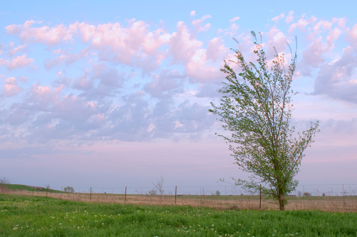
I shot this last night hoping that I would get some really nice cloud formations for a good sunset. Unfortunately, my clouds didn't cooperate the way I wanted them to so I moved to plan B, which was across the road from where I had setup my tripod. I did quite a bit to this photo is CS4 but I'm hoping that it looks realistic (reduced contrast, added cooling filter, increased saturation, slight burning). Comments welcome.

Nikon D300s, 24-70mm @ 24mm, ISO 320, f/20, 1/2 sec

PS - This was my first trip with my new tripod and ball head set up. The ball head, RRS BH-55, is a tremendous improvement over what I had before. I think my days of a drifting ball head are over, YEA! :jump:

Comments

5 comments
Comment posted by Mark Seaver on March 23, 2011 at 8:04 PM
Cristina, that's a lovely sky with all those pastel pink clouds. I find myself wishing for a foreground that would add depth to the image.
Registered on January 23, 2011, 1103 Posts, 17270 Comments
Comment posted by Lucy VanSwearingen on March 24, 2011 at 8:18 AM
Welcome to the network!

I'd like to see the sky darkened. Too bad about the blown highlights. Would also be pretty to "spruce up' the FG by giving it more contrast and sharpen things up a bit. Both would give it the depth Mark mentioned.

And, I hate those little burned branches at the top. I get those, too, and I clone them out. mine are always at sunset and are either purple or orange!.
Registered on May 23, 2009, 800 Posts, 2042 Comments
Comment posted by Bill Chambers on March 24, 2011 at 8:20 AM
A very pleasing image. I think it might be even more pleasing without the increased saturation.

I've been using the BH-55 for 4-5 years now - you will be VERY pleased you got it.
Registered on April 10, 2005, 753 Posts, 21216 Comments
Comment posted by Manoj Vallati on March 24, 2011 at 9:33 PM
the beautiful colors would pop even more if you reduce the exposure of the highlights and increase the contrast of the foreground ( midtones ).. I wish there was more area to look at in the current picture
One more visit to the same place might please your clouds and may they bless you with more colors :)
Registered on February 24, 2011, 49 Posts, 148 Comments
Comment posted by Michael J Greene, on March 25, 2011 at 11:54 AM
Peaceful and lovely color palette. Nice work Cristina. I agree with the others about an increase in contrast or saturation.

Michael
Registered on June 18, 2009, 86 Posts, 2317 Comments