Nature Photographers Network
This is the preserved archive of the original Nature Photographers Network. The community continues at naturephotographers.network.
Island Spring + REPOST
‹ PreviousLandscape GalleryNext ›

Island Spring + REPOST

by Wayne Jones

Gallery: LandscapePosted March 24, 2011179 views13 comments
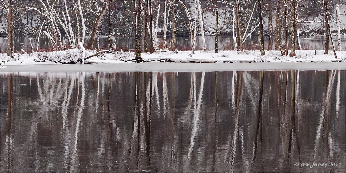
First day of Spring on a little island in the upper Hudson River. (That's ice on the shoreline, not sand.)
There were a couple of strange things I encountered in processing this.
-- First, the angle of the island seems to make this look like it has a slight counter-clockwise tilt, even though I checked the reflections carefully, and it is perfectly level. QUESTION: Should I tilt it clockwise anyway?
-- Second, the original image and even the 1200 pixel image have no blown highlights, but some detail was lost in the shrinkage process, causing some of the white parts to loose detail. I suppose I could fix that, but at least the large image looks OK. Just thought I would mention that.

Stitched Panorama of 3 vertical frames. (Top and bottom cropped)
Canon 50D; Sigma 17-70mm.
f/11 @ 1/15 sec.; 2-sec. Self-timer; mirror up
Tripod w/home-made pano bracket.

Comments

13 comments
Comment posted by Morkel Erasmus on March 24, 2011 at 4:22 PM
I quite like the idea here Wayne...I just wonder if it wouldn't have been better with more on top and less water at the bottom? Did you purposefully crop the top out due to distracting elements like houses?
Registered on March 22, 2011, 385 Posts, 2068 Comments
Comment posted by R.Bill Moser on March 24, 2011 at 4:28 PM
I do also like the composition idea here. nice reflections. I like this image
Registered on January 29, 2010, 285 Posts, 4281 Comments
Comment posted by Kyle L. Krause on March 24, 2011 at 4:42 PM
Superb intimate winters scene Wayne. I like the abstract feel with in the image. I would not change a thing. Nicely done.
Registered on June 15, 2010, 29 Posts, 605 Comments
Comment posted by Adam Gibbs on March 24, 2011 at 4:43 PM
Nice idea Wayne. The pano works very well although I tend to agree with Morkel in that I would like to see just a bit more stuff on the top.
Registered on November 1, 2003, 168 Posts, 870 Comments
Comment posted by Bill Chambers on March 24, 2011 at 4:46 PM
Hey, I like this a lot!. This would look super printed large and wideeee! The reflections just pull me right in. I would NOT tilt it - looks fine to me.
:toast: :toast: :toast:
Registered on April 10, 2005, 753 Posts, 21216 Comments
Comment posted by Wayne Jones on March 24, 2011 at 7:35 PM
Thanks guys.
Morkel and Adam. This is a wild section of the river flowing through State lands (no buildings) so the only reason for my pano crop was that I decided to concentrate on the reflections. Here's a 4x6 crop of the 3-image composite, showing some background woods through a misty rain. I may try some cropping alternatives that show a bit more of the upper part, but I still want the reflections to dominate the image.
Registered on April 18, 2007, 953 Posts, 6435 Comments
Comment posted by Morris McClung on March 24, 2011 at 7:50 PM
A very interesting mix of tones and lines, Wayne. I like your comp choice to emphasize the refelctions. A unique and engaging piece for me.
Registered on May 7, 2007, 670 Posts, 19650 Comments
Comment posted by Neale Dyster on March 24, 2011 at 8:11 PM
Nice work Wayne, I like the repost but I think the reflections in the original crop are great too. It doesn't need a tilt imho.
Registered on February 19, 2008, 94 Posts, 738 Comments
Comment posted by Barbara Graham on March 24, 2011 at 8:40 PM
Wayne, I understand your comp choice to emphasize the reflections, but having said that the repost is breathtaking to me.
Registered on July 27, 2010, 1310 Posts, 5035 Comments
Comment posted by Mark Seaver on March 24, 2011 at 9:23 PM
Lovely scene, Wayne. The two images give completely different feels. I like the emphasis in the pano (post 1) on the reflections. Your comments about the tilt or the perception of tilt certainly ring a bell. I'm inclined to think that because it's now so easy now to adjust for tilt that we look for it (possibly excessively). I find myself often wondering if the image is tilted or if the shoreline, ridgeline, etc. is moving away or dropping lower. There are many instances where the translation from 3D into a 2D picture create angles that can be perceived as tilt, when the angle is the truth....time to jump down of my soap box. Nice pictures!
Registered on January 23, 2011, 1103 Posts, 17270 Comments
Comment posted by Zack Clothier on March 25, 2011 at 12:09 AM
Nice scene on the Hudson, Wayne. IMHO If this were mine I would crop so that the distant shoreline is 1/3 of the way down from the top, right about at the top of the birch that is a little off center to the right. I would leave the tilt alone, the distant shoreline is level. Nice work!
Registered on January 28, 2010, 343 Posts, 2257 Comments
Comment posted by Bill Chambers on March 25, 2011 at 8:22 AM
I just get a chance to check out the repost. Like Mark Seaver mentioned, it's a completely different feel than the original post. Both are wonderful and it's hard to choose between the two. If I had to choose, I would choose the original post, but thankfully, I don't have to make that choice because I thoroughly enjoy both.
Registered on April 10, 2005, 753 Posts, 21216 Comments
Comment posted by Phil Pogledich on March 25, 2011 at 4:45 PM
I like the original but am more drawn to the repost, perhaps because (like others) I'm wishing for a bit more room at the top of the original. Either way you found and captured a nice scene here. I would not tilt it, as I think the tilt would then show up in the reflections.
Registered on August 24, 2009, 123 Posts, 3099 Comments