Gallery: Regional: UKNPPosted March 25, 2011271 views15 comments
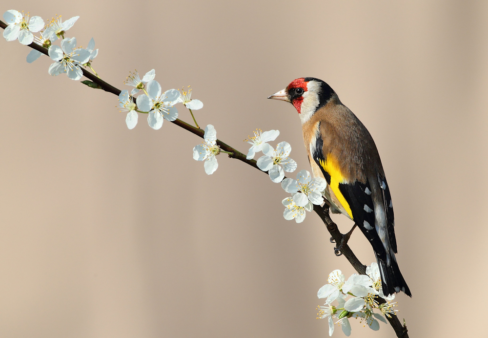
A Goldfinch from the garden. Have also done a portrait version would appreciate you thoughts on which works best.
Canon 1DMK4, Canon 500f4L, ISO 400, f9, 1/800
Comments
15 comments
Comment posted by Karen Summers on March 25, 2011 at 7:24 PM
Portriat version
Registered on December 3, 2009, 83 Posts, 818 Comments
Comment posted by Ian Haskell on March 25, 2011 at 7:45 PM
Hi Karen
I like both and the bird stands out from the background on both. Detail is there across the entire bird which I think is great. If I was to choose from the versions on here I would probably go for the portrait version. Of course this view may change from a printing point of view.
Ian
Registered on October 30, 2008, 24 Posts, 673 Comments
Comment posted by Larry Reitz on March 25, 2011 at 8:40 PM
Great capture of a beautiful bird on an attractive perch. Both versions are well composed. However, IMO the vertical crop version is much better. The bird is larger in the frame and focuses one's attention on the subject.
Registered on September 7, 2007, 32 Posts, 335 Comments
Comment posted by Catherine Reilly on March 26, 2011 at 2:05 AM
Mmmm... tough call on which is better between landscape and portrait views. I think it's an altogether wonderful shot no matter which way it sits. The detail and sharpness on bird and blooms and the separation of subject from bg are so well done.
Registered on August 16, 2006, 603 Posts, 9192 Comments
Comment posted by Edwin kats on March 26, 2011 at 3:50 AM
Hi Karen,
Beautiful bird and perch. Like the vertical best. The shadows are a bit of a shame because now the birds legs have the same colour as the perch. Light is a bit harsh I think. A bit more 'eyes to camera' would improve this great shot to a superb one.
Edwin
Registered on April 24, 2006, 177 Posts, 399 Comments
Comment posted by Karen Summers on March 26, 2011 at 6:31 AM
Thanks everyone, Edwin you are right of course about the harsh light did set myself up with a challenge really especially with the white blossom aswell, went with this one because of the comps but have got some with the shadow not so strong so the legs show a better colour and one with the head more turned so will have a go with those.
Registered on December 3, 2009, 83 Posts, 818 Comments
Comment posted by Dave Bartlett on March 26, 2011 at 6:40 AM
I would go for the portrait version if I had to choose, but both are excellent. The curve of the perch is attractive in the portrait version. Light looks a bit harsh, but its nice to actually have light!
Dave
Registered on March 9, 2008, 9 Posts, 113 Comments
Comment posted by John Robinson on March 26, 2011 at 7:45 AM
First one for me. Hard light handled well too.
JR
Registered on March 2, 2008, 535 Posts, 2453 Comments
Comment posted by Phil Mclean on March 26, 2011 at 7:48 AM
Certainly a challenge with that light and whites but you've done a good job.
Portrait version for me Karen.
Phil.
Registered on March 16, 2010, 30 Posts, 153 Comments
Comment posted by David Sewell on March 27, 2011 at 8:48 AM
Which version? The portrait for me, but only by a whisker. The blossom is the icing on the cake and, as others have noted, you have handled the lighting conditions well.
David
Registered on September 10, 2008, 63 Posts, 801 Comments
Comment posted by Guy Rogers on March 27, 2011 at 6:04 PM
Hello Karen.
Two very nice images and it would be the portrait one for me if I had to choose.
Registered on January 16, 2007, 450 Posts, 995 Comments
Comment posted by Barrie Courtenay on March 28, 2011 at 12:43 PM
Hi Karen,think the landscape for me but both brilliant images,superb colours and sharpness
Registered on July 11, 2005, 12 Posts, 98 Comments
Comment posted by Andy Shepherd on March 29, 2011 at 1:44 PM
Landscape for me too, Karen.
Andy...
Registered on September 24, 2006, 123 Posts, 1254 Comments
Comment posted by Craig Jones on March 30, 2011 at 7:57 AM
The portrait looks better Karen but I do like the landscape also. The soft colours look great and the pose and detail is brilliant
Registered on January 31, 2009, 67 Posts, 316 Comments
Comment posted by Geoffrey Baker on March 31, 2011 at 5:01 PM
A great image Karen, I prefer the portrait version but only marginally
Well done.
Geoff.
Registered on August 20, 2010, 192 Posts, 980 Comments

Comments
15 commentsI like both and the bird stands out from the background on both. Detail is there across the entire bird which I think is great. If I was to choose from the versions on here I would probably go for the portrait version. Of course this view may change from a printing point of view.
Ian
Beautiful bird and perch. Like the vertical best. The shadows are a bit of a shame because now the birds legs have the same colour as the perch. Light is a bit harsh I think. A bit more 'eyes to camera' would improve this great shot to a superb one.
Edwin
Dave
JR
Portrait version for me Karen.
Phil.
David
Two very nice images and it would be the portrait one for me if I had to choose.
Landscape for me too, Karen.
Andy...
Well done.
Geoff.