Galleries
Forums
Portfolios
PhotoPortfolios
Groups
Instruction
Inspiration
About
This is the preserved archive of the original Nature Photographers Network. The community continues at
naturephotographers.network
.
‹ Previous
Photo Art Gallery
Next ›
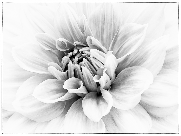
Softly
by
David W. Kelly
Gallery:
Photo Art
Posted
April 5, 2011
184
views
13
comments
I shot this image a couple of summers ago at my local conservatory. I converted it in SEP2 and was going for a bit of a sketch quality.
Comments
13 comments
Comment posted by
Bill Chambers
on April 5, 2011 at 4:13 PM
Wow, this is superb David! Great composition and conversion.
Registered on April 10, 2005, 753 Posts, 21216 Comments
Comment posted by
Jeremy Week
on April 5, 2011 at 6:01 PM
Very beautiful David! I really like how the petals flow out and sort of disappear at the edges. Well done!
Registered on February 19, 2007, 62 Posts, 394 Comments
Comment posted by
Craig Myers
on April 6, 2011 at 12:02 AM
A beautiful, delicate presentation. Love the shading.
Registered on September 1, 2008, 85 Posts, 757 Comments
Comment posted by
Christine Adams
on April 6, 2011 at 6:33 AM
Hi David. This is really nice! Love the dahlia! Normally, I'm not a huge fan of B&W, but this is exquisite!
Registered on January 24, 2006, 119 Posts, 1871 Comments
Comment posted by
Eve Burgum
on April 6, 2011 at 8:36 AM
Greyscale is an interesting effect with flowers. Emphasizes their form and texture. Maybe could use some kind of frame, vignette or contrast too.
Registered on January 21, 2011, 65 Posts, 20 Comments
Comment posted by
Bob Duff
on April 6, 2011 at 12:53 PM
David, this is one of the best B&W flora (being a colour guy you know) images I've seen IMFO..i
Registered on April 21, 2010, 160 Posts, 1675 Comments
Comment posted by
Morris McClung
on April 6, 2011 at 6:36 PM
Excellent and yes, it looks like a sketch to me. I really like the lighter vignette on this, too!
Registered on May 7, 2007, 670 Posts, 19650 Comments
Comment posted by
Nancy Lea Sandy
on April 6, 2011 at 9:46 PM
Beautiful details. I'd say it's a remarkable b&w image but it's actually more of a white-on-white. I find myself holding my breath when I look at it.
Registered on January 24, 2011, 576 Posts, 6942 Comments
Comment posted by
Carol Hyman
on April 7, 2011 at 4:33 PM
David, I think this is exquisite. Great high key effect.
Carol
Registered on January 18, 2007, 597 Posts, 8062 Comments
Comment posted by
Bill Fach
on April 9, 2011 at 1:36 PM
David: This is just superb! Your recent conversions are just fabulous.
>=))>
Registered on November 1, 2003, 1805 Posts, 26981 Comments
Comment posted by
Ron Pederson
on April 10, 2011 at 8:34 AM
Great job with this one, David. The shapes and the conversion work well.
Registered on October 19, 2010, 95 Posts, 470 Comments
Comment posted by
David W. Kelly
on April 11, 2011 at 8:33 AM
Thanks Everyone
Registered on October 7, 2005, 883 Posts, 6590 Comments
Comment posted by
Wayne Rhodus
on April 13, 2011 at 11:14 AM
Beautiful David, this does look like a hand sketched drawing. Nice effect and a wonderful subject for this treatment.
Registered on November 16, 2003, 157 Posts, 3326 Comments

Comments
13 commentsCarol