Nature Photographers Network
This is the preserved archive of the original Nature Photographers Network. The community continues at naturephotographers.network.
Government Shutdown + repost
‹ PreviousLandscape GalleryNext ›

Government Shutdown + repost

by Stan Rose

Gallery: LandscapePosted April 9, 2011340 views25 comments
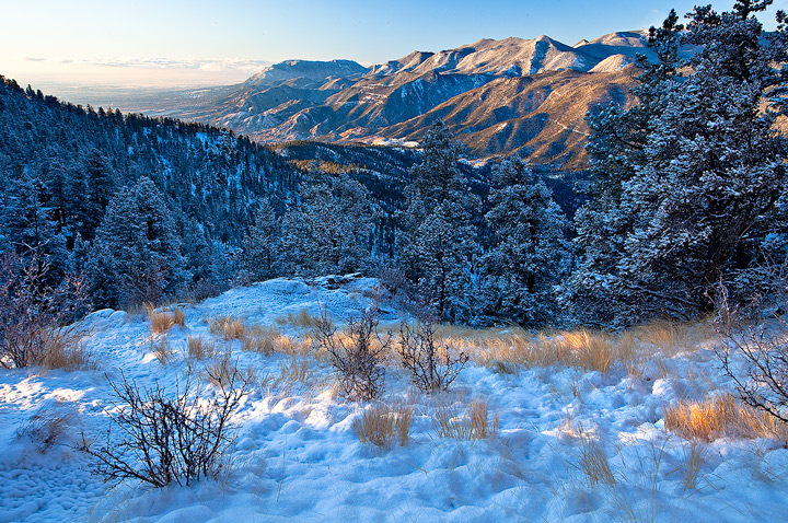
Why fret--just head up Rampart Range Road through a few inches of fresh snow and soak in the views of distant Cheyenne Mountain (inside the hollowed mountain lies NORAD...) from up high. Im hoping for at least one or two snowfalls to go, im not ready for Winter to end just yet...
5Dmkii; 17-40; 2img blens at f/20
C&C Welcome!
SEE REPOST BELOW!

Comments

25 comments
Comment posted by John Mumaw on April 9, 2011 at 2:34 PM
A real purty viewpoint, Stan! Great colors, too.
I think you could crop about an inch from the left to lose that real bright patch of snow and more of the bright skies.
Registered on September 9, 2005, 62 Posts, 2289 Comments
Comment posted by Peter Richter on April 9, 2011 at 2:54 PM
Stan, you show us an incredibly natural look of this scenery, I feel like breathing the fresh air!

Peter
Registered on November 10, 2010, 218 Posts, 2723 Comments
Comment posted by Bill Chambers on April 9, 2011 at 2:56 PM
very pretty. The overall scene is nice, but what I love is the brown garsss against the white snow!
Registered on April 10, 2005, 753 Posts, 21216 Comments
Comment posted by Andreas Resch on April 9, 2011 at 3:04 PM
I find the blues a bit strong but they interact so nicely with the warm grass, so maybe it's a good thing after all. The comp is classy as always as are the details. What a place to rest and enjoy.
Registered on November 14, 2007, 322 Posts, 6101 Comments
Comment posted by Nick Bristol on April 9, 2011 at 4:44 PM
Stan, What a beautiful place. I can see why you would like a couple more snows. The light here is just wonderful! The lit up golden grass looks great with the shadowed snow. A fantastic look to me. another :toast: hmmmmm...I think my head might be starting to spin a bit. :wink:

Nick Bristol
Lone Rock, WI
Registered on February 1, 2004, 752 Posts, 14140 Comments
Comment posted by Ken Smith on April 9, 2011 at 5:40 PM
Beautiful scene! I like the golden grass with sun rays. Agree w/other comment on strong blues...but, it gives a chilly mood for late in the day and when sky leans on the blue hues. Comp is nicely balanced.
Registered on September 5, 2008, 449 Posts, 2444 Comments
Comment posted by Morris McClung on April 9, 2011 at 5:42 PM
You made that foreground snow and grasses look gorgeous! Great view from up there and I'm sorry, but Spring can stay as long as I care. :biggrin:
Registered on May 7, 2007, 670 Posts, 19650 Comments
Comment posted by Eva McDermott on April 9, 2011 at 8:17 PM
Beautiful light on the foreground grasses Stan. The mix of warm and cool cools works well for me. Looks like a great place to spend a government shut down. I prefer winter over spring...... spring is OK and better than summer but not as good as autumn.
Registered on January 4, 2009, 1015 Posts, 13229 Comments
Comment posted by Tony Kuyper on April 9, 2011 at 9:42 PM
Pretty, Stan. I like the light and the golden plants highlighting the frame. Personal preference but the cyan seems a bit on the strong side to me.
Registered on November 1, 2003, 364 Posts, 22328 Comments
Comment posted by Stan Rose on April 9, 2011 at 10:46 PM
Thanks folks! I warmed this up 1000+ degrees from AWB, but i did leave it on the blue side for the reasons mentioned--to contrast with the warmer colors here. I think the cyan is partly a result of the srgb conversion--ill probably pull back on that a bit for web presentation.
Registered on September 15, 2005, 836 Posts, 17099 Comments
Comment posted by Preston Birdwell on April 9, 2011 at 11:19 PM
Pretty nice, Stan. I agree with John about the crop. Also, working on the blues/cyans in the foreground are good idea, in my opinion. I lke the textures in the FG snow and grasses.

--P
Registered on November 1, 2003, 471 Posts, 5188 Comments
Comment posted by Shane McDermott on April 10, 2011 at 12:38 AM
Gorgeous scenic indeed, with lots of interesting FG textures to look at. How you have chosen to compose this really pulls the eye around the distant range of mountains and leaves the rest to the imagination... I like it. I agree with a previous comment suggesting to pull darken the far left sky, possibly even warm it up a bit. Nice work Stan. :toast:
Registered on November 12, 2007, 49 Posts, 1074 Comments
Comment posted by Zack Clothier on April 10, 2011 at 3:05 AM
Very nice Stan, I might try to bring some more detail back into the sky at the far left, other than that it looks like a great place to spend a day! The warm/cool tones work well together.
Registered on January 28, 2010, 343 Posts, 2257 Comments
Comment posted by Dietrich Gloger on April 10, 2011 at 11:42 AM
With winter views like this I would not mind the winter to continue. Love the light in the fg.
Registered on January 26, 2007, 360 Posts, 9876 Comments
Comment posted by Stan Rose on April 10, 2011 at 12:26 PM
ok--here it it with way less cyan, and i darkened the bright sky, kept it uncropped for now. better?
Registered on September 15, 2005, 836 Posts, 17099 Comments
Comment posted by Adrian Klein on April 10, 2011 at 12:33 PM
Stan, before I even scrolled down I was going to suggest a change to the bright sky in the corner. Definitely not a deal breaker for me on this scene but I do like the repost much better. The light breaking through in the FG is also a nice added element here. I personally don't think it needs any cropping.
Registered on June 10, 2007, 112 Posts, 1506 Comments
Comment posted by Hamed Musharbak on April 10, 2011 at 4:53 PM
plz send a print 60*60 for my room :biggrin:

wonderful indeed :toast:
Registered on June 1, 2009, 372 Posts, 2282 Comments
Comment posted by Stan Rose on April 10, 2011 at 5:11 PM
It's on the way, Hamed--so is the bill for $60,000 :wink: :biggrin: (hey, if its ok for Peter Lik...)
Registered on September 15, 2005, 836 Posts, 17099 Comments
Comment posted by Nancy Lea Sandy on April 11, 2011 at 7:38 PM
Oh for the glow of morning light on golden grasses. If another two feet melts I might be able to see them again. I'm sooo ready for spring but you've made winter look so beautiful here I'm ashamed to admit it. I love the contrast between the warm and cool notes and the lovely light. very nice
Registered on January 24, 2011, 576 Posts, 6942 Comments
Comment posted by Doug Koepsel on April 11, 2011 at 10:11 PM
The warming of the repost is nice, imo. I like the light streaking across the foreground to make the golden grass stand out against the cooler snow
Registered on April 1, 2010, 196 Posts, 1592 Comments
Comment posted by Erik Stensland on April 11, 2011 at 10:16 PM
Hey Stan, the repost is an improvement. I'm wishing for a little more space on the top. On this monitor there also appears to be a dark band along the trees on the left. Apart from those, I like this, especially the variety of textures in this image.
Registered on September 27, 2004, 121 Posts, 718 Comments
Comment posted by Luis Argerich on April 12, 2011 at 10:22 PM
Hi Stan,
Majestic blues I actually like the first version better. It's a wonderful snowscape I really like the touches of light on the scene.
Registered on December 22, 2009, 91 Posts, 1349 Comments
Comment posted by Michael J Greene, on April 13, 2011 at 10:29 AM
Hi Stan,

I am going to be upfront and I talk about several technical issues I see with this image. First off, your blending could be improved. Take a look at the ridge line of trees on the left hand side of the image - there's a black line at the top. Second, you have a couple distracting elements on the right hand side of the frame. The tip of the tree running off the frame on the top is very distracting to me, plus it looks like it has some haloing around it. Also, the branches protruding in from the right hand side in the foreground are distracting as well.

I recommend a slight crop on the right and then clone out the additional branches in the foreground. (If you believe in that sort of thing, I know some folks won't do it). The blending speaks for itself and personally I like the original colors better. The cyan reduction gives the image a garish feeling - maybe something half way in the middle would be a good compromise. I also like the darkening of the sky on the left. Overall, it is a pretty shot - just not up to your usual standards of presentation on this forum.

Michael
Registered on June 18, 2009, 86 Posts, 2317 Comments
Comment posted by Stan Rose on April 13, 2011 at 12:27 PM
Thanks for the comments Michael. Ill take another look and see if i can do anything with those suggestions. The branches etc on the rhs were basically unavoidable unless i want to crop out the sunlit grasses which were the main focus of the shot. I know the 'dark line' on the ridge top looks like a blending issue--but actually it isn't. In fact, i did zero blending here (i only took down the bright portion of the sky above --could have used a single exposure for the entire shot) It's an illusion caused by the lack of snow on the trees on the ridge--the wind blew them clean, while below its snow covered. Here's a 200% crop that shows that a bit more clearly.
I suppose it might help if i brought down the snow brightness a bit (??) but the dark values are identical from top to bottom.
Registered on September 15, 2005, 836 Posts, 17099 Comments
Comment posted by Michael J Greene, on April 14, 2011 at 12:39 AM
Your welcome Stan and wow that's crazy. I stand corrected. I don't think I have ever consciously noticed that phenomenon before and it sure is cool. Now that I see it up close, the shadows are looking a bit on the cyan side, once again it comes down to web presentation vs print. I think for the web I'd leave it cyan heavy...different story for print though.....

Michael
Registered on June 18, 2009, 86 Posts, 2317 Comments