Nature Photographers Network
This is the preserved archive of the original Nature Photographers Network. The community continues at naturephotographers.network.
Send Me Dead Flowers+repost
‹ PreviousFlora GalleryNext ›

Send Me Dead Flowers+repost

by Bruce King

Gallery: FloraPosted April 16, 201167 views12 comments
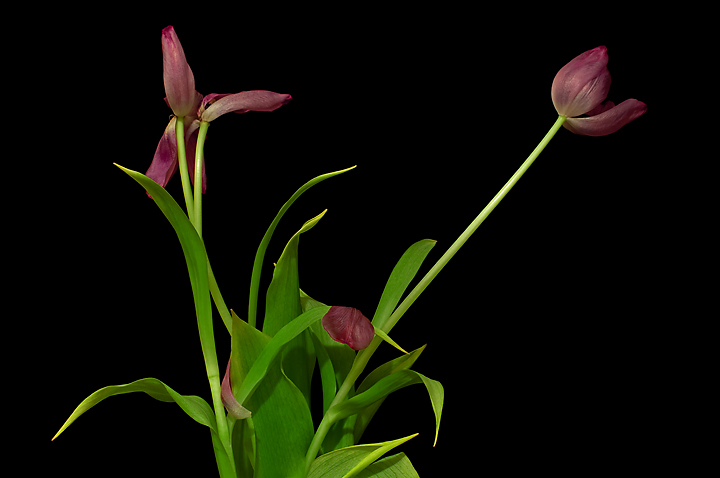
I thought these wilting tulips were more interesting in the throes of death than when they were fresh and they reminded me of the lyrics to that old Rolling Stones song, hence the title.
Is it too cramped at the top? Removed some of the more unsightly areas in PP. The shadows are a little annoying but at least they're subtle. Comments welcome, thanks for looking.

Tamron 70-300 @ 105mm
F/16 @ 5 sec
ISO 100

Comments

12 comments
Comment posted by Pat Sampson on April 16, 2011 at 6:44 AM
Bruce,

Because of the relative brightness between the flowers and the greenery, the latter seems to me to be the dominant element in the composition. Assuming you want to place more emphasis on the flowers, I might use a gradient to darken the greenery from the bottom up. I think the dark bg works very well here and the shadows don't bother me at all.

pat
Registered on May 19, 2007, 953 Posts, 15989 Comments
Comment posted by Ken Smith on April 16, 2011 at 9:23 AM
Hi Bruce, I like old tulips that you can extract some hidden beauty into a shot. I like the edgy ...not a centered flower...style...like we discussed at photo-club. The flowers are jumbled and small strongly lit against the black. My only thought is there is no focal point...nothing large, distinct and separate.
Registered on September 5, 2008, 449 Posts, 2444 Comments
Comment posted by Tina Schell on April 16, 2011 at 1:13 PM
I love the colors against the black bg. Did you try playing with a vertical vs horizontal composition?
Registered on October 22, 2010, 26 Posts, 34 Comments
Comment posted by Bob&Charly Nelson on April 16, 2011 at 4:22 PM
Although the greens are rather dominant Bruce, I like this image as posted. I find this image comforting. Good job.
Bob
Registered on October 27, 2005, 289 Posts, 4202 Comments
Comment posted by Craig Strand on April 16, 2011 at 8:12 PM
This is interesting Bruce. I have to admit that my eyes were a bit confused at first look, it didn't excite me, yet it had pleasing elements (the greenery and wilting blooms) that seemed pulled apart without direction to follow. After reading a couple of other comments I can agree that the foliage is as strong an attraction as the spaced apart blooms and that is what blocks a natural flow for the eyes to take in..... at least mine. Perhaps cropping green off the bottom or using Pats suggestion would help pull it all together.
Registered on March 30, 2008, 416 Posts, 2885 Comments
Comment posted by Nancy Lea Sandy on April 16, 2011 at 8:48 PM
Unusual and intriguing. the foliage is a little too bright IMO but still an interesting composition
Registered on January 24, 2011, 576 Posts, 6942 Comments
Comment posted by Bruce King on April 16, 2011 at 9:53 PM
Ok, I hear you. Here's a version reworked with a few curves adjustments. I definitely think it's an improvement. What do you think?

Looking at the uploaded repost it now seems that the petals are a little over-cooked. I just got a new monitor, it's calibrated but working my images is well......a little different. At least I'll blame it on that for now. :wink:
Registered on January 14, 2010, 276 Posts, 2212 Comments
Comment posted by Monica Siri on April 17, 2011 at 1:09 PM
Bruce,
the repost works better for me. Different and beautiful comp. I like it. :toast:
Registered on September 20, 2009, 132 Posts, 3764 Comments
Comment posted by Ian Wolfenden on April 17, 2011 at 5:25 PM
I have to say, Bruce, that I think you got it right first time. To me, the bright greenery is a vital part of the composition - the various strands of stem and leaf beautifully anchor the flowers in the landscape format. I find the leafage in the second version maybe a touch dull by comparison. This is obviously just me !! Whatever, it is a delightful image - fresh and original.
Registered on May 18, 2007, 1108 Posts, 7647 Comments
Comment posted by Gary Yeoh on April 17, 2011 at 10:17 PM
Bruce:
I think the originally is technically better than the repost in terms of color and brightness. My eyes tend to wander around the frame and I agree with Ken's comment about the composition lacking a central focal point of interest.
Registered on September 1, 2009, 588 Posts, 8184 Comments
Comment posted by Wayne Jones on April 19, 2011 at 12:46 PM
Interesting subject and comp, even with two focal points. I think processing somewhere between the two images posted here would be about right.
Registered on April 18, 2007, 953 Posts, 6435 Comments
Comment posted by Catherine Reilly on April 19, 2011 at 5:00 PM
Refreshingly different. I like the comp; maybe a little more room at the top. Without the shadows it would look pretty flat, I think. I like this, Bruce.
Registered on August 16, 2006, 603 Posts, 9192 Comments