Gallery: Photo ArtPosted April 20, 201194 views4 comments
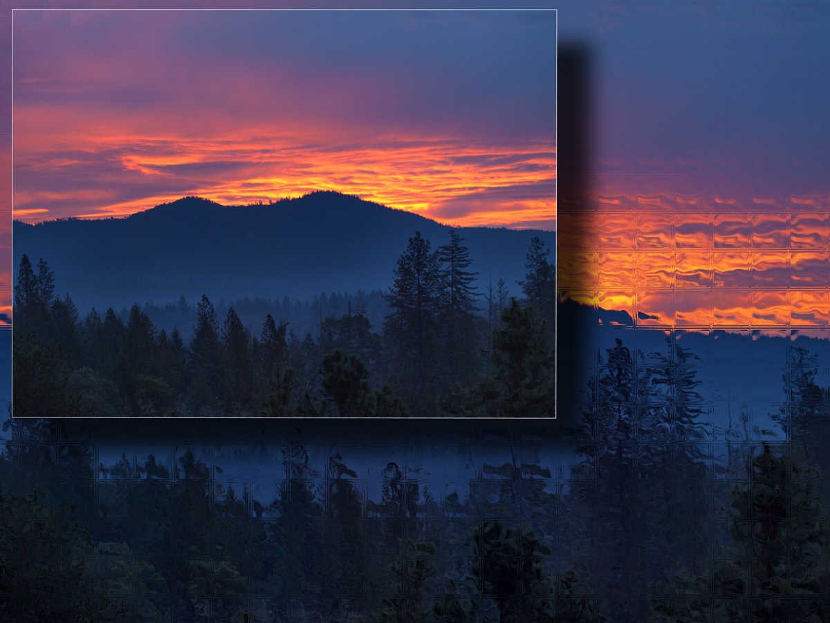
Playing around.
I'm learning to respect negative as well as positive comments, so please feel free to say what you think.
Charlie
Comments
4 comments
Comment posted by Nancy Lea Sandy on April 21, 2011 at 9:56 AM
This is lovely. The image within an image style is perfect for this scene and the different treatments of each frame is stunning. A very creative and enjoyable piece.
Registered on January 24, 2011, 576 Posts, 6942 Comments
Comment posted by Craig Myers on April 21, 2011 at 3:44 PM
Hi Charlie,
Welcome back. I really like the beautiful foreground layering of silhouettes and the nice contast of the cool blues with the warm reds and oranges. I generally really like the framing, but would have preferred a slightly larger top image; mainly, I think, because the distorted tiling in the frame layer begins to draw attention away from the top layer rather than just set it off. Good to see your work again.
Registered on September 1, 2008, 85 Posts, 757 Comments
Comment posted by Charlie Baugh on April 21, 2011 at 4:15 PM
Craig I don't disagree with your thinking at all. I've played with this image combination and others for awhile since seeing another photo-in-photo on another group that I loved and haven't found any of my images work anywhere near as well as that. I played around with sizing of the upper photo and when larger I felt that I needed to keep this much of that layer for recognition that it was the same image.
I really like the idea and will play with it some more. You have some great sand dune and mountain photos that would possibly work well as this kind of artsy effort.
Thanks for comments and it is real good to be posting again.
Registered on April 18, 2011, 329 Posts, 1985 Comments
Comment posted by David W. Kelly on April 21, 2011 at 5:12 PM
The main image is beautiful and really stands out by itself Charlie but I like what you have done with this.
Registered on October 7, 2005, 883 Posts, 6590 Comments

Comments
4 commentsWelcome back. I really like the beautiful foreground layering of silhouettes and the nice contast of the cool blues with the warm reds and oranges. I generally really like the framing, but would have preferred a slightly larger top image; mainly, I think, because the distorted tiling in the frame layer begins to draw attention away from the top layer rather than just set it off. Good to see your work again.
I really like the idea and will play with it some more. You have some great sand dune and mountain photos that would possibly work well as this kind of artsy effort.
Thanks for comments and it is real good to be posting again.