Gallery: LandscapePosted April 25, 2011624 views23 comments
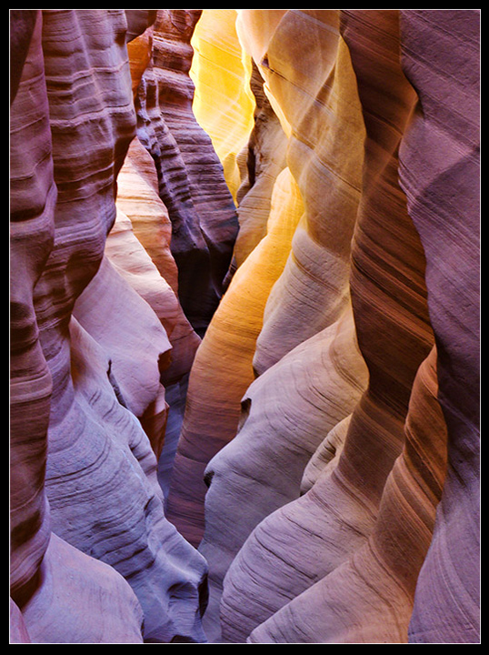
The preternatural glow in this stone chamber evoked sulfuric thoughts...
..and thus a title was born.
Canon 5D w/24-105 lens @ 58mm
1/8 sec. @ f16 ISO 100
Comments
23 comments
Comment posted by Eva McDermott on April 25, 2011 at 9:48 PM
Very different color, light, and perspective compared to the other slot shots John. I like the high key nature of this which gives it a more ethereal mood.
Registered on January 4, 2009, 1015 Posts, 13229 Comments
Comment posted by Richard Bernabe on April 25, 2011 at 10:11 PM
WOW! Amazing light, John
Registered on November 24, 2004, 180 Posts, 1545 Comments
Comment posted by Tony Kuyper on April 25, 2011 at 10:17 PM
I love the scene, John, but it feels a bit overexposed. Pulling down the highlights really lets the color differences and textures play a larger role.
Registered on November 1, 2003, 364 Posts, 22328 Comments
Comment posted by Luke Ormand on April 25, 2011 at 10:26 PM
Incredible shapes, colors and tones. It's a little hot at the very end though
Registered on February 4, 2009, 1093 Posts, 7035 Comments
Comment posted by David Chauvin on April 25, 2011 at 10:30 PM
An amazing array of colors and forms! I love the bottomless feel of the comp.
Registered on August 5, 2004, 1007 Posts, 5595 Comments
Comment posted by Marc Adamus on April 25, 2011 at 10:33 PM
Looks like the web version could use quite a bit more sharpening to my eye. I don't mind the brightness but it does look like the processing could be improved. It feels a little too contrasty in places and the middle-left has some areas that are nearly featureless and almost blown with little color despite no reflected or direct light being evident. Conversely, I find the blacks a bit heavy to the lower right of that area. Having been here many times myself, I wouldn't figure you could get everything in focus at f/16 either without a crop...maybe there was one.
Anyway, I don't want it to sound like I don't like it. It's just that since I know the area so well I can nitpick a little more. Overall the variations in color and textures throughout are quite impressive and the composition is excellent.
Registered on September 17, 2005, 780 Posts, 8091 Comments
Comment posted by Mark Seaver on April 25, 2011 at 10:57 PM
What a fantastic collection of shapes, colors, and textures. Absolutely amazing!
Registered on January 23, 2011, 1103 Posts, 17270 Comments
Comment posted by John Mumaw on April 25, 2011 at 11:13 PM
Thanks very much for the kind words and especially the helpful tips.
I did indeed need to crop both sides for optimum sharpness.
Registered on September 9, 2005, 62 Posts, 2289 Comments
Comment posted by Chris Chamberlain on April 25, 2011 at 11:24 PM
I really like the perspective, and the comp! I agree about the web sharpening, but other than that, I wouldn't have noticed the other things Marc pointed out. But, he does have a very keen eye for that kind of stuff.
Chris
Registered on March 13, 2007, 500 Posts, 8365 Comments
Comment posted by Art Escobado on April 25, 2011 at 11:26 PM
The image and colors look nice - however it doesn't look sharpened for the web and loses a little pop in the presentation. Sharpen it up and repost!
Registered on January 7, 2007, 0 Posts, 775 Comments
Comment posted by Bret Edge on April 25, 2011 at 11:26 PM
I have GOT to visit this place with you some time, John. Gorgeous sandstone, great light, beautiful composition. Awesome, man!
Registered on November 1, 2003, 711 Posts, 6363 Comments
Comment posted by Koveh Tavakkol on April 25, 2011 at 11:59 PM
An absolute beauty here John! I do agree you can do a little bit of selective sharpening as Marc mentions. Seems a little soft in parts.
Registered on September 1, 2009, 41 Posts, 608 Comments
Comment posted by Nancy Lea Sandy on April 26, 2011 at 12:03 AM
Fabulous color. The bedding planes add a strong horizontal element to a vertical subject. Nice balance.
Registered on January 24, 2011, 576 Posts, 6942 Comments
Comment posted by Michael J Greene, on April 26, 2011 at 12:19 AM
Hi John,
I really like the composition and I've probably been influenced by reading others' comments below. I too noticed the softness of the web version immediately. Like Tony suggested, I could see darkening the lower half of the image. Overall, I think this a beautiful shot of which slot canyon? I hope all is well.
Michael
Registered on June 18, 2009, 86 Posts, 2317 Comments
Comment posted by Stan Rose on April 26, 2011 at 9:25 AM
Extremely cool comp--great patterns and colors! But it aint 'a little soft'--it looks OOF to me
Registered on September 15, 2005, 836 Posts, 17099 Comments
Comment posted by Joel Hazelton on April 26, 2011 at 11:14 AM
Cool shot John!
Registered on August 6, 2008, 194 Posts, 1315 Comments
Comment posted by Shane McDermott on April 26, 2011 at 4:46 PM
Hey John
Sweet image! I love all the layers and the slightly elevated perspective. The processing is incredibly lively, I like it!
Shane
Registered on November 12, 2007, 49 Posts, 1074 Comments
Comment posted by Ian Plant on April 27, 2011 at 9:03 AM
lovely image John, and I really like the natural processing. Top shelf stuff mate!
Registered on July 7, 2008, 271 Posts, 1657 Comments
Comment posted by Zack Clothier on April 27, 2011 at 11:10 PM
Some nice light for sure and the comp is nearly perfect. My only nits are that small piece of wall in the upper left hand corner, and for some reason the left side of the image appears soft, perhaps due to web compression?
Registered on January 28, 2010, 343 Posts, 2257 Comments
Comment posted by Rudy Ruberti on April 28, 2011 at 12:04 AM
The bottomless feel is really nice here. Great colors, too.
Registered on October 28, 2008, 179 Posts, 1875 Comments
Comment posted by Jared Ropelato on April 28, 2011 at 5:20 PM
I think this shot would benefit from a darker mood.
Registered on March 1, 2011, 25 Posts, 204 Comments
Comment posted by Dennis Harding on April 28, 2011 at 8:06 PM
Very nice, I like it very much. My gut feeling is that it could be improved with a bit more contrast but this would make the highlights over powering.
Maybe try knocking the saturation back on the highlights first. Best of luck.
Registered on January 19, 2011, 33 Posts, 408 Comments
Comment posted by Mark Metternich on April 29, 2011 at 1:02 AM
Hey John. Great shot! Love the composition! You got great lighting here obviously.
I too agree this has some processing issues.
When I get back from my trip I'll call you and if you get Skype I'd love to be of help. I'm not sure it is OOF as Stan suggests, but even if it was, for web that could be easily cured.
Registered on June 19, 2009, 276 Posts, 6240 Comments


Comments
23 commentsAnyway, I don't want it to sound like I don't like it. It's just that since I know the area so well I can nitpick a little more. Overall the variations in color and textures throughout are quite impressive and the composition is excellent.
I did indeed need to crop both sides for optimum sharpness.
Chris
I really like the composition and I've probably been influenced by reading others' comments below. I too noticed the softness of the web version immediately. Like Tony suggested, I could see darkening the lower half of the image. Overall, I think this a beautiful shot of which slot canyon? I hope all is well.
Michael
Sweet image! I love all the layers and the slightly elevated perspective. The processing is incredibly lively, I like it!
Shane
Maybe try knocking the saturation back on the highlights first. Best of luck.
I too agree this has some processing issues.
When I get back from my trip I'll call you and if you get Skype I'd love to be of help. I'm not sure it is OOF as Stan suggests, but even if it was, for web that could be easily cured.