Gallery: LandscapePosted April 30, 2011283 views12 comments
Taken last September, just never got around to sharing it.
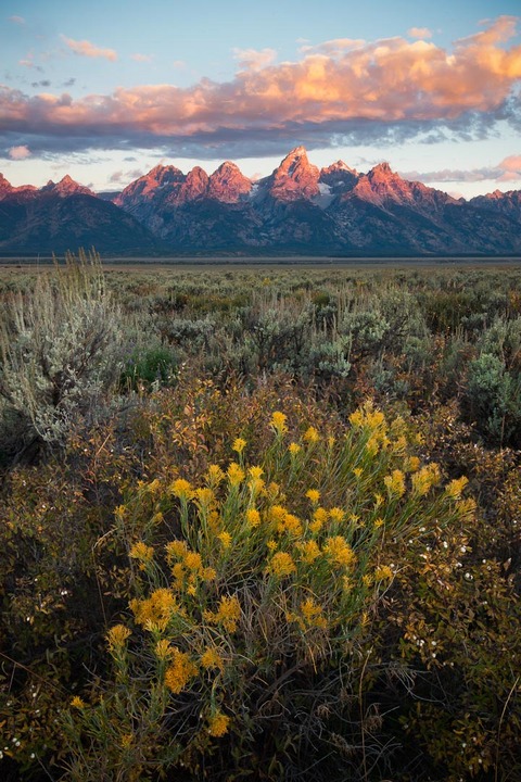
Two image blend for DOF.
Any thoughts or opinions on this image are welcome and appreciated.
Cheers!
Comments
12 comments
Comment posted by Jake Case on April 30, 2011 at 5:21 PM
There's a lot to love about this shot, pretty flowers, alpenglow on the peaks, intense clouds, all well composed. I'm no expert at DOF blending, but it looks pretty good to me. The processing looks pretty good, but it looks a little dull, I think it could use some sort of contrast boost. Otherwise, this is a very well done image.
Registered on December 13, 2010, 38 Posts, 167 Comments
Comment posted by John Mumaw on April 30, 2011 at 8:12 PM
A lovely scene and composition, with sweet light on the peaks!
However, I agree with Jake re: the presentation.
Try this local contrast enhancement using the Unsharp Mask filter:
Amount-20
Radius-50
Threshold-0
..and see what you think.
Registered on September 9, 2005, 62 Posts, 2289 Comments
Comment posted by Neil Paskin on May 1, 2011 at 12:29 AM
I agree with other comments Nicolaus - it's a great shot but just needs a little more PP to make it shine.
Registered on May 30, 2008, 7 Posts, 39 Comments
Comment posted by R.Bill Moser on May 1, 2011 at 10:18 AM
This is a beautiful scene......nice floers in the foreground, the light on the mountain peaks and some pretty nice clouds in the sky.......the image looks a bit dull, though....so I agree with the other comments. It just needs a few more steps in photoshop
Registered on January 29, 2010, 285 Posts, 4281 Comments
Comment posted by Stan Rose on May 1, 2011 at 12:06 PM
beautiful classic comp, nice subject and conditions! I agree with the others about some contrast (except in the clouds--dont know what happened there--but be careful...)
Registered on September 15, 2005, 836 Posts, 17099 Comments
Comment posted by Nicolaus Wegner on May 1, 2011 at 5:50 PM
Thanks for the comments guys, I'm just wondering how far PP needs to be taken these days before it becomes unrealistic. I've seen a lot of shots lately that push the limits...personal opinion of course. I'm still hoping to see more people post original images instead of just going for the oohs and ahhs about how well they can process a photo. ;]
Original file attached, and yup, I do realize that raw files are rather flat...but not that flat.
And I'm not quite sure what you mean about the clouds Stan. I saturated them slightly, but only slightly. You'd have to ask momma nature why she made them that way on this morning.
Registered on February 21, 2010, 133 Posts, 1509 Comments
Comment posted by Nicolaus Wegner on May 1, 2011 at 5:51 PM
And using your suggestions John, with a bit of additional sharpening to boot.
Again, thanks for the critiques. I seriously do appreciate them.
Registered on February 21, 2010, 133 Posts, 1509 Comments
Comment posted by Tony Kuyper on May 1, 2011 at 8:08 PM
Nice scene, nice blend. It's so well done that it actually feels a bit static. I guess I like the last image best. Has a bit more unrealistic pop that we all seem to like.
Registered on November 1, 2003, 364 Posts, 22328 Comments
Comment posted by John Mumaw on May 1, 2011 at 9:49 PM
Well, that's not unrealistic pop to my eyes. Looks terrific and quite natural, IMO.
I get what you're saying about pushing the envelope in 'development' and all, but this really needed something extra as evidenced by the near unanimity of opinion.
What do you think of this version, Nicolaus?
Registered on September 9, 2005, 62 Posts, 2289 Comments
Comment posted by Marc Adamus on May 2, 2011 at 6:15 PM
I'd agree with both John and Tony here. A: It's so flawless it feels a bit static (the eye travels effortlessly up and back down here). B: The second version does NOT look unnatural. Lastly, I would add that the showing of RAW files isn't something that's going to generally go over real well with today's crowd, or the crowd of yesteryear for that matter. I don't think Ansel would be seen passing around his negatives. It's the final result that tells the story of the photographers vision - it tells it the way the photographer wanted to, and it speaks for itself. The RAW's just muddy up the final presentation/perception. Just my take on it of course.
Registered on September 17, 2005, 780 Posts, 8091 Comments
Comment posted by Nicolaus Wegner on May 2, 2011 at 11:50 PM
Thanks again for the comments and critiques.
John, I like all the versions. The processed ones from an artistic standpoint and the original from a technical perspective. But your advice certainly cleared up some of the areas I was having difficulty with and I appreciate the pointer. And don't get me wrong, I have absolutely nothing against eye popping photographs. It's part of the digital age...we have so much tech at our fingertips to make an image how we want... it's just awesome. ;]
Marc, the joy of sharing photos and opinions is what keeps bringing me back to this site, but I'd sure as hell give a pinky finger to see some of Ansel's negatives. As I see this site as a place for learning, I'm still all for sharing raw files along with the edited version. 1. It can sometimes prove the unbelievable, especially in this day and age when blends are so easily done and photos so easily manipulated. 2. It's awesome to see the canvas upon which photographers have created their vision...but I've said that before. I know it's pretty much hopeless asking, but I'll keep on trying.
Registered on February 21, 2010, 133 Posts, 1509 Comments
Comment posted by Jay Levin on May 3, 2011 at 1:44 PM
Nicolaus, the last image in my mind is superb throughout. I would just tone down the bright yellow areas in the clouds, which I think are a distraction.
Registered on April 24, 2009, 21 Posts, 184 Comments

Comments
12 commentsHowever, I agree with Jake re: the presentation.
Try this local contrast enhancement using the Unsharp Mask filter:
Amount-20
Radius-50
Threshold-0
..and see what you think.
Original file attached, and yup, I do realize that raw files are rather flat...but not that flat.
And I'm not quite sure what you mean about the clouds Stan. I saturated them slightly, but only slightly. You'd have to ask momma nature why she made them that way on this morning.
Again, thanks for the critiques. I seriously do appreciate them.
I get what you're saying about pushing the envelope in 'development' and all, but this really needed something extra as evidenced by the near unanimity of opinion.
What do you think of this version, Nicolaus?
John, I like all the versions. The processed ones from an artistic standpoint and the original from a technical perspective. But your advice certainly cleared up some of the areas I was having difficulty with and I appreciate the pointer. And don't get me wrong, I have absolutely nothing against eye popping photographs. It's part of the digital age...we have so much tech at our fingertips to make an image how we want... it's just awesome. ;]
Marc, the joy of sharing photos and opinions is what keeps bringing me back to this site, but I'd sure as hell give a pinky finger to see some of Ansel's negatives. As I see this site as a place for learning, I'm still all for sharing raw files along with the edited version. 1. It can sometimes prove the unbelievable, especially in this day and age when blends are so easily done and photos so easily manipulated. 2. It's awesome to see the canvas upon which photographers have created their vision...but I've said that before. I know it's pretty much hopeless asking, but I'll keep on trying.