Nature Photographers Network
This is the preserved archive of the original Nature Photographers Network. The community continues at naturephotographers.network.
I'm a walrus, goo g'joob
‹ PreviousWildlife GalleryNext ›

I'm a walrus, goo g'joob

by Stephen Kaluski

Gallery: WildlifePosted May 5, 2011120 views11 comments
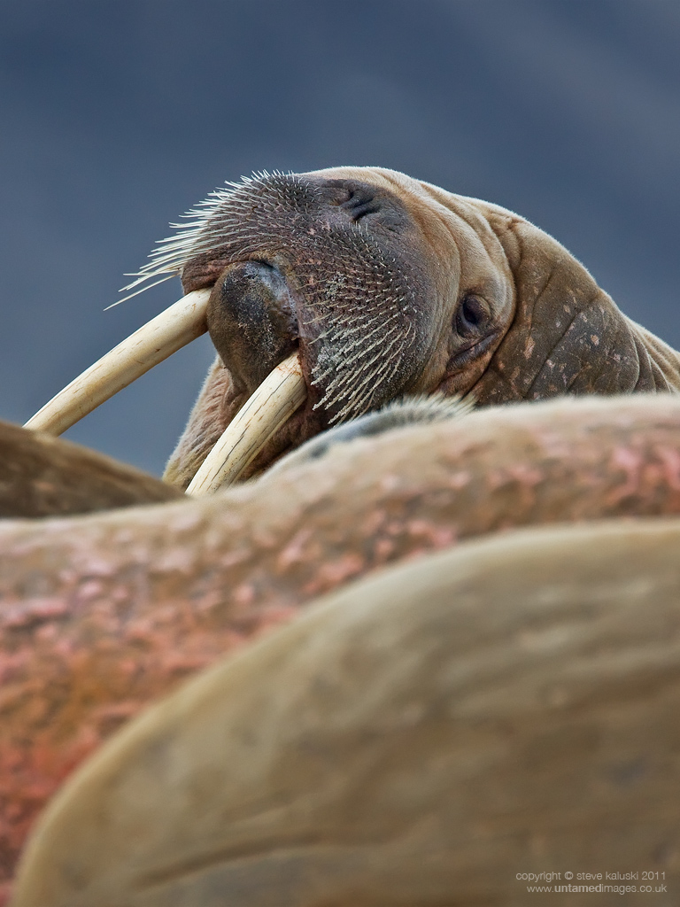
This was photographed in Svalbard whilst on the lookout for Polar bears when we came across this rather sleepy pod of male Walrus. Getting close wasn't difficult, just short steps to a point where you were just on their comfort zone, any further and the pod would either move into the sea, or make a lung. So staying within the parameters you got the shots and at times the full aroma of the group, essence of fish with a hint of vegetation from memory. Occasionally one would pop it's head up just to check, otherwise the pod would dose, snore, or belch, charming. :smile:

Steve
MKIII 500f/4 f/4 1/1000 ISO800 (almost FF, Gitzo tripod/Wimberley head)

PS The title should be 'I am a walrus goo, goo, g'joob' for all those Beatles fans
:wink:

Comments

11 comments
Comment posted by Guy Runco on May 5, 2011 at 3:07 PM
Cool capture - great detail, color and dof. The comp works well, with the layers of rock(?) and walrus. Overall a very pleasing shot!
Registered on September 9, 2008, 77 Posts, 705 Comments
Comment posted by Stephen Kaluski on May 5, 2011 at 3:14 PM
Cheers Guy, I meant to add, I know some may not like the OOF front half, but to me I felt it gave depth and conveyed shooting through the pod.

Steve
Registered on March 25, 2007, 189 Posts, 1064 Comments
Comment posted by Luca Mussato on May 5, 2011 at 5:27 PM
i like the details and the composition too. the vertical cut is ok for me.

Luca
Registered on November 14, 2006, 118 Posts, 855 Comments
Comment posted by Lon Sharp on May 5, 2011 at 10:52 PM
You should have enough pixels for a test crop...How about horizontal? I really like the angles and detail of the head and feel the foreground is not giving you much assistance. Color and exposure look wonderful.
Registered on December 9, 2007, 258 Posts, 9892 Comments
Comment posted by Dan Roberts on May 5, 2011 at 11:46 PM
I love it. Agree that the FG gives the sense of the pod. A very unique perspective that works for me.
Registered on March 9, 2011, 69 Posts, 501 Comments
Comment posted by Stephen Kaluski on May 6, 2011 at 1:37 AM
Thanks Guys

Lon hope this is inline with your thinking :wink:

cheers
Steve
Registered on March 25, 2007, 189 Posts, 1064 Comments
Comment posted by Lon Sharp on May 6, 2011 at 7:19 AM
The cropped version provides a stronger, dramatic attitude, IMO! Cool.
Registered on December 9, 2007, 258 Posts, 9892 Comments
Comment posted by Marsel van Oosten on May 6, 2011 at 8:04 AM
I'd like to suggest something in between: cropping from the bottom, but keeping the main three foreground layers. Probably the biggest problem is the brightness of the foreground, especially compared to the brightness of the main subject. Toning down the brightness of the OOF foreground layers considerably (without increasing saturation) will make them less dominant while still adding depth to the shot. Hope that makes sense.
Registered on March 9, 2004, 285 Posts, 2277 Comments
Comment posted by Brad Hill on May 6, 2011 at 8:54 AM
Hi Steve,

I really like the colour palette here and your use of selective focus to make the main subject pop. At first I was undecided about the foreground in the vertical capture (and was leaning towards the idea losing a lot of the foreground via cropping), but after looking at the re-post I actually think the original vertical crop works better for me. As you say, it does help convey the idea of you shooting through the pod. I do find the Walrus's right tusk a tad tight to the right side of the frame - if you have a LITTLE more room here on the original I'd experiment with adding a little of it back. BTW - I think you nailed the sharpening on this one! :wink:

Cheers...thanks for sharing this (both the original and the re-post).

Brad
Registered on May 29, 2007, 431 Posts, 6061 Comments
Comment posted by Wayne Willison on May 6, 2011 at 3:38 PM
Both images are fine, although I liked the layers and layers of fat feel I had when first seeing the original post. Wading through all that fat pays off because you get to the remarkable head and all that detail.
Registered on April 10, 2009, 292 Posts, 3967 Comments
Comment posted by Ashley Vincent on May 7, 2011 at 2:54 AM
I like both versions Steve, although the horizontal crop is far more striking. Very nice to see both ways :^)
Registered on March 1, 2011, 154 Posts, 2083 Comments