Nature Photographers Network
This is the preserved archive of the original Nature Photographers Network. The community continues at naturephotographers.network.
"Desert Surfing"
‹ PreviousLandscape GalleryNext ›

"Desert Surfing"

by James Fougère

Gallery: LandscapePosted May 9, 2011349 views34 comments
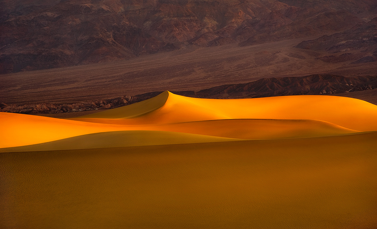
While in Death Valley, we had a good amount of wind the previous day, so the next morning the conditions we ideal and untouched by footprint etc. :smile:

This is a 200mm telephoto shot at sunrise at the Mesquite Dunes. I was blown away with the huge wall of sand that resembled a surfing wave from the North Shore of Hawaii!! I did quite a bit or sharping so you could see the detailed ripples in the wall. I would have loved to drop into that with my "fat" downhill skis :biggrin:

I included the larger version to see more detail.

The background was very textured and with warm colors and sedimentary layers. But this composition demands a crop here. The first posted version includes some of the background with a small crop, and the 2nd posted image is with more of a crop, without the background included.

So I am putting it to a vote :biggrin: Which version do you like better?

Nikon 3Ds, 70-200 f2.8, F8, ISO 100, 1/30sec.

Comments

34 comments
Comment posted by Vlad Sadovsky on May 10, 2011 at 12:04 AM
Excellent capture, James . As it comes to the vote i like the second better, this crop helps me to focus on lines and transitions. Subjectively i would even make the aspect ratio longer (panoramic) , as to me these central lines are main attraction. Contrasting of pure gold color vs plush background also complements the impact.. Well done!

Registered on November 12, 2010, 48 Posts, 358 Comments
Comment posted by Mark Hespenheide on May 10, 2011 at 12:22 AM
James,

The curves and the light are fantastic here. The visual tilt in the background is bothering me, though. Perhaps an even-more exaggerated panorama (wider and shorter) that brings the elements back to looking horizontal?

Man, I'm jealous of that light, though, and the absence of footprints.

Best,
Mark.
Registered on August 14, 2010, 3 Posts, 61 Comments
Comment posted by James Fougère on May 10, 2011 at 12:45 AM
Version 2
Registered on October 25, 2010, 41 Posts, 831 Comments
Comment posted by Scott Fricke on May 10, 2011 at 12:52 AM
This is beautiful James, the light is superb and the flowing lines of sand are quite stunning. My initial reaction was that the composition looked a little static with the almost equal division of the sand and background. I think I would have gone with cropping more off of the bottom, not the top because the bottom is relatively featureless and the top has some nice texture as you mentioned.
Registered on January 19, 2007, 133 Posts, 1448 Comments
Comment posted by James Fougère on May 10, 2011 at 12:53 AM
Vlad & Mark;

The desert angle tilt does mimic the same line in the leading edge of the dune wall. Also, the proportions of the desert background are the same as the area in the dune wall, so I thought it looked balanced. But I guess with to much of a background showing, you lose focus on the main part of the image which is the dunes :biggrin:
Registered on October 25, 2010, 41 Posts, 831 Comments
Comment posted by Scott Smorra on May 10, 2011 at 12:56 AM
Very nice "wave" you captured here James. I really like the details in the larger version. I could go either way with the crop. If you really want to emphasize the dune, the cropped version is the way to go. If you want to show the dune in the setting of the larger landscape, the first version does a great job. Either way these are excellent images.
Registered on November 2, 2009, 161 Posts, 2143 Comments
Comment posted by James Fougère on May 10, 2011 at 12:57 AM
That is a good point Scott, I will try cropping from both the top and the bottom and post a 4th version!! Thanks for the comment :smile:
Registered on October 25, 2010, 41 Posts, 831 Comments
Comment posted by Rick Goldwasser on May 10, 2011 at 1:28 AM
I absolutely love the light and processing here- that's about as good as a sand dune can look! It seems like all the lines here go right-left across the frame, I wish there were some front/back lines to give the image a little more flow.
Registered on May 10, 2009, 127 Posts, 970 Comments
Comment posted by Scott Miller on May 10, 2011 at 1:32 AM
I love the colors and the horizontal lines here. The one poster who mentioned the lack of vertical line is correct, however I think your upcoming 4th version might solve that. Removing some space from the bottom will emphasize the layers in the image and thus add vertical flow without adding vertical lines.

Because of this I would be been tempted to do a real close up of the main point in your image where the 4 dune ridges all line up in close succession about a third of the way from the left edge of the image. That one spot is just awesome with the 4 different shades of color and texture with nice crisp lines.
Registered on May 9, 2011, 23 Posts, 322 Comments
Comment posted by James Fougère on May 10, 2011 at 1:47 AM
I have really focused on the center piece of this image with this version, and it looks great on my 30" monitor , I feel this will also look more appealing printed quite big as a pano. This way, there is no where else for the eye to go. You still get a view of the mountain range behind the dunes which are nice in the light of the rising sun :biggrin: Your thoughts?
Registered on October 25, 2010, 41 Posts, 831 Comments
Comment posted by James Fougère on May 10, 2011 at 2:15 AM
Scott from Portland, this version is for you :biggrin:

This version is appealing to me as well, and does really focus on the 4 lines you were talking about. I am opening a Gallery here in Whistler BC soon, and may use this image, so your vote is very helpful. Thanks for all the comments.
Registered on October 25, 2010, 41 Posts, 831 Comments
Comment posted by Marc Adamus on May 10, 2011 at 2:45 AM
You just needed that 500mm, eh? Gorgeous light on those dunes.
Registered on September 17, 2005, 780 Posts, 8091 Comments
Comment posted by Scott Miller on May 10, 2011 at 2:57 AM
Yay! I got my own version. I love it! Both of the last two versions posted are awesome. Great job with the great light. As a bonus, in the last version those vertical lines in the foreground dune actually give you nice lines heading up in to the frame.
Registered on May 9, 2011, 23 Posts, 322 Comments
Comment posted by Danny Laureys on May 10, 2011 at 5:08 AM
I really like the last crop, but if you.... :biggrin: really do like the last one, the light in this is fantastic, excellent :toast: :toast: :toast:
Registered on January 5, 2008, 590 Posts, 1261 Comments
Comment posted by Alex Mody on May 10, 2011 at 6:15 AM
This is a really nice, telephoto crop of a scene you don't see handled this way too often. I really dig the most panoramic of all the reposts.
Registered on December 25, 2007, 163 Posts, 1896 Comments
Comment posted by Kevin Trinkner on May 10, 2011 at 8:16 AM
That is some awesome light James, those dunes are incredible. I think I prefer some of your cropped versions best, either the "pano" version, or the last one you posted for Scott. Really helps isolate that "wave". All of them are very nice, great work.
Registered on June 30, 2008, 203 Posts, 2641 Comments
Comment posted by Paul Duval on May 10, 2011 at 8:58 AM
James,

I think it all boils down to viewer preferences and you definitely provided quite a few options with just one image. But the light is stunning and the subject appealing, it looks like waves of molten metal.

Paul
Registered on June 30, 2009, 508 Posts, 1907 Comments
Comment posted by Nick Bristol on May 10, 2011 at 8:59 AM
This is wonderful, James. The light, shadows and color are all beautiful. The last version looks very nice, but I think I like the full pano version best. Really nice!

Nick Bristol
Lone Rock, WI
Registered on February 1, 2004, 752 Posts, 14140 Comments
Comment posted by Tony Kuyper on May 10, 2011 at 9:32 AM
That is gorgeous, James. Either version is beautiful.
Registered on November 1, 2003, 364 Posts, 22328 Comments
Comment posted by Cory Freeman on May 10, 2011 at 9:37 AM
very nice color and soft light James. I like the last version for scott and I could see as an alternative a square crop in the center on the wave.
Registered on December 16, 2003, 107 Posts, 1341 Comments
Comment posted by Bill Chambers on May 10, 2011 at 10:07 AM
The dunes are superb James - great color and a wonderful variety of hues. The BG seems a bit distracting because of the tilt - I might be tempted to crop downward somewhat and create a pano.

EDIT: I didn't go downward before I replied so I didn't see the cropped versions. I like the third one the best!
Registered on April 10, 2005, 753 Posts, 21216 Comments
Comment posted by Floris van Breugel on May 10, 2011 at 11:09 AM
Love the buttery smoothness to this James. I do get a little distracted by the dark band of rock behind the dune peak, but I don't think there was any way around that.
Registered on December 19, 2008, 306 Posts, 4840 Comments
Comment posted by James Fougère on May 10, 2011 at 11:17 AM
I see what you mean Floris, The options are to darken the mountains to the left, or lighten the mountains to the right. What I do like about the mountains on the right being dark, is that it is a nice contrast to the "buttery dunes". Thanks for the comment.
Registered on October 25, 2010, 41 Posts, 831 Comments
Comment posted by Zack Schnepf on May 10, 2011 at 12:24 PM
Excellent James! You know me, I like the tighter crops, I think the 4th version is my favorite overall. Your processing skills have really come a long way in a short time, well done James.
Registered on November 1, 2003, 403 Posts, 2528 Comments
Comment posted by Koveh Tavakkol on May 10, 2011 at 12:38 PM
Beautiful light James!
Registered on September 1, 2009, 41 Posts, 608 Comments
Comment posted by Gary McGhee on May 10, 2011 at 2:17 PM
Vey nice James, the colour and light on the dunes looks great. Plenty of depth in this too. I definately prefer the first crop.

Gary.
Registered on April 15, 2010, 142 Posts, 2416 Comments
Comment posted by Shaun Mazurek on May 10, 2011 at 4:23 PM
Hello James,

I love both compositions but Iove the contrast of the transient dune set against the slower erosion of the rock behind it. Great shot!
Registered on June 12, 2010, 21 Posts, 162 Comments
Comment posted by Chip Phillips on May 10, 2011 at 5:44 PM
Very nice work James. Simple and elegant comp, and the colors are beautiful. Chip
Registered on November 26, 2007, 128 Posts, 1436 Comments
Comment posted by Chris Chamberlain on May 10, 2011 at 6:24 PM
It's hard to beat that light and color. The distance works well here also to make the ripples fine details. They all work for me in defferent ways for different reasons. The extreme pano is great. In the end, I like either the first posted version, or the last. Really nice!

Chris
Registered on March 13, 2007, 500 Posts, 8365 Comments
Comment posted by John Mumaw on May 10, 2011 at 7:02 PM
"I absolutely love the light and processing here- that's about as good as a sand dune can look!"
I'll second that statement! Drop dead gorgeous, James. I've liked 'em all but simply have to go with Scott from Portland's version as that one distills everything down to shapes, lines and colors.
Congratulations on scoring so very well in the Southwest (..so far).
Registered on September 9, 2005, 62 Posts, 2289 Comments
Comment posted by James Fougère on May 10, 2011 at 10:57 PM
Thanks for all the input :wink: Your opinion is valuable, and in this case the close up shots are the winners !!
Registered on October 25, 2010, 41 Posts, 831 Comments
Comment posted by Youssef Ismail on May 11, 2011 at 12:57 AM
James,

Very impressive.
Registered on November 1, 2003, 474 Posts, 5555 Comments
Comment posted by Justin Reznick on May 11, 2011 at 11:55 AM
Wow James, this really highlights the incredible curves of the dunes, beautiful image!
Registered on November 24, 2009, 79 Posts, 515 Comments
Comment posted by Mark Metternich on May 11, 2011 at 12:06 PM
James you just keep hitting homers! Very fine image! Love the yellow on brown and centered composition! :toast:
Registered on June 19, 2009, 276 Posts, 6240 Comments