Nature Photographers Network
This is the preserved archive of the original Nature Photographers Network. The community continues at naturephotographers.network.
Badwater Tempest
‹ PreviousLandscape GalleryNext ›

Badwater Tempest

by Sarah Marino

Gallery: LandscapePosted May 12, 2011141 views12 comments
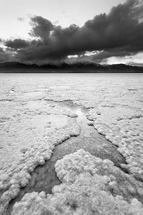
The Badwater Salt Flats are one of my favorite places in Death Valley. After spotting a shiny section of the flats from the road, I found this small area that had some water remaining from earlier storms. The title comes from the fact that this day was one of the windiest days I think I have ever experienced, punctuated by brief periods of stinging rain. The bad weather brought interesting clouds all afternoon, with this image taken at twilight.

5D2, 17-40 lens @ 17mm, f/16, 5 sec. Converted to b+w in CS4.

Thank you for any comments or suggestions for improvement.

Comments

12 comments
Comment posted by Jared Ropelato on May 12, 2011 at 4:13 PM
nice range of contrast and very moody sky. I like this. I like how vivid it is.
Registered on March 1, 2011, 25 Posts, 204 Comments
Comment posted by Mark Metternich on May 12, 2011 at 8:20 PM
Very cool shot Sarah. It is sort of unconventional in its tones but works well especially the use of line and foreground interest.

Mark
Registered on June 19, 2009, 276 Posts, 6240 Comments
Comment posted by Sarah Marino on May 12, 2011 at 9:32 PM
Thanks for taking the time to comment, Mark and Jared. I appreciate it.

Mark, what do you mean in terms of your comment about the tones? Dark clouds on a light sky?
Registered on November 10, 2008, 23 Posts, 393 Comments
Comment posted by Tony Kuyper on May 12, 2011 at 10:33 PM
I think you interpreted Mark's comment right, Sarah, as that's my sense too. The black frame lets the white sky work perfectly, but with B&W, black sky/white clouds are usually the norm. The sky, however, makes for a strong image as it challenges our preconceived ideas and we realize that this does work.
Registered on November 1, 2003, 364 Posts, 22328 Comments
Comment posted by James Fougère on May 13, 2011 at 12:48 AM
I see Tony's point, but as he says, it works well in your image, I like lots of your B&W work :biggrin:
Registered on October 25, 2010, 41 Posts, 831 Comments
Comment posted by Jared Atencio on May 13, 2011 at 1:37 AM
Your badwater collection is among the best and most extensive I've seen Sarah, and this is a nice addition. I really like the detail in the FG, the comp/proportions, and the patterns/textures in the pools. The ULC is a bit odd for me. I don't know if it's as much a distraction or just the fact that I usually don't see a sky rendered in white as TK mentions? You might also experiment with a midtone layer for the clouds/mountain peaks to see if you can lighten those whites just a tad. As is, I feel that my eye jumps from bright FG to bright sky and unfortunately skips right past those peaks.
Registered on June 23, 2009, 21 Posts, 422 Comments
Comment posted by Stuart Williams on May 13, 2011 at 3:50 AM
very nice b&w and i like how the FG element mirrors, in part, the clouds. my only concern might be the relative brightness of the sky and parts of the salty flats - there are parts of the salty flats that are as bright as the sky. it does make for a graphic image though and that works.
Registered on December 7, 2007, 247 Posts, 4792 Comments
Comment posted by Sarah Marino on May 13, 2011 at 10:29 AM
Hi all - thank you for the comments and suggestions for improvement. I am going to play around with darkening the sky so that it competes less with other parts of the composition. I appreciate the feedback!
Registered on November 10, 2008, 23 Posts, 393 Comments
Comment posted by R.Bill Moser on May 13, 2011 at 11:54 AM
Good use of lines and good foreground.
Registered on January 29, 2010, 285 Posts, 4281 Comments
Comment posted by Vance Gese on May 13, 2011 at 1:35 PM
Love the foreground and those remarkable textures. The dark, almost brooding clouds make for a stark contrast with the foreground which I really like. I can see the value of others suggestions to darken the sky somewhat; would really emphasize the outstanding foreground.
Registered on November 13, 2008, 298 Posts, 6629 Comments
Comment posted by Guy Tal on May 14, 2011 at 8:05 PM
Now that is a unique and creative take on the place. Very interesting processing.

Guy
Registered on November 1, 2003, 566 Posts, 15507 Comments
Comment posted by Lucy Aron on May 15, 2011 at 7:48 PM
Love the foreground and think it's strong enough to stand alone, almost as an abstract. Or even when I scroll down to remove about the top 2/3 of the sky the image seems more intriguing. I adore Death Valley.


lucy
Registered on February 25, 2011, 189 Posts, 1160 Comments