Gallery: Photo ArtPosted May 24, 2011522 views12 comments
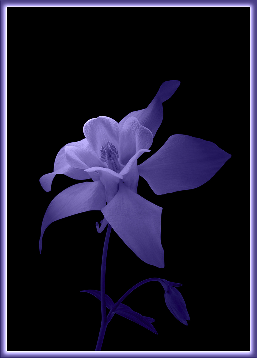
Another shy attempt in the area of PhotoArt. I used duotone and lighting effect to make this shot. What do you think? Thanks for looking at it and any comments.
Comments
12 comments
Comment posted by Ken Smith on May 24, 2011 at 2:28 PM
I like this...the brighter portion gives it the look of reaching upward for the sun....pleasing. Nice soft shadows compliment the mood. Ken S
Registered on September 5, 2008, 449 Posts, 2444 Comments
Comment posted by Bill Fach on May 24, 2011 at 3:55 PM
Chris: Works for me. Beautiful subject beautifully presented. >=))>
Registered on November 1, 2003, 1805 Posts, 26981 Comments
Comment posted by SandyRichardsBrown on May 24, 2011 at 11:38 PM
Chris, this is lovely! The softn, DOF, and angle of the flower are all excellent. I'm ambivalent about the purple stems/leaves. It works fine here, but it's such an unnatural colour, I don't know...
Wonderful concept, though!
Sandy
Registered on November 24, 2003, 3937 Posts, 12909 Comments
Comment posted by Ron Pederson on May 25, 2011 at 8:57 AM
Nice tonal values and colors, but not certain how well the color works for this subject. I'd consider a crop off the top - seems like too much space...and I find the border a bit distracting; just a personal preference.
Registered on October 19, 2010, 95 Posts, 470 Comments
Comment posted by David W. Kelly on May 25, 2011 at 11:21 PM
Hey you are thinking outside of the box and thats a good thing. I really like the lighting and the mood of this image. Very nice.
Registered on October 7, 2005, 883 Posts, 6590 Comments
Comment posted by Craig Myers on May 26, 2011 at 2:55 AM
I really like the flower itself. Not so sure about the border; I think it detracts from the beauty of the subject. The subtle elegance of the flower with its wonderful light and texture can stand on its own, I believe. If you think you need a border, I'd try something less in-your-face.
Registered on September 1, 2008, 85 Posts, 757 Comments
Comment posted by Chris Grabski on May 26, 2011 at 3:22 PM
Thank you for constructive comments. What about this version, without a frame?
Registered on April 29, 2011, 122 Posts, 431 Comments
Comment posted by Craig Myers on May 26, 2011 at 9:12 PM
Chris, the repost works better for me; it will be interesting to see feedback from others.
Registered on September 1, 2008, 85 Posts, 757 Comments
Comment posted by Barbara Sammons on May 27, 2011 at 9:43 PM
Chris, I really like how the light falls on the upper part of the flower. And I have to say that I like it better as the repost, without the frame. Great job.
Registered on September 20, 2009, 109 Posts, 323 Comments
Comment posted by SandyRichardsBrown on June 2, 2011 at 12:11 AM
Congrats on a nie WP!
Sandy
Registered on November 24, 2003, 3937 Posts, 12909 Comments
Comment posted by Bill Chambers on June 2, 2011 at 9:26 AM
Wow, this is a beauty! Well deserved EP.
Registered on April 10, 2005, 753 Posts, 21216 Comments
Comment posted by Monica Siri on June 6, 2011 at 3:55 PM
Congrats on a beautiful EP, Chris.
Registered on September 20, 2009, 132 Posts, 3764 Comments


Comments
12 commentsWonderful concept, though!
Sandy
Sandy