Paintrock Falls
by Nicolaus Wegner
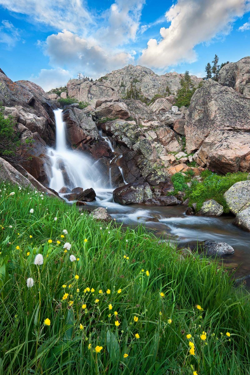
One of my favorite waterfalls in Wyoming. It's such a cool little location, right next to Cloud Peak, with an excellent open area to camp in and plenty of space to allow for acceptable distances from the creek. I use this area as a starting point into other more wild spots in the Bighorns. Not a bad place to hang out for a day or two.
Took this last summer. Two image dof blend at f16 plus another to save some of the trees on the ridge and portions of the clouds. Tried my best to blend the grasses properly but there are a couple of slightly blurry areas I was unable to rescue. They can be viewed in the larger image if you look closely. Hopefully they are not too apparent as I sort of like this photograph and would like to keep it.
As always, thanks for any critiques. Feel free to rip this baby apart. I post these shots to improve my photography, and you guys are always a huge help.
Cheers, and may your summer adventures kick arse!
Happy Memorial weekend by the way. Try and remember all of our home boys and girls overseas, and those that came before us.

Comments
16 commentsI am having a hard time finding anything to critique. Maybe a little haloing on the horizons edge with the background clouds (not a sharpening halo, but a smoother wider one). Very subtle though and doubt many would see it.
Marc, that smudge is the one thing that bothers me most about this image, but I made the mistake of taking only two dof shots and this is the one area I was just unable to pull anything from either exposure. I suppose I could clone in a sharper section of the grass, but I hate doing that...feels too unrealistic, although it might be a necessity on this image as that spot could be pretty obvious on a larger print. I'll keep this image for now, and maybe try and clone something. There is always the chance I'll get something better this summer!
Mark, that haloing you see could have something to do with the way I added contrast to that portion of the image. I might go back and see if I can darken things up a bit. Thanks for pointing it out.
You are correct Robert. Actually the entire image is slightly brighter than it was in reality. I wanted something bright and colorful in my portfolio. Something that gave the sense of the joy and excitement I feel when in areas like this.
Brian you are correct as well, but this was actually intentional, although I should have had the contrast gradient blended a bit better. In a print I don't think the clouds would look over sharpened...not sure though.
What a beautiful landscape image with so much to enjoy here. Bottom to top, all the elements work very well together. this is simply very nicely composed and balanced. And you've got a terrific sky to compliment the scene. My only nit does have to do with the sky; it seems just too much of a pretty blue, if that makes sense. Maybe it's the cyan, I'm not sure. Then again no one else has mentioned it, so worse case, it's a very minor thing.
Reminds me very much of Sonora Pass area of the Sierra Nevada.
Lon