Nature Photographers Network
This is the preserved archive of the original Nature Photographers Network. The community continues at naturephotographers.network.
The Waking Tortoise + Repost
‹ PreviousLandscape GalleryNext ›

The Waking Tortoise + Repost

by David Edwards

Gallery: LandscapePosted May 31, 201188 views6 comments
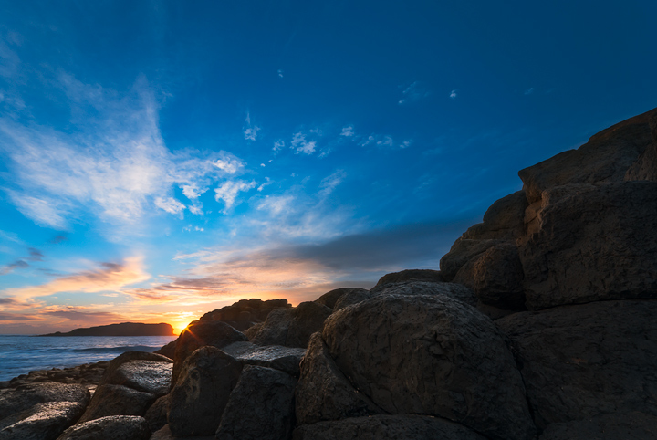
It's heading into winter over here bringing crisp, clear skies with rich blues. This shot was taken on a recent trip to Fingal Head in New South Wales.

If you spot the tortoise head in the image, the title was inspired by aboriginal 'Dreamtime', a period long ago called the Dreaming when the land was shaped by giant mythical beings.

I would be interested in your thoughts on the color and shadow detail in the image. I've finally updated my monitor to a wide-gamut NEC and this is my first image processed with it.

Many thanks for your thoughts.

Nikon D80, Sigma 10-20mm @10mm, f/16. 1/5sec sky + 15sec land manually blended.

Comments

6 comments
Comment posted by Neale Dyster on May 31, 2011 at 2:41 AM
Some nice elements David. I really like the light on the lower left rocks and the lower sky is lovely also. Colours look fine to me.
Personally, I think a bit of a crop from the right and the top would strengthen the image and a little more detail in the shadowy rocks would be nice too.
Registered on February 19, 2008, 94 Posts, 738 Comments
Comment posted by Kah Kit Yoong on May 31, 2011 at 8:21 AM
I would crop away a significant portion of the right. I know that it looks natural to be dark and in shadow but that bit takes up to much of the frame compositionally IMO. All the good stuff is on the left which is very nice indeed.
Registered on September 27, 2006, 636 Posts, 10682 Comments
Comment posted by Morkel Erasmus on May 31, 2011 at 6:07 PM
lovely light and colours here...I agree with Kah Kit's assessment and crop suggestion
Registered on March 22, 2011, 385 Posts, 2068 Comments
Comment posted by David Edwards on May 31, 2011 at 7:00 PM
Thank you for your suggestions guys. Here is a cropped version for comparison.
Registered on December 6, 2008, 142 Posts, 2623 Comments
Comment posted by Lon Overacker on May 31, 2011 at 8:02 PM
David,

The cropped version works quite well so thanks for posting that on the suggestion of others. Personally, I think the blue in the sky is a little punchy for my tastes. Not by much and mostly in the lower portion. Also, you did a pretty good job handling the light, exposure and blend for the time of day and sunset lighting. I am wishing for a bit more detail in the rocks. Not much and not so much that it becomes unnatural.

Lon
Registered on November 24, 2006, 521 Posts, 19147 Comments
Comment posted by Nick Bristol on June 2, 2011 at 4:48 PM
Very pretty David. The repost looks really good to me. I think the suggestions with this worked out great!

Nick Bristol
Lone Rock, WI
Registered on February 1, 2004, 752 Posts, 14140 Comments