NPN has moved to naturephotographers.networkYou’re viewing the read-only archive of the original site (2000–2018). The community is active today, with new critiques and discussions every day.
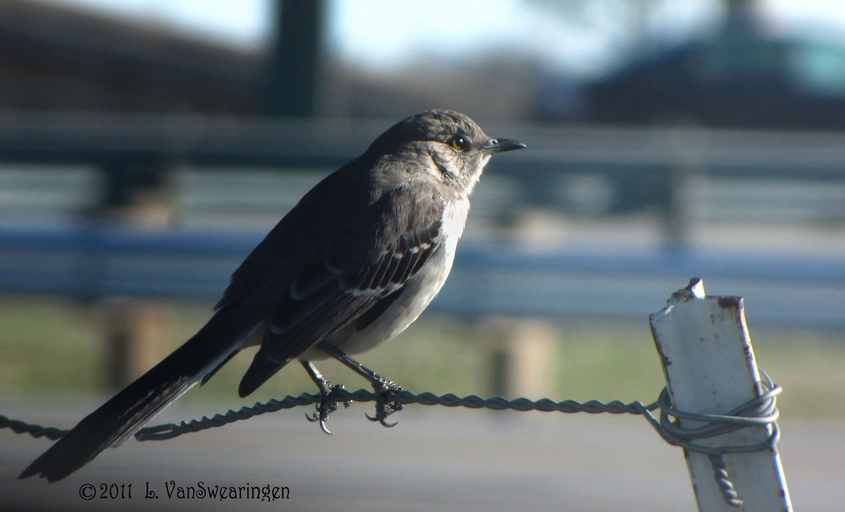
This little fellow was so pretty. But, his background was not very pretty. He should go in the WC well this week.
Comments
2 comments
Comment posted by Gary Minish on June 10, 2011 at 2:28 AM
A nice sharp capture and a good choice for the theme, Lucy!
Registered on February 4, 2006, 625 Posts, 3583 Comments
Comment posted by Varina Patel on June 13, 2011 at 9:27 AM
He's lovely, Lucy. :) I love the catch-light in his eye. The shadows seem a bit dark - especially the back of the bird, where I can't see much detail. The front of the bird looks a bit blown - I don't see any details in the bright white either. I also find the bright area in the sky just a bit distracting.The urban setting works perfectly for this weeks theme - and I think your composition is just right.
Registered on August 22, 2008, 45 Posts, 1578 Comments

Comments
2 comments