Gallery: LandscapePosted June 11, 2011125 views7 comments
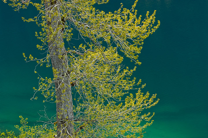
I went looking for this shot but I was hoping for more gradient in the water. I probably should have used a smaller apeture.
Xsi,55-250@100,1/6@f8,ISO 100.
Comments
7 comments
Comment posted by Anthony Vincent on June 11, 2011 at 1:01 PM
Nice Dean. The various shades of green work well together. Conceptually, I think shifting the camera to the right thus bringing the tree on more a third. The subtle shades of water would them dominate the right 2/3 and balancing that out would be the tree.
Did you crop or have something of that nature? Thats all I have for critique, otherwise this is very nice.
The simplicity make this work.
Good eye
Registered on February 5, 2009, 199 Posts, 2775 Comments
Comment posted by Nancy Lea Sandy on June 11, 2011 at 3:28 PM
Nice study in green. I really like the strong structure of the tree trunk as a foil to all the color.
Registered on January 24, 2011, 576 Posts, 6942 Comments
Comment posted by Sarah Marino on June 11, 2011 at 7:53 PM
Hi Dean - I am surprised that this does not have more comments. I really like this a lot! The bright green leaves against the beautiful water. I also think a 6x12 aspect ratio crop of the middle section would work, too.
Registered on November 10, 2008, 23 Posts, 393 Comments
Comment posted by Nick Bristol on June 11, 2011 at 8:21 PM
This is really interesting, and I like it very much. Your comp works well for me here too. I think it is really well done and very pleasing to look at. Looks like it would make a nice print to me.
Nick Bristol
Lone Rock, WI
Registered on February 1, 2004, 752 Posts, 14140 Comments
Comment posted by John Williams on June 12, 2011 at 9:39 AM
The mix of green on green works great. When you say smaller aperture, do you mean you wanted more DOF?
Registered on September 6, 2007, 221 Posts, 5985 Comments
Comment posted by dean hebert on June 12, 2011 at 12:14 PM
Yes John, I was thinking the leaves could be sharper with a bit more DOF.
Registered on August 4, 2010, 70 Posts, 1132 Comments
Comment posted by Tony Kuyper on June 12, 2011 at 2:26 PM
I like it as is. The off-centered comp works very well and the colors are sweet.
Registered on November 1, 2003, 364 Posts, 22328 Comments

Comments
7 commentsDid you crop or have something of that nature? Thats all I have for critique, otherwise this is very nice.
The simplicity make this work.
Good eye
Nick Bristol
Lone Rock, WI