Sniffing the Air
by Ashley Vincent
Canon EOS 7D, EF 70-200mm f/2.8L IS II USM + 2x TC @ 400mm, Aperture Priority @ f/5.6 (1/200 sec), 0 EV, ISO 3200, Handheld, JPEG from RAW, Cropped 25% from Full Frame
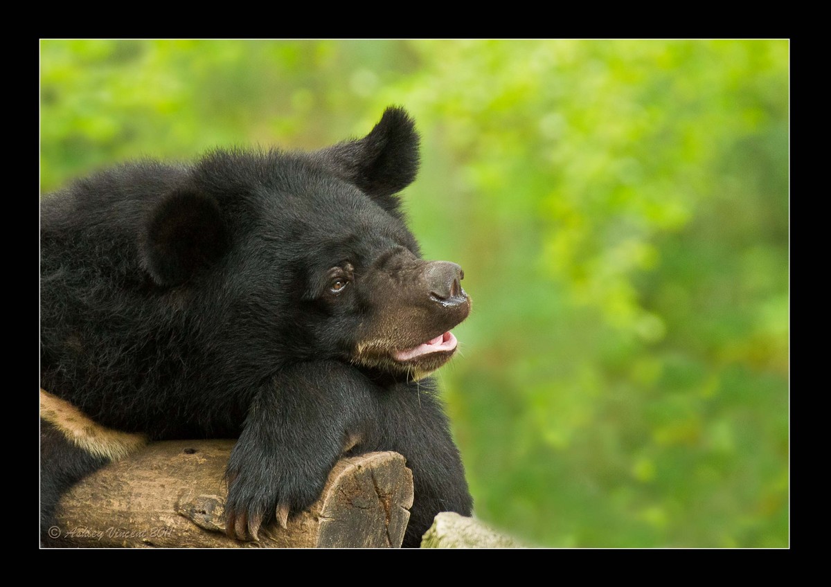
Subject: Asiatic Black Bear AKA Moon Bear (captive)
Although I'd been wanting to find an opportunity for a while now to post up a couple of my bear shots, what actually prompted me to do so was seeing Darren's recent post (Lunch Time) showing an expression similar to the one you see here, so I'm happy to dedicate this one to you Darren in the hope that you'll get to see it :^)
Although hopefully no one will notice my handiwork, I did actually remove and clone out a couple of elements that I found too distracting and I cleaned up the Bear's coat a little. Hope the knowledge of this doesn't spoil anyone's enjoyment of the finished result you see here.
Critique and comments always welcome :^)

Comments
4 commentsYep, you managed to capture the same "bear looking a bit like a pig" expression that Darren had in his image! Nice and simple and while the background is a BIT bright for my taste, it's nice that it's an elephant-free zone. I always strive to keep those big grey distractions out of the background on my images too!
I like the general composition here and the black-on-black detail on the bear looks quite good to me. A comment similar to on your previous bear post - I do find the bottom a bit tight (just a bit), especially how tight those claws coming to touching the lower edge of the frame. If the image was mine (and if the original has extra room down there) I'd add a sliver more room on the bottom (only very little is needed). Personally I would pull back on both brightness and saturation (esp. the yellows) in the background - not sure if all the "spots" are a function of your cloning but currently (i.e., at current brightness and saturation) it does pull my eye a little...
Cheers...thanks for sharing this one!
Brad
Brad: There is indeed more space along the lower edge of the frame, but adding more would have included another element that would have proved somewhat troublesome to remove and I really didn't want to include it, but you're right and I too would prefer this with a little more area between the claws tips and the bottom edge.
Perhaps I'll get round to reworking this again some time, and if I do I'd also bring down the brightness of the background, as I also see what you mean.
Although I suspect the "spots" you're seeing in the background are more in parts I didn't touch and more likely of Nature's design ;^) happy to show you the original, even though it will make it clear that I'm yet to be considered a Master when it comes to clone work in PS ;^p